Table of Contents
- Introduction
- Getting started
- Overview
- Form definition
- Handling events
- Nested forms
- Advanced features
- Tables
- Deployment
- Example
- How to
- How to add a piece of uneditable text?
- How to place a button next to a textfield?
- How to disable a component unless a condition is met?
- How to send an update to the form and immediately continue calculations?
- How to change the options of my Select component?
- How to change the options of my Selectboxes component?
- How to use numbers with scientific notation?
- How to add an image?
- Testing
- Frequently asked questions (FAQ)
- Release notes
- Known issues & limitations
Introduction
Simian GUI provides an accessible way to define graphical user interfaces for your Python or MATLAB applications, that can be deployed on a server where they can be used by authorized users. The user interface can be developed using relatively basic code, focusing on GUI content specification and (mutual) positioning of interface components. In other words: the developer focuses on the final product, while more technical GUI aspects are handled by Simian GUI.
The key capabilities of Simian GUI are:
- Development of your models and the graphical user interface can be performed in the same environment (Python or MATLAB).
- Write the user interface definition in basic Python or MATLAB code. Utilize over 40 different customizable components to create the interface you want.
- The same codebase is used for local and deployed mode.
- Exploit the computational power of your deployment server instead of having to use that of your user’s machines.
- MATLAB: No MATLAB license required for each user when running deployed applications.
- No HTML/JavaScript/JSON knowledge required to create full-fledged user interfaces.
Simian GUI has a Python and a MATLAB implementation, both of which are described in this document.
The pieces of code in this document are Python or MATLAB code, indicated by the  and
and  icons in the top-right of the code blocks.
In these code snippets, the following imports are assumed to be made (and thus are not shown) in order to keep them readable:
icons in the top-right of the code blocks.
In these code snippets, the following imports are assumed to be made (and thus are not shown) in order to keep them readable:
- Python:
import simian.guifrom simian.gui import componentfrom simian.gui import composed_componentfrom simian.gui import component_propertiesfrom simian.gui import utils
- MATLAB:
simian.gui_v3_2_0.*where the release number3_2_0may vary.
Parts of the documentation on name-value pairs show them in PascalCase: starting with an upper case character and starting every word with a capital letter.
These name-value pairs are used in MATLAB. In Python, the name-value pairs are snake_cased: lower case with underscores separating the words.
This means that if a name-value pair is documented as NestedForm, the input argument in Python becomes nested_form.
For an example of a form hosting the inputs and results of a model please refer to the Ball Thrower example.
Python
Graphical user interfaces defined with Simian GUI can be tested and used locally with pywebview. The GUI can also be deployed on a server and can be accessed with an internet browser by users that have sufficient access rights. When deployed, the calculations behind the GUI are performed by the server and not the user's machine. The appearance and functionality of the GUI in local Python mode is the same as that in deployed mode.
Currently, Python versions 3.10 - 3.13 64-bit are supported on Windows and Linux.
Local use
During development of the GUI, it can be used and tested locally with pywebview. Refer to the Setup section for the steps required to do this.
Deployed use
When the GUI is ready it can be deployed on a server to reach a wider audience. There is not a standard deployment target for Python as there is with MATLAB. GUIs created with Simian GUI have successfully been deployed on the following environments (sorted alphabetically):
- Azure functions
- FastAPI
- Flask (Not suited for production)
- ownR
Other environments may also work as deployment target, but these have not been tried.
For more information on deployment, refer to the Deployment section.
When the web app code is deployed, the Simian Portal must be configured to connect with it, so that users can use it.
MATLAB
Graphical user interfaces defined with the MATLAB version of Simian GUI can be tested and used in a native MATLAB figure. They can also be deployed on the MATLAB Production Server, which allows users with sufficient access (Active Directory) to access the tools through their internet browser in real-time. They do not require a MATLAB license or more computational power than is needed for the browser. The appearance of the GUI in local MATLAB mode is the same as that in deployed mode.
Simian GUI is supported in MATLAB releases R2022a1 and newer.
Workflow
The basic workflow of Simian GUI in combination with the MATLAB Production Server is illustrated in the image below.

Local use
While the tool is under development, using the MATLAB Production Server is not a necessity yet. The general workflow is as follows:
- Start off by defining the form (GUI) initial states and underlying behaviour in MATLAB. Tie the front-end to the back-end by specifying what event should trigger what computations.
- The form is initialized in a MATLAB figure. In this figure, you can change values in the form using checkboxes, text fields etc.
- When you are done making changes to the form, click a button that triggers a submission of the form data to the back-end (MATLAB). The computations you specified for that button are performed and updates are sent back to the form for the user to interact with.
Deployed use
Your tool can be used with the MATLAB Production Server using the following steps:
- Generate an archive from your MATLAB code and deploy your tool on the MATLAB Production Server. This is described in Deployment.
- Configure your Simian Portal to add a link to the deployed web app for the users.
- A user can now access the tool from their favourite web browser without requiring an active MATLAB session. Since the application is the same as in local mode, the same edits can be made as in step 2 of the list above.
- After a button is clicked, the data is submitted to the back-end (MATLAB Production Server) where computations are performed. Updates are sent back to the front-end (the user's web browser).
Contact us, if you need older MATLAB version support.
Form.io
Form.io is a form and data management platform for progressive web applications. It provides a structural approach to build and communicate with a front-end client interface that runs in the browser, and a back-end running on a server.
Simian GUI uses the front-end part of Form.io to build a user interface and interact with a back-end running on the WSGI applications or Matlab Production Server.
Forms
HTML forms are the common way to collect user input on a webpage. The Form.io framework builds upon this technology with its own JSON format for defining forms and to communicate data with the server. In turn, Simian GUI uses this format to bring the user input into a Python or MATLAB application.
To gain insight into the capabilities of Simian GUI, you can use the Simian Form Builder (beta) or the online form builder. It illustrates how Form.io forms can be constructed and what components and properties are available. The online builder cannot be used for the actual implementation of your application or tool. When you drag components from the left onto the form and change some of their properties, you can see the resulting interactive form at the bottom of the page. The definition of the form in JSON format is shown on the right. Below the form, you can see the submission data that will be sent to the back-end when an event is triggered (for example the push of a button), also in JSON format.
In Python/MATLAB, you write code to define the form (See Form definition). The resulting form definition is an object tree that will be converted to JSON for you. The submission data received from the front-end is converted from JSON into a dict/struct that is more easy to navigate and change. What the form builder does not show is that the submission data of the form can be updated by the back-end as well to perform certain actions such as filling a component with data or hiding/showing a component.
Getting started
This chapter describes the required setup for creating a form with Simian GUI, both in Python and in MATLAB.
The first step is to setup your project in Python or MATLAB . Then, it is time to create your first application as described in Hello world!.
A more elaborate example that illustrates the use of Simian GUI is shown in the Ball Thrower example application.
Python setup
Requires the following resources:
- An internet connection to download and install Simian GUI from our PyPi server (or an offline alternative).
Setup steps:
-
Create and activate a Python environment.
Note: Use Python 3.8 - 3.12.
-
Install the packages using
pip:pip install --extra-index-url https://pypiserver.monkeyproofsolutions.nl/simple/ simian-gui simian-local simian-examplesNote that for installation on a deployment server the
simian-localandsimian-examplespackages are not required.-
The
simian-localpackage installspywebviewas a dependency1. To verify it is installed correctly on your system, run the following python commands. A window, displaying the PyWebview web page, should open.import webview webview.create_window('Hello world', 'https://pywebview.flowrl.com/') webview.start() -
If you want to use Redis cache (for deployed mode) it can be specified as optional dependency of the
simian-gui:pip install simian-gui[redis]
-
Testing your setup
You can test your environment setup by running the following commands in your Python environment:
import simian.gui
form = simian.gui.Form()
If you get a Form object, your environment is setup correctly. If pywebview is installed correctly in your Python environment, you should be able to start the BallThrower example locally by running the following commands:
import simian.local
simian.local.run("simian.examples.ballthrower", window_title="Ball Thrower")
If you get an error, you can check this against these error messages and solutions:
-
ModuleNotFoundError: No module named 'simian'Simian GUI was not found on the Python path. Ensure that thesimian-guiandsimian-localpackages are installed. -
ModuleNotFoundError: No module named 'simian.examples.ballthrower'Thesimian-examplespackage was not found on the Python path. Ensure that thesimian-examplespackage is installed. -
ModuleNotFoundError: No module named xxxEnsure that all dependencies are installed in your Python environment.
Simian GUI contents
A full Simian GUI installation in your Python environment installs the following folders and files in the site-packages folder:

From simian-builder:
simiancssCSS for the builder.templatesTemplates for creating apps and composed components.builder.jsonBuilder form definition.builder.pyThe Builder module.version.txtVersion information.
From simian-examples:
simianexamplesall_components.pyWeb app with all components that can be used in Simian.ballthrower.pyWeb app with the BallThrower application. It contains thegui_initandgui_eventfunctions that define the user interface of the application.ballthrower_engine.pyModule with a class that implements the ball throwing model.plot_types.pyWeb app showing some of the Plotly figures that can be used in Simian.workshop_example.pyWeb app showing a DataTable and Plotly figure in use.wrapped_thrower.pyWeb app with the BallThrower and a engine that is wrapped with Simian Wrapper.
version.txtVersion information.
From simian-gui:
simianguiFolder containing Simian GUI code.config.jsonFile containing the version number of the front-end.entrypoint.pyUtility for handling callbacks.version.txtVersion information.
From simian-local:
simianhtmlFolder containing the front-end build for PyWebview.eventh_handler.pyUtility for communication with tht PyWebview window.local.pyThe Simian Local module.local.pyiPython stub file containing type hints for thelocal.pymodule.version.txtVersion information.
On Linux, pywebview[qt] is installed. For it to work properly, Qt 6 and its required dependencies must be installed on the system. Use export PYWEBVIEW_GUI=qt (for instance in your .bashrc) to ensure that Qt is the default.
MATLAB setup
Requires the following resource:
- MATLAB Simian GUI release toolbox file.
Setup steps:
- Install the toolbox by double-clicking it in the MATLAB file browser or use
matlab.addons.install. Refer to section Simian GUI contents for more information about its contents.
Note In all code presented in the documentation,
v3_2_0must be substituted with the version number for the actual release that is used. It is recommended to use dynamic version numbers.
Testing your setup
You can test your environment setup by running the following commands in MATLAB:
form = simian.gui_v3_2_0.Form();
If you get a Form object, your environment is setup correctly. You should also be able to start the BallThrower example locally by running the following command:
simian.local_v3_2_0.run("simian.examples_v3_2_0.ballthrower");
If you get an error, you can check this against these error messages and solutions:
Unable to resolve the name simian.gui_v3_2_0.Form.Ensure that the thesimian-guifolder is on the MATLAB path and that the version in the namespace corresponds with your Simian GUI version.Unable to resolve the name simian.local_v3_2_0.Form.Ensure that the thesimian-localfolder is on the MATLAB path and that the version in the namespace corresponds with your Simian GUI version.Unable to resolve the name 'simian.examples_v3_2_0.ballthrower'Ensure that the thesimian-examplesfolder is on the MATLAB path and that the version in the namespace corresponds with your Simian GUI version.
Simian GUI contents
An overview of archive contents is shown in the figure below.

simian-examplesFolder containing the included examples.+simian+examples_v3_2_0@BallThrowerClass implementing the ball throwing model.+ballthrowerThe BallThrower application package. It contains theguiInit.mandguiEvent.mfunction files that define the user interface of the application.+treemapThe Tree map application package. It contains theguiInit.mandguiEvent.mfunction files that define the user interface of the application.
simian-guiFolder containing the Simian GUI code.+simian+gui_v3_2_0Simian GUI package where the name contains the version number. When you use Simian GUI you must ensure that the correct name is used. Refer to the deployment section for tips on making this easier.
config.jsonFile containing the version number of the front-end.
simian-localFolder containing the code to run Simian GUI locally.+simian+local_v3_2_0Simian Local package where the name contains the version number. When you use Simian GUI you must ensure that the correct name is used. Refer to the deployment section for tips on making this easier.
htmlFolder containing the front-end build for uihtml.
Contents.mSimian GUI version number.install.pScript that sets up Simian GUI for running applications locally.GettingStarted.mlxHelp text for the toolbox.
Working with multiple releases
It is possible to work with, and deploy, multiple Simian GUI applications simultaneously, even if they use different Simian GUI releases. To facilitate this, the version numbers are included in the package namespace.
Therefore, the recommended approach is to dynamically select the Simian GUI package in your code.
-
Create a function that returns the required version number, e.g.:
function simianGui = getSimianGui() simianGui = "gui_v3_2_0"; end -
Use the function to import or call the correct version of Simian GUI:
% Direct calls:
nr = simian.(getSimianGui()).component.Number("myKey");

% Importing:
import("simian." + getSimianGui() + ".*");
nr = component.Number("myKey");
In order to update to a new release of Simian GUI, you only have to update the string returned by this function. All other files remain unchanged.
Alternatively, when not referencing the package dynamically, all calls to Simian GUI need to be updated to the new version. This may lead to a large number of changes. Extra care is required when using version control and multiple braches are under development simultaneously.
In order to update your code to a newer Simian GUI release, use the updateVersion function included in the Simian GUI package.
This function edits the version number in all m-files in a given folder and its sub-folders.
For example: simian.gui_v3_2_0.updateVersion("C:\Applications\MyApp").
Save all m-files and make a back-up before you run this function!
Hello world!
This section will guide you through creating your first, simple Simian web app in a couple of steps. To reduce code snippet sizes, code from earlier steps is left out, indicated with '...'.
Prerequisites
Ensure that Simian GUI for your programming language is available (unzipped) on your machine and that it is on the path. You need to be able to run the functionality in Simian GUI to be able to use it.
The editor you are using should offer tab completion, code analysis, linting and other hints during programming when Simian GUI is available to the editor.
The steps to setup a working environment be found in:
First application
We will start with creating an empty application, that only has a title and logo.
Python
In Python, an application is a module containing two functions: gui_init to define the form and gui_event to handle events.
Create a file
hello.py. Make sure the containing folder is on the Python path.
hello.py
from simian.gui import component
from simian.gui import Form
from simian.gui import utils

def gui_init(meta_data: dict) -> dict:
    # Create a form and set a logo and title.
    form = Form()

    payload = {
        "form": form,
        "navbar": {
            "logo": "favicon.ico",
            "title": "Hello, World!",
        },
    }

    return payload

def gui_event(meta_data: dict, payload: dict) -> dict:
    # Process the events.
    return payload
Start the application from the Python console:
import simian.local
simian.local.run("hello")
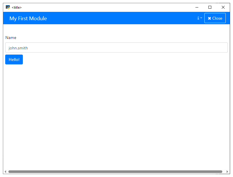
A PyWebview window will open, showing the empty application as in the figure below the MATLAB example.
Add components to the form
A component is created with a call to its constructor. Each constructor takes one or two input arguments:
- a (unique)
key - and optionally a
parentcomponent or form.
Properties, such as label and defaultValue can be set on the created object. In this example we will add a TextField and a Button to the form. For more information, see the section about Form structure.
MATLAB
In MATLAB, an application is a package folder containing two functions: guiInit to define the form and guiEvent to handle events.
Create a folder
+helloand add the m-filesguiInit.mandguiEvent.m. Make sure the containing folder is on the MATLAB path.
+hello/
    guiInit.m
    guiEvent.m
guiInit.m
function payload = guiInit(metaData)
    import simian.gui_v3_2_0.*;

    % Create a form and add it to the payload.
    form            = Form();
    payload.form    = form;

    % Set a logo and title.
    payload.navbar.logo = "favicon.ico";
    payload.navbar.title = "Hello, World!";
end
guiEvent.m
function payload = guiEvent(metaData, payload)
    import simian.gui_v3_2_0.*;

    % Process the events.
end
Start the application from the command line:
simian.local_v3_2_0.run("hello")
A MATLAB figure will open, showing the empty application as in the figure below.
Note: Substitute
v3_2_0with the actual version that you are using.
Python
Append the
gui_initfunction by with code to add a text field and a button.
hello.py
def gui_init(meta_data: dict) -> dict:
    ...

    # Create a textfield.
    hello_text = component.TextField("helloKey", form)
    hello_text.label = "Enter first word"
    hello_text.defaultValue = "Hello"

    # Create a button.
    world_button = component.Button("buttonKey", form)
    world_button.label = "World!"

    return payload
Start the application from the Python console:
import simian.local
simian.local.run("hello")
The form now looks as shown in the figure below.
Add an event
Buttons can emit events when clicked. These events are handled in the gui_event function. In this example we will add an event to the previously created button, to print a message to the command line. For more information, see the chapter about Handling events.
MATLAB
Append the
guiInitfunction with code to add a text field and a button.
guiInit.m
function payload = guiInit(metaData)
    ...
    % Create a textfield.
    helloText               = component.TextField("helloKey", form);
    helloText.label         = "Enter first word";
    helloText.defaultValue  = "Hello";

    % Create a button.
    worldButton         = component.Button("buttonKey", form);
    worldButton.label   = "World!";
end
Start the application from the command line:
simian.local_v3_2_0.run("hello")
The form now looks as shown in the figure below.

Python
Add the event to the button in
gui_initwith thesetEventmethod and the name of the event as input argument.
Add code to handle the event in
gui_event.
def gui_init(meta_data: dict) -> dict:
    ...

    # Create a button that emits the "world_button_pushed" event.
    world_button = component.Button("buttonKey", form)
    world_button.label = "World!"
    world_button.setEvent("WorldButtonPushed")

    return payload


def gui_event(meta_data: dict, payload: dict) -> dict:
    # Process the events.
    Form.eventHandler(WorldButtonPushed=say_hello)
    callback = utils.getEventFunction(meta_data, payload)
    return callback(meta_data, payload)


def say_hello(meta_data: dict, payload: dict) -> dict:
    # Print the "<helloKey> world!" string to the console.
    print(utils.getSubmissionData(payload, "helloKey")[0] + " world!")
    return payload
Start the application from the Python console:
import simian.local
simian.local.run("hello")
Click the button.
The message Hello world! is printed to the console.
MATLAB
Add the event to the button in
guiInitwith thesetEventmethod and the name of the event as input argument.
guiInit.m
function payload = guiInit(metadata)
    ...

    % Create a button that emits the "WorldButtonPushed" event.
    worldButton         = component.Button("buttonKey", form);
    worldButton.label   = "World!";
    worldButton.setEvent("WorldButtonPushed");
end
Add code to handle the event in
guiEvent.
guiEvent.m
function payload = guiEvent(metaData, payload)
    % Process the events.
    import simian.gui_v3_2_0.*;
    Form.eventHandler("WorldButtonPushed", @sayHello);
    payload = utils.dispatchEvent(metaData, payload);
end

function payload = sayHello(metaData, payload)
    % Print the "<helloKey> world!" string to the console.
    import simian.gui_v3_2_0.*;
    fprintf(1, "%s world!\n", utils.getSubmissionData(payload, "helloKey"));
end
Start the application from the command line:
simian.local_v3_2_0.run("hello")
Click the button.
The message Hello world! is printed to the command window.
Code generation
Code generation is not a substitute for knowledge and understanding. To use it effectively, you must provide clear guidance, ask informed questions, and be able to recognize and correct the inevitable mistakes.
It is recommended to manually build a few simple Simian apps before using code generation. This will help you get a feel for its capabilities and limitations, preventing you from prompting for non-existing features, which code generation models may happily write good-looking but erroneous code for.
Ultimately, code generation is a tool. And much like wielding a hammer, you risk getting hurt when you don't know how to use it properly.
Provide context
There are currently no code generation resources trained for using the Simian libraries. You can use the standard code generation models for your programming language, as long as you provide sufficient context. The models will use the provided context to generate similar code, effectively 'learning' to apply the Simian libraries' functionality.
The context may consist of (a subset of):
- your Simian web apps code,
- the Simian examples library,
- additional examples on Github
- (for Python only) a Simian Context file containing all major features.
For most Python cases providing just the Simian context file should be sufficient.
Clearer prompts
To communicate your expectations to the code generation model more effectively, consider the following when writing instructions.
-
Components in your form have a key with which they can be identified. In your commands use this key between quotes to mark it as an identifier and not an unusual word in the sentence.
# Make "hello" disabled when "counter" equals 0. -
In your instructions use wording that matches the documentation or your context. For instance:
- "Form": as the root of the web app.
- The type names of the components and their properties and methods. (Case insensitive)
- "blur": as the event for components losing focus.
-
To create new components use a word like "add" or "create", the
typeof the component, and where it should be added; to the "form" or the parent component's key. The model may not know if the component already exists, so to add components it is best to be explicit. You may find it more convenient though, to make simple changes via the Simian Builder.# Add a textfield to the form for specifying the name of the user -
To modify existing components with component initializer functions you need to add the instruction below. Otherwise the model may get 'creative' in accessing the component.
# Using component initializer functions to modify properties of components defined in the json file.
Instructions from file
You can interactively expand your app by prompting one change after the other or prompt the model with a set of changes. Alternatively, you can register a set of code generation instructions in a file and apply them all at once. The instructions may be written to a separate text file or placed as comments in your Simian app code.
The instructions should look similar to the following:
# Generate code:
# Using component initializer functions to modify properties of components defined in the json file.
# While keeping the 'gui_init' and 'gui_event' functions together. (for Python)
Followed by lines with your code generation instructions. Optionally, end with the following to keep the instructions in the file after code gen.
# Keep these instructions in the file.
Overview
Basics of a form
An application is defined as a namespace containing several main functions with predefined names (starting with gui) and syntax. These are described in the table below.
For Python the namespace must be a module. For MATLAB it must be a package.
Simian GUI must be able to find the namespace on the path. Refer to the examples for illustrations.
Simian GUI will try to execute the gui functions during initialization and when handling events.
The form code can be in other files and functions, as long as the gui functions call these other functions in turn.
When the functions are not found or cannot be executed for any other reason, the form will not function correctly.
gui functions
| Function | Description |
|---|---|
payload = gui_init(metadata) | Required: Form initialization code. See Form definition. |
payload = gui_event(metadata, payload) | Required: Event handling code. See Handling events. |
payload = gui_download(metadata, payload) | Optional: Download content from the form. This function is executed instead of gui_event when the downloadStart event is triggered. For more information, see the gui_download section. |
payload = gui_upload(metadata, payload) | Optional: Upload content to the form. This function is executed instead of gui_event when a button is clicked that had the setUpload method called on it during form initialization. For more information, see the gui_upload section. |
gui_close(metadata) | Optional: Define what should happen when the application is closed. For example, data may need to be saved or the workspace might need to be cleaned up. In addition to what is executed in your custom function, the cache is cleared. |
gui_refresh() | Optional, Python only: Called when using the Form refresh button for fast re-initialization during development. |
Note that the snake case gui_xxx functions have a lower camel case guiXxx equivalent in the MATLAB version of Simian GUI.
Running locally
The functions must be in a package (or module) to prevent shadowing these functions implemented for other potential applications created with Simian GUI. Once these functions have been created and the code and Simian are on the path, the form can be initialized locally by using:
import simian.local
simian.local.run("my.namespace")
simian.local_v3_2_0.run("my.namespace")
where "my.namespace" is the unique namespace of your form.
The following extra options can be specified:
- Python:
run(_, app_data={})Sets the application data dictionary. Available asapplication_datain the metadata dict.Set by the Portal when deployed. May contain list of strings and scalar numeric, text, and boolean values.run(_, user={})Authenticated user dict. Available asauthenticated_userin theclient_datapart of themeta datadict. Set by the Portal when deployed. May contain ausernameanduser_displaynamefield.run(_, debug=debug)Sets the application debug flag.run(_, fullscreen=fullscreen)Sets the window full screen on start when true.run(_, size=size)Sets the initial window size [width, height].run(_, window_title=window_title)Specifies a title for the application window.run(_, show_refresh=True)Shows the Refresh button in the navbar.
- MATLAB:
run(_, "AppData", struct)Specifies the application data struct. Available asapplication_datain the metadata struct. Set by the Portal when deployed. May contain array of strings and scalar numeric, text, and logical values.run(_, "User", struct)Specifies the authenticated user struct. Available asauthenticated_userin theclient_datapart of themeta datastruct. Set by the Portal when deployed. May contain ausernameanduser_displaynamefield.run(_, "FigureHandle", figHandle)Specifies a custom parent figure.run(_, "FigureProps", props)Specifies additional options (cell array) to use for the uihtml component.run(_, "Fullscreen", fullscreen)Sets the figure full screen on start when true.run(_, "Maximized", maximized)Maximizes the figure on start when true.run(_, "Size", size)Sets the initial size [width, height] of the figure.run(_, "WindowTitle", title)Specifies a title for the figure.run(_, "ShowRefresh", true)Shows the Refresh button in the navbar.
For deploying the form on a server please refer to the deployment chapter.
Form definition
The form definition is specified in the gui_init function that is called upon initialization of the form.
It contains application-specific code for building the form and filling it with components.
Simian GUI offers over 40 different components such as buttons, checkboxes, tables etc.
The documentation on name-value pairs shows them in UpperCamelCase: starting with an upper case character and starting every word with a capital letter.
These name-value pairs are used in MATLAB. In Python, the name-value pairs are snake_cased: lower case with underscores separating the words.
This means that if a name-value pair is documented as NestedForm, the input argument in Python becomes nested_form.
Implementing gui_init
The gui_init function is called during initialization of the application and provides the form definition.
In this section the calling syntax, arguments and return values will be discussed, followed by a small example.
Syntax
def gui_init(meta_data: dict) -> dict:
    ...
    return payload
function payload = guiInit(metaData)
    ...
end
Arguments
meta_data:
Meta data describing the client session.
Dict/struct with fields:
session_id: unique ID for the session, can be used to differentiate between multiple instances of the applicationnamespace: package name of the applicationapplication_data: The application data dictionary / struct. Contains the fields and values set by the Portal or local run call.mode:localordeployedclient_data:authenticated_user: for deployed apps, the portal provides the logged on user infouser_displayname: user name for printing (e.g. "John Smith")username: unique identifier used by the authentication protocol
In the gui_init function, form is defined by filling the form field of the payload.
The payload is then sent to the front-end in order to present the form to the user.
payload:
Return value with the form definition.
Dict/struct with fields:
form: asimian.gui.Formnavbar(optional): dict/struct with fields:logo(optional): image source reference (anything that can be put in HTML<img src="..." />)title(optional): HTML stringsubtitle(optional): HTML string
See also
- For an example see Hello world!.
Form structure
The Hello world! example of the previous chapter follows the general structure of the form initialization code:
- Create an empty form:
form = simian.gui.Form() - Add components to it from top to bottom:
- Create the component with default property values.
- Change property values of the component where necessary.
- Return a
dict/structwith aformfield that contains the form.- Optionally specify a
navbarfield to set thelogoandtitleof the application.
- Optionally specify a
There are three ways of adding components to the form:
Adding components from constructor
Components are created by calling the Component constructor:
comp = component.<name>(<key>, <parent>)
In this call:
nameis the name of any class incomponentthat is not theComponentclass. TheComponentis an abstract superclass of all implemented components, so it cannot be used directly. For a full list of available components, see Components and subsections.keyis a unique string by which the component can be recognized. In MATLAB it must be a valid structure field name, which can be checked usingisvarname(<key>)(Python does not have this restriction). In order to prevent unexpected behavior, it is advised to use globally unique component keys within the form.parentis an optional parent to which the new component must be added. You can add the new component directly to the form just like in the Hello world! example. Alternatively, you could add the component to a parent component such as a panel or table. More information on nesting of components can be found in Component nesting.
You can choose to import the component package to prevent having to use it for the creation of every single component. The syntax then becomes:
from simian.gui.component import *
comp = <name>(<key>, <parent>)
import simian.gui_v3_2_0.component.*
comp = <name>(<key>, <parent>);
There are over 35 different components that follow the same pattern. Each of these is described in the Components section and subsections.
Adding components from table
When each component is constructed individually, the code can quickly become very lengthy. In order to keep the overview, components can be specified in a Pandas DataFrame or list of lists (in Python) or MATLAB table by using the utils.addComponentsFromTable function. It takes two input arguments:
parent: aFormorComponentthat can have subcomponents (i.e. it has acomponentsproperty),table: a Pandas DataFrame, list of lists, or MATLAB table.
It returns the created components in a dict/struct.
The table or DataFrame may have the following columns :
- key: Component key (mandatory). Must be a valid variable name and unique per level.
- type/class: Component type or class for creating the component (mandatory).
- level: Nesting level. Top level components (relative to parent) have level 1. Nested components, e.g. in a Panel, increment with 1. If the column is not present, all levels will be set to 1.
- options: Dictionary/struct with options, may contain any property that can be set to the component. Use
None/missingto leave unspecified. If the column is not present, all options will be set toNone/missing. Keys/fields 'defaultValue', 'label', 'tooltip', 'type', and 'key' are ignored, as these are columns of the table. - defaultValue: The default value for the component, must be of a valid data type for the component type. Use
None/missingto leave unspecified. If the column is not present, all default values will be set toNone/missing. - label: Label for the component. Use
None/missingto leave unspecified. If the column is not present, all labels will be set toNone/missing. - tooltip: Tooltip for the component. Use
None/missingto leave unspecified. If the column is not present, all tooltips will be set toNone/missing.
In case of a Python list of lists input these columns are assumed to be the fields of the inner lists, unless specified differently in the column_names input.
Although in general only components can be added to the table, there are some other type/class values that can be added:
- column for adding the actual columns to a
Columnscomponent. In the options, awidthfield with an integer value must be specified. The total of the column widths must add up to 12. - tab for adding the actual tabs to a
Tabscomponent. The label will be shown on the tab. - tablerow for adding rows to a
Tablecomponent. Can only be added to a Table. - tablecell for adding a
TableCellto atablerow. TheTableCellcan contain other components.
Validation, conditionals and logic can be added to the returned components as usual (see here), or they can be added via the options dict/struct that is put in the table.
The dict/struct that is returned uses the keys specified in the table definition as keys/fields. If keys in the table are not unique, then only the last component with the non-unique key will be in the output.
Example
This example shows a simple form built using a DataFrame/table. It consists of a panel that is added to the form and four components that are added to the panel, using the level column. The options dict/struct is used for multiple components, further reducing the amount of code required for building the form.
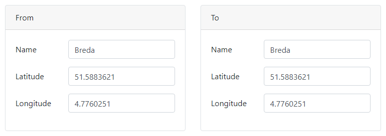
def gui_init(_meta_data: dict) -> dict:
    form = Form()

    component_dict = _create_layout(form)

    _fill_column(component_dict["left"], "From")
    _fill_column(component_dict["right"], "To")

    return {"form": form}


def _create_layout(form: Form) -> dict:
    column_options = {"width": 6}

    component_specs = [
        #   key             class       level   options
        [   "locations",    "Columns",  1,      None            ],
        [   "left",         "Column",   2,      column_options  ],
        [   "right",        "Column",   2,      column_options  ],
    ]

    return utils.addComponentsFromTable(form, component_specs, ["key", "class", "level", "options"])


def _fill_column(column: component.Columns, label: str) -> None:
    key = label.lower()

    shared_options = {"labelPosition": "left-left"}

    component_specs = [
        #   key             class           level   options             defaultValue    label
        [   key + "Panel",  "Panel",        1,      None,               None,           label       ],
        [   key,            "Container",    2,      None,               None,           None        ],
        [   "name",         "TextField",    3,      shared_options,     "Breda",        "Name"      ],
        [   "latitude",     "Number",       3,      shared_options,     51.5883621,     "Latitude"  ],
        [   "longitude",    "Number",       3,      shared_options,     4.7760251,      "Longitude" ],
    ]

    column_names = ["key", "class", "level", "options", "defaultValue", "label"],

    utils.addComponentsFromTable(column, component_specs, column_names)
function payload = guiInit(metaData)
    form = Form();

    componentStruct = createLayout(form);

    fillColumn(componentStruct.left, "From");
    fillColumn(componentStruct.right, "To");

    payload.form = form;
end

function componentStruct = createLayout(form)
    columnOptions.width = 6;

    componentSpecs = {
        % key           class       level   options
        "locations",    "Columns",  1,      missing
        "left",         "Column",   2,      columnOptions
        "right",        "Column",   2,      columnOptions
        };

    componentTable = cell2table(componentSpecs, 'VariableNames', ["key", "class", "level", "options"]);

    componentStruct = utils.addComponentsFromTable(form, componentTable);
end

function fillColumn(column, label)
    key = lower(label);

    sharedOptions.labelPosition = "left-left";

    componentSpecs = {
        % key           class           level   options             defaultValue    label
        key + "Panel",  "Panel",        1,      missing,            missing,        label
        key,            "Container",    2,      missing,            missing,        missing
        "name",         "TextField",    3,      sharedOptions,      "Breda",        "Name"
        "latitude",     "Number",       3,      sharedOptions,      51.5883621,     "Latitude"
        "longitude",    "Number",       3,      sharedOptions,      4.7760251,      "Longitude"
        };

    componentTable = cell2table(componentSpecs, 'VariableNames', ["key", "class", "level", "options", "defaultValue", "label"]);

    utils.addComponentsFromTable(column, componentTable);
end
Adding components from JSON
With the introduction of the Simian Form Builder,
it is possible to generate components from a JSON form definition file by providing a named argument to the Form constructor.
form = Form(from_file="/path/to/my/form.json")
form = Form(from_file=__file__)  # The extension is replaced with ".json" for convenience.
form = Form(FromFile="/path/to/my/form.json");
form = Form(FromFile=mfilename("fullpath")); % The ".json" extension is added for convenience.
Additionally components that are able to hold other components, can be populated using the addFromJson method.
comp = component.Container("myContainer")
comp.addFromJson("/path/to/my/form.json")
comp = component.Container("myContainer");
comp.addFromJson("/path/to/my/form.json");
Initialization code
When components are generated using a JSON form, the component objects are added to the form tree. To modify a component programmatically without searching for it in the form, register a component initializer function.
This can be done by calling the static method Form.componentInitializer before building the form. The input consists of named arguments, where the keyword/name must match the key of the component and the value is an initialization function handle. The initialization function will be called with one input argument: the component object. Only one function can be registered per component.
Note that the initialization function must be registered before the component is created. Otherwise, the function is not applied to the component. As a result, you cannot register an initialization function from another initialization function.
def gui_init(meta_data: dict) -> dict:
    Form.componentInitializer(name=initialize_name)
    form = Form(from_file=__file__)
    return {"form": form}

def initialize_name(comp: component.TextField):
    comp.defaultValue = os.getlogin()
function payload = guiInit(metaData)
    Form.componentInitializer('name', @initializeName);
    form = Form(FromFile='form.json');
    payload = struct("form", form);
end

function initializeName(comp)
    comp.defaultValue = getenv('USERNAME');
end
Note that you can configure the behaviour of registered initializer functions by adding inputs to a function that wraps the actual function. In the example below a standard set_default function is used to set the default value of multiple components.
def gui_init(meta_data: dict) -> dict:
    Form.componentInitializer(
        name=set_default(os.getlogin()),
        folder=set_default(os.getcwd()),
    )
    form = Form(from_file=__file__)
    return {"form": form}

def set_default(value) -> Callable:
    def inner(comp: component.TextField):
        comp.defaultValue = value
    return inner
function payload = guiInit(metaData)
    Form.componentInitializer( ...
        'name', set_default(getenv('USERNAME')), ...
        'folder', set_default(cd()) ...
        );
    form = Form(FromFile='form.json');
    payload = struct("form", form);
end

function func = set_default(value)
    func = @(comp) inner(comp, value);
end

function payload = inner(comp, value)
    comp.defaultValue = value;
end
In a wrapped initialization function it is possible to register other initialization functions. In the example below the initialization function for the folder TextField is added in the function wrapping the name TextField initializer.
A construction like this is useful when your web app is created from a JSON form definition and incorporates another JSON form definition with initializer functions that must be executed.
def gui_init(meta_data: dict) -> dict:
    Form.componentInitializer(name=initialize_name())  # Function is executed!
    form = Form(from_file=__file__)
    return {"form": form}

def initialize_name() -> Callable:
    # Add an initialize function for the 'folder' component.
    Form.componentInitializer(folder=initialize_folder)
    def inner(comp: component.TextField):
        comp.defaultValue = os.getlogin()
    return inner

def initialize_folder(comp: component.TextField):
    comp.defaultValue = os.getcwd()
function payload = guiInit(metaData)
    Form.componentInitializer('name', initializeName());  % Function is executed!
    form = Form(FromFile='form.json');
    payload = struct("form", form);
end

function func = initializeName()
    % Add an initialize function for the 'folder' component.
    Form.componentInitializer(folder=@initialize_folder)
    func = @(comp) inner(comp);
end

function inner(comp)
    comp.defaultValue = getenv('USERNAME');
end

function initialize_folder(comp)
    comp.defaultValue = cd();
end
Simian Form Builder
The Simian Form Builder can be used to build Simian web apps or components in a graphical environment, reducing the amount of code to be written.
Simian web apps created with the builder can be used without having the builder installed. They do need Simian GUI to be installed to work.
Currently the Simian Form Builder only runs in Python, although it can be used to create Matlab apps and components.
Installation
To install the builder, make sure you have simian-gui and simian-local installed. Then, in the same environment, run:
pip install --extra-index-url https://pypi.simiansuite.com/ simian-builder
Getting started
Open the Simian Form Builder window
python -m simian.builder
The Builder opens and shows the default layout. The menu shows two buttons: one to create a new module and one to load an existing form definition file. Below that, the Form.io builder is shown.
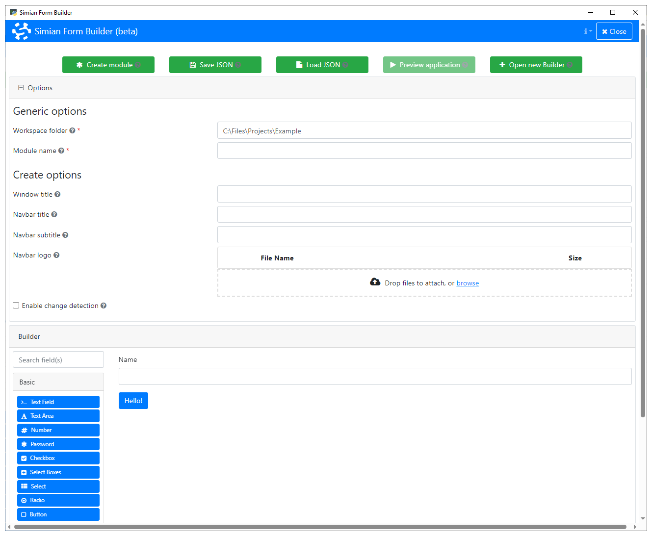
Click the New... button to start.

The options for creating a new module appear:
- Language: Create a Python or Matlab module.
- Mode: Create a web app or a reusable composed component.
- Workspace folder: The folder that needs to be on the path to find your module.
- Module name / Package name: The fully quailified name of the module to create.
When Mode is App:
- Window title: The title to show on the Pywebview / uihtml window.
- Navbar title: The title to show on the navigation bar.
- Navbar subtitle: The subtitle to shown on the navigation bar.
- Navbar logo: The logo to shown on the navigation bar.
- Enable change detection: When selected, shows an indicator badge whenever the user makes changes to the form.
When Mode is Composed component:
- Class name: the name of the composed component class.
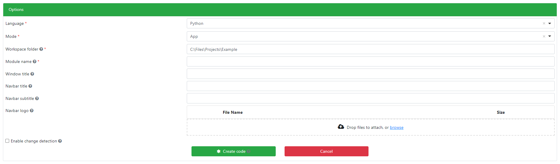
In this example we will create a Python web app to illustrate the working of the Builder. The steps for the other options are similar.
Specify the Workspace folder and Module name.

Click Create code to generate the module code.

This generates:
- A form definition file (
.json). - A Python module that loads the form definition file. The module can be run as a script to open the app locally.
- A
cssfolder containing the modules style sheet.
Drag and drop components to build a form.
Edit component settings to change behavior and appearance.
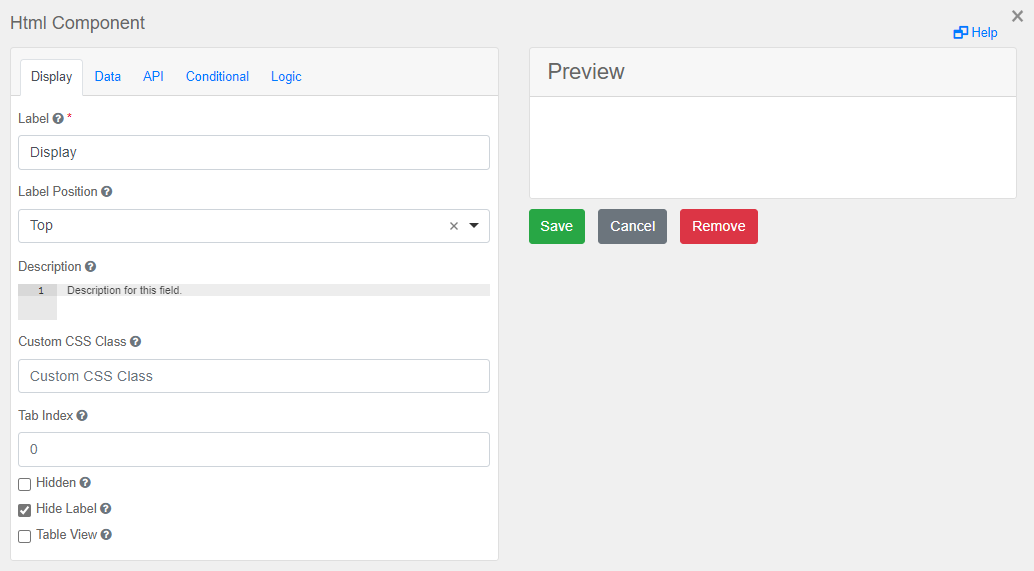
In general the edit pane for each component has several tabs with settings on the left and a preview on the right. Not each component has all tabs, and the contents of the tabs also varies depending on the properties of the component type. See the Components section and its subsections for more details on specific component types.
The tabs that may be present are:
- Display: generic options such as label, description, visibility, etc.
- Data: settings regarding the value of the component, such as default value, multiple values, input masks, etc.
- Validation: frontend input validation, such as required, min, max, etc.
- API: the field
Property Namecontains the component key. It is automatically generated based on the label, but can be changed here. - Conditional: settings to conditionally show or hide the component.
- Logic: settings to update the component properties based on triggered events.
Click the Save button to save the updated form.
For Python web apps, a preview can be opened in a new Python process.
Next steps
Please consider reading the following documentation pages to further develop your application.
The Component class
The numerous different components all inherit properties and methods from the Component superclass.
The following alphabetically ordered list of properties may be relevant for every component, regardless of their type:
| Name | Description | Datatype |
|---|---|---|
| allowCalculateOverride | Whether to allow the calculateValue to be overridden by the user. See the calculateValue property. Set to False by default. | Boolean |
| attributes | Set of HTML attributes for additional styling. See the setAttribute method described below. | dict/struct/containers.Map |
| calculateValue | The value of the component, calculated using the values of other components. Can be JavaScript or JSON Logic. Set using the setCalculateValue method described below. See Custom JavaScript. | String |
| clearOnHide | Whether or not the component's value should be cleared when it becomes hidden. Is set to False by default (different from the default value in Form.io) | Boolean |
| conditional | Defines when the component should be shown or hidden depending on values or properties of components in the form. For more info, see the Conditional section. | Conditional |
| customClass | Custom HTML class(es) to use for the component. Separate multiple classes with spaces. Adding custom classes is easily done using the addCustomClass method described below. You can add your own custom classes as described here. | String |
| customConditional | A component can be hidden using this advanced conditional. Assign the variable show in a piece of JavaScript. For example: show = data.checkbox1 && data.checkbox2;. See Custom JavaScript. An example is provided in How to. | String |
| defaultValue | The default value of the component shown after initialization and that is received when the form is submitted and the component value was not edited. | Unspecified |
| customDefaultValue | A custom default value can be derived in the frontend, using other data in the form. Assign the variable value in a piece of JavaScript. For example: value = data.number1 + data.number2;. | String |
| description | Text to display below the component in dark-gray. | String |
| disabled | Whether or not the component is disabled for the user. If it is disabled, the value cannot be changed by the user, but it can still be altered from the back-end. You can disable a component based on a condition as described in How to. | Boolean |
| errors | Allows customizable errors to be displayed for the component when an error occurs or validation fails. For more info, see the Error section. | Error |
| hidden | Set to true to make the component hidden by default. | Boolean |
| input | Whether the component is an input from the user, or is purely visual. Generally does not need to be changed from the default value of the component. | Boolean |
| key | Unique string by which the component can be identified. This can not be changed after calling the component's constructor. | String |
| label | Text to display on, in or around the component. For example, the text to display on a button. | String |
| logic | Specifies custom behaviour for the component, such as enabling/disabling the component based on a condition. For more info, see the Logic section. | Logic |
| modalEdit | Edit the value in a modal dialog instead of the component in the form. Defaults to False for all components. | Boolean |
| multiple | Whether or not multiple values can be entered. Default is False. | Boolean |
| placeholder | Text/value to display in an editable field, such as a textfield. The placeholder disappears when the component has a value. | Unspecified |
| prefix | The text to display as prefix of the component. Available for all components that allow textual input, such as textfields and numbers. The prefix is not part of the value of the component. | String |
| redrawOn | When to redraw the component. If the value of the component is set by for example custom JavaScript using Logic, you may require setting this property. The value can have the following forms:
| String |
| suffix | The text to display as suffix of the component. Available for all components that allow textual input, such as textfields and numbers. The suffix is not part of the value of the component. | String |
| tabindex | Set this to override the tab index of the form, allowing you to control the order in which a user can tab through the application. The index can have decimals. | Double |
| tableView | When true and the component is part of an EditGrid, the component's value is shown (simplified) in the collapsed row of the EditGrid. | Boolean |
| tooltip | Tooltip to display when the question mark icon on the component is hovered over. This is available for most, but not all components. | String |
| type | Type of the component. This is generally the name of the class, but lower-case. This property value cannot be changed. | String |
| validate | Defines validation criteria for the component. If the validation fails, a message is shown and a Submit button is disabled. For more info, see the Validate section. | Validate |
| validateWhenHidden | Set to True to validate the component value when is is hidden. Note that the user cannot modify its value until the component is shown again. False by default. | Boolean |
The following methods are available for all components:
| Name | Syntax | Description |
|---|---|---|
| addComponent | addComponent(obj, comp1, ..., compN) | Add a number of components to the input component. The input component must be able to host child components. |
| addCustomClass | addCustomClass(obj, class1, ..., classN) | Sets the customClass property by adding the given HTML class names. These names can include custom classes you define as described here. |
| addValidation | addValidation(obj, prop=value, ...) | Create a Validation object with the specified settings for the component. |
| disableWhen | disableWhen(obj, triggerType, triggerValue, disableComponent) | Add disable (or enable) logic to a component. Does the same as the createDisableLogic function. |
| setAttribute | setAttribute(obj, name, value) | Set an HTML attribute of a component. If the attribute is already set, append it instead of overwriting it. Example: obj.setAttribute("style", "color: red") |
| setCalculateValue | setCalculateValue(obj, theValue, allowOverride) | Set the calculateValue property to theValue and (optionally) the allowCalculateOverride property to allowOverride. |
| setRequired | setRequired(obj) | Makes the component required so that a Submit button cannot be clicked until the component has a value. |
Available components
The components that can be added to your application have been divided into five categories. Each category contains an alphabetical list of all components including descriptions and examples.
- Basic: These can be used to collect basic user inputs such as text fields and checkboxes.
- Advanced: These components are for more advanced user inputs such as e-mail addresses or dates.
- Layout: Use these to define the layout of your application.
- Data: These can hold and/or present data, generally in tabular form.
- Miscellaneous: These components can be used to perform uploads, downloads or to nest forms.
Frequent properties
There are properties that are available in many components, but are not common to all:
| Name | Components | Description | Datatype |
|---|---|---|---|
| autocomplete | Text and number | The browser's User agent may fill text and number components based on info provided with the autocomplete property. May be 'on', 'off' or any string. | String |
| hideLabel | With a label | Whether to hide the label in the app. Default is False. | Boolean |
| labelPosition | With a label | Position of the label with respect to the tags. Can be 'top' (default), 'bottom', 'right-right', 'left-right', 'left-left' or 'right-left'. | String |
| spellcheck | Text | When True, the spelling of values is checked. Default is True. | Boolean |
| truncateMultipleSpaces | Text and Number | When True, consecutive spaces in the value are replaced with one space. Default is False. | Boolean |
Value masks
TextField-like components allow for defining a placeholder, input and/or display masks that help with setting a value that can be processed in the backend. For instance, a date may be easier selected when the placeholder reads "mm/dd/yyyy" or when a mask controls where numbers or letters may be set.
Masks may contain:
- meta-characters - that are shown as placeholders that can only be replaced with allowed characters.
- "a": for letters.
- "9": for numbers.
- "*": for letters and numbers.
- hardcoded characters - that the user cannot change.
- Characters not listed above are treated as hardcoded parts of the value.
- Escape the above meta-characters with a "" to use them as a hardcoded character.
For instance: The input mask "99/M\ar/2099" allows for selecting any day in March in the 21st century. When no value is set, the component shows "__/Mar/20__" where the underscores can be replaced with numbers.
Properties
| Name | Description | Datatype | Default |
|---|---|---|---|
| allowMultipleMasks | Set to True to specify multiple input masks. | Boolean | False |
| applyMaskOn* | Set to "Change" or "Blur" to apply the displayMask on the appropriate moment. | String | |
| displayMask* | Mask to make a value easier to read. Does not change the actual value. Can be applied over an input mask. | String | |
| inputMask | Combination of meta-characters and hardcoded characters. | String | |
| inputMaskPlaceholderChar | Placeholder character shown when no value is set for a meta-character in the input mask. | String | '_' |
| inputMasks | When allowMultipleMasks. Combinations of the 'label' to show in the component and its 'mask'. The submission data contains a 'value' and 'maskName' field. | List of dicts / struct array |
* Also available on Number components.
Basic
The components in this section can be used to collect basic user inputs. Click the name of a component to move to a more detailed description.
| Component | Description |
|---|---|
| Button | The Button component is a clickable button. |
| Checkbox | A checkbox is a box with a checked and unchecked state. |
| Number | Number components let the user enter a number. |
| Password | Lets the user enter text that is obfuscated. |
| Radio | Defines the specifics of a set of options of which exactly one must be selected. |
| Select | Use the Select component to let the user select an option from a dropdown list. |
| Selectboxes | Define a group of checkboxes in the form. |
| TextArea | Textareas are multi-line input fields allowing for long input text. |
| TextField | TextField components let the user enter text on a single line. |
Button Component
The Button component represents a clickable button element.

Buttons can be used to submit the form to the back-end or to initiate other actions. If you want a button to trigger custom events within your form’s gui_event function, call the button’s setEvent() method and provide a unique event name. Make sure this name does not conflict with any reserved Form.io event names, as doing so may lead to unexpected behavior or errors.
If the button label is left empty, the button will appear extremely thin. For this reason, it is strongly recommended to always define a non-empty label.
Besides the properties and methods described below, this component also inherits all properties and methods from the base Component class. For instance, every Button component supports the label and tooltip properties, even if they are not explicitly listed here.
Displaying a message on the spinner
Some callbacks may take a noticeable amount of time to complete. In such cases, it can be helpful to inform the user about the ongoing process. You can display a custom message on the spinner by setting the eventMessage custom property.
obj.properties = {"eventMessage": "Calculating results..."}
obj.addCustomProperty("eventMessage", "Calculating results...");
Properties
| Name | Description | Datatype | Default |
|---|---|---|---|
| action | The action to execute when the button is clicked. One of the following:
| String | 'event' |
| block | Set to true to make the button the full width of the container instead of based on the text width. | Boolean | False |
| custom | When action is set to custom, this is the JavaScript that will run when the button is clicked. | String | |
| disableOnInvalid | Whether to disable the button if the form is invalid. | Boolean | False |
| event | The name of the event to trigger when the button is clicked. Most useful when action is set to event. | String | |
| leftIcon | The icon to place to the left of the button. This should be a FontAwesome font. Example: fa fa-plus. For an overview of available icons please refer to the FontAwesome website. | String | |
| rightIcon | The icon to place to the right of the button. This should be a FontAwesome font. Example: fa fa-plus | String | |
| showValidations | When the button is pressed, whether or not to display validation errors on the form. Ignored if the action is submit. | Boolean | False |
| size | Button size as defined by the Bootstrap documentation. Shall be one of xs, sm, md, lg, xl. | String | 'md' |
| tableView | When true and the component is part of an EditGrid, the component's value is shown (simplified) in the collapsed row of the EditGrid. | Boolean | False |
| theme | Bootstrap-defined theme of the button. Can be primary, success, default etc. | String | 'primary' |
Methods
| Name | Syntax | Description |
|---|---|---|
| setEvent | obj.setEvent(eventName) | Sets the action property to 'event' and the event property to eventName |
| setUpload | obj.setUpload(contentType) | When the button is clicked, a user can upload content of the specified type. The contentType must be a valid MIME type or a comma-separated list of extensions (e.g. .jpg,.png). After this method has been called on a Button, clicking the button triggers gui_upload instead of gui_event. See gui_upload for more information. |
The Checkbox component
A checkbox is a box with a checked and unchecked state.

In addition to the properties listed below, this component inherits properties and methods from the superclass Component. For example, any Checkbox component has a label and defaultValue property even though these are not explicitly listed here.
Properties
| Name | Description | Datatype | Default |
|---|---|---|---|
| dataGridLabel | Whether or not to show the checkbox label on every row when it is placed within a DataGrid component. | Boolean | True |
| inputType | Type of input. Can be 'checkbox' or 'radio'. | String | 'checkbox' |
| labelMargin | The percentage of the line width used as margin around the label. | Number | 3 |
| labelWidth | The percentage of the line width being taken up by the label. | Number | 30 |
| name | The HTML name to provide to this checkbox input. | String | |
| tableView | When true and the component is part of an EditGrid, the component's value is shown (simplified) in the collapsed row of the EditGrid. | Boolean | False |
| value | The HTML value to provide to this checkbox input. | String |
See also
- Use the triggerHappy functionality to trigger an event whenever the value of the Checkbox component is changed by the user.
- Use a DataGrid component to create a table with a column of checkboxes.
- For a component with mutually exclusive options, use the Radio button.
- The Selectboxes component lets you create a group of checkboxes.
The Number component
Number components let the user enter a number. Several customizations are available.

In addition to the properties listed below, this component inherits properties and methods from the superclass Component. For example, any Number component has a label and defaultValue property even though these are not explicitly listed here.
Properties
| Name | Description | Datatype | Default |
|---|---|---|---|
| delimiter | Whether or not to separate thousands by a delimiter. | Boolean | True |
| decimalLimit | Maximum number of decimals the user can enter (or that are shown when the Number is filled some other way). Please note that this does not round the numbers that are entered. It only cuts off all decimals past the specified limit. | Integer | 20 |
| requireDecimal | Whether to always show a decimal. | Boolean | False |
| tableView | When true and the component is part of an EditGrid, the component's value is shown (simplified) in the collapsed row of the EditGrid. | Boolean | False |
| validate | This property of the Component is very useful for validating numbers:
| Validate |
The Number component does not support exponential notation. In order to specify numbers in scientific notation, use a TextField component with custom validation.
See also
- Use Validate to set things like min/max values for the Number component.
The Password component
Lets the user enter text that is obfuscated. As its name suggests, this is especially useful for entering passwords.

In addition to the properties listed below, this component inherits properties and methods from the superclass Component. For example, any Password component has a label and defaultValue property even though these are not explicitly listed here.
Properties
| Name | Description | Datatype | Default |
|---|---|---|---|
| tableView | When true and the component is part of an EditGrid, the component's value is shown (simplified) in the collapsed row of the EditGrid. | Boolean | False |
See also
- This components works the same as a TextField, but the entered characters are obfuscated.
The Radio component
Defines the specifics of a set of options of which exactly one must be selected.

In addition to the properties and methods listed below, this component inherits properties and methods from the superclass Component. For example, any Radio component has a label and defaultValue property even though these are not explicitly listed here.
Properties
| Name | Description | Datatype | Default |
|---|---|---|---|
| values | Specifies the options the user can choose from. Must be an array of values where each item has the following fields:
setValues method. | Dict/Struct | |
| inline | If set to true, layout the radio buttons horizontally instead of vertically. | Boolean | False |
| optionsLabelPosition | Position of the text of every option with respect to the radio button. Can be 'right', 'left', 'top' or 'bottom'. | String | "right" |
| tableView | When true and the component is part of an EditGrid, the component's value is shown (simplified) in the collapsed row of the EditGrid. | Boolean | False |
Methods
| Name | Syntax | Description |
|---|---|---|
| setValues | obj.setValues(labels, values, default) | Set the labels and accompanying values. This sets the values property of the Radio component. Optionally, provide the label or the value of the option to select by default. |
By using the setValues method, the example Radio component above can be created using:
gender = component.Radio("gender_radio", form)
gender.label = "Gender"
gender.setValues(["Male", "Female", "Other", "Will not say"],
    ["m", "f", "o", "wns"])
gender          = component.Radio("gender_radio", form);
gender.label    = "Gender";
gender.setValues(["Male", "Female", "Other", "Will not say"], ...
    ["m", "f", "o", "wns"])
See also
- Use the triggerHappy functionality to trigger an event whenever the value of the Radio component is changed by the user.
- The Checkbox component allows for multiple selections at once.
- The Selectboxes lets you define a group of checkboxes in a similar fashion as the Radio component.
- The Survey component uses Radio buttons to ask several questions, each of them with the same set of possible answers.
The Select component
Use the Select component to let the user select an option from a dropdown list.

In addition to the properties and methods listed below, this component inherits properties and methods from the superclass Component. For example, any Select component has a label and defaultValue property even though these are not explicitly listed here.
Properties
| Name | Description | Datatype | Default |
|---|---|---|---|
| dataSrc | Source of the data to show as options. Can be 'values', 'json', 'url', 'resource' or 'custom'. At the moment, only the 'values' and 'custom' options are supported. | String | 'values' |
| data | The data to use for the options of the Select component. See below for more details | Dict/Struct | |
| refreshOn | The key of a field within the form that will trigger a refresh for this field if its value changes. | String | |
| searchEnabled | Whether to allow searching for an option. | Boolean | True |
| template | HTML template that defines how the Select options are shown. You can use the item variable to access the selectable objects. | string | "<span>{{ item.label }}</span>" |
| valueProperty | The property of the selectable items to store as the value of this component. This is useful when the selectable items are objects, but only one property of the object is to be used as the value of this component. | String | |
| widget | The type of widget to use for this component. Can be choicesjs and html5. The difference between the two is shown below. | String | "choicesjs" |
Methods
| Name | Syntax | Description |
|---|---|---|
| setValues | obj.setValues(labels, values, default) | Set the labels and accompanying values. This sets the values property of the Select component. dataSrc is set to 'values'. Optionally, provide the label or value of the option to choose by default. |
The data property
The data property contains the values that are available in the Select component.
-
When
dataSrcis set to'values', thedataproperty must contain a dict/struct with key'values', which must contain an list/array of dicts/structs with fields:-
label: Text to display for the option. -
value: Value of the option.The
setValuesmethod provides a simpler way to define the labels and values.
-
-
When
dataSrcis set to'custom', thedataproperty must contain a dict/struct with key'custom', which may contain JavaScript code that fills avaluesvariable with:-
a list of objects. For instance:
```JavaScript values = [ {"label": "A", "value": "a"}, {"label": "B", "value": "b"}, {"label": "C", "value": "c"} ]; ``` The labels of the objects are shown in the Select component. The selected value depends on the Select component's `valueProperty` setting. -
a list of labels. For instance:
```JavaScript values = ["A", "B", "C"]; ``` This puts the letters A to C in the Select component and also uses the labels as values. -
a reference to data of other components in the form. For instance:
```JavaScript
values = data.other_component_key;
```

This allows for changing the selectable options "after initialization", as described in [How to](../how_to/update_select.md).
-
The widget property
The widget property can be used to switch between a Choices.js widget and a regular HTML 5 select widget.
The visual difference between the two can be seen below, with on the left the Choices.js widget and on the right, the HTML 5 select widget.
The Choices.js widget allows the user to search for an option, whereas the HTML 5 widget does not.

See also
- Use the triggerHappy functionality to trigger an event whenever the value of the Select component is changed by the user.
- Change the options of a Select component after initialization as described in How to.
The Selectboxes component
Define a group of checkboxes in the form. This is similar to the Radio component, but allows for multiple selections at the same time.

In addition to the properties and methods listed below, this component inherits properties and methods from the superclass Component. For example, any Selectboxes component has a label and defaultValue property even though these are not explicitly listed here.
Properties
| Name | Description | Datatype | Default |
|---|---|---|---|
| values | Specifies the options the user can choose from. Must be an array of values where each item has the following fields:
setValues method. | Dict/Struct | |
| inline | If set to true, layout the checkboxes horizontally instead of vertically. | Boolean | False |
| optionsLabelPosition | Position of the text of every option with respect to the checkboxes. Can be 'right', 'left', 'top' or 'bottom'. | String | "right" |
Methods
| Name | Syntax | Description |
|---|---|---|
| setValues | obj.setValues(labels, values, defaults) | Set the labels and accompanying values (keys). All values must be valid variable names. This sets the values property of the Selectboxes component. Optionally provide default values for the checkboxes. |
The selectable options can be changed "after initialization" as well, as described in How to.
See also
- Use the triggerHappy functionality to trigger an event whenever the value of the Selectboxes component is changed by the user.
- Use the Radio to only allow for one selection.
- Change the options of a Selectboxes component after initialization as described in How to.
The TextArea component
Textareas are multi-line input fields allowing for long input text.

In addition to the properties listed below, this component inherits properties and methods from the superclass Component. For example, any TextArea component has a label and defaultValue property even though these are not explicitly listed here.
Properties
| Name | Description | Datatype | Default |
|---|---|---|---|
| autoExpand | Whether the text area should expand automatically when it is full. When set to False, the component can be manually expanded by dragging at the bottom-right. | Boolean | False |
| editor | Text editor enabling text formatting. ACE, CKEditor, or Quill | String | |
| isuploadEnabled | Allow for uploading images into a text editor. | Boolean | False |
| rows | Number of rows the text area should contain. | Integer | 3 |
| showCharCount | Whether or not to show the number of characters entered in the TextArea below the component. | Boolean | False |
| showWordCount | Whether or not to show the number of words entered in the TextArea below the component. | Boolean | False |
See also
- Use a TextField component to allow the user to enter text on a single line.
The TextField component
TextField components let the user enter text on a single line.

In addition to the properties listed below, this component inherits properties and methods from the superclass Component. For example, any TextField component has a label and defaultValue property even though these are not explicitly listed here.
Properties
| Name | Description | Datatype | Default |
|---|---|---|---|
| errorLabel | Error message to be shown when the value is not valid. Can be left empty. | String | empty |
| showCharCount | Whether or not to show the number of characters entered in the TextArea below the component. | Boolean | False |
| showWordCount | Whether or not to show the number of words entered in the TextArea below the component. | Boolean | False |
See also
- Use a TextArea to allow for multiple lines of input text.
Advanced
The components in this section are for more advanced user inputs such as e-mail addresses or dates. Click the name of a component to move to a more detailed description.
| Component | Description |
|---|---|
| ColorPicker | This component lets the user select a colour. |
| Currency | This component lets the user enter a value in a specific currency. |
| DateTime | A DateTime component lets users specify a date and/or a time. |
| Day | The Day component can be used to select a single day by individually choosing the day, month and year. |
| This component lets the user enter an e-mail address. | |
| PhoneNumber | This component lets the user enter a phone number. |
| Signature | Users can draw a signature with this component. |
| Slider | Users can select a value between a minimum and maximum value by moving a knob. |
| Survey | Asks multiple questions, all with the same options. |
| Tags | Add separate tags. |
| Time | This component lets the user enter a time. |
| Toggle | This component lets the user select between two values. |
The Address component
Users can select an address.
The address form component is a component that looks up adresses using data from an external provider. Currently, we only support the use of OpenStreetMap Nominatim as the provider.
Note: due to restrictions in MATLABs uihtml, it is not possible to connect to the provider when running the app locally.

In addition to the properties listed below, this component inherits properties and methods from the superclass Component. For example, any Radio component has a label and hidden property even though these are not explicitly listed here.
Properties
| Name | Description | Datatype | Default |
|---|---|---|---|
| disableClearIcon | Set to True to hide the clear button. | Boolean | False |
| manualModeViewString | Template for manual mode settings combination. | String | |
| provider | The address search service provider. Only OpenStreetMap Nominatim supported. | String | "OpenStreetMap Nominatim" |
| providerOptions | Dict / Struct of configuration options for the service provider | Dict / Struct | |
| switchToManualModeLabel | Label for the checkbox that is shown when enableManualMode is True. | String |
The ColorPicker component
Users can select a colour.

In addition to the properties listed below, this component inherits properties and methods from the superclass Component. For example, any Radio component has a label and hidden property even though these are not explicitly listed here.
Properties
| Name | Description | Datatype | Default |
|---|---|---|---|
| tableView | When true and the component is part of an EditGrid, the component's value is shown (simplified) in the collapsed row of the EditGrid. | Boolean | False |
The Currency component
This component lets the user enter a value in a specific currency.

In addition to the properties listed below, this component inherits properties and methods from the superclass Component. For example, any Currency component has a label and tooltip property even though these are not explicitly listed here.
Properties
| Name | Description | Datatype | Default |
|---|---|---|---|
| currency | The selected currency. For example "EUR". | String | "USD" |
| tableView | When true and the component is part of an EditGrid, the component's value is shown (simplified) in the collapsed row of the EditGrid. | Boolean | False |
The DateTime component
A DateTime component lets users specify a date and/or a time interactively.

In addition to the properties and methods listed below, this component inherits properties and methods from the superclass Component. For example, any DataTime component has a label and tooltip property even though these are not explicitly listed here.
Properties
| Name | Description | Datatype | Default |
|---|---|---|---|
| datePicker | The date picker configurations. | DatePickerConfiguration | See below |
| defaultDate | The default date selected when the value has not been edited. This shall follow the format of the component or you can use Moment.js functions such as moment().subtract(10, 'days') (which is not supported by the defaultValue property). | String | |
| enableDate | Whether or not the date picker should be enabled. | Boolean | True |
| format | The date and time format used for presenting the date captured by the component. | String | 'yyyy-MM-dd HH:mm a' |
| shortcutButtons | Quick date buttons to add. Define combinations of 'Label', and 'onClick' with javascript code that assigns a Date object to the date variable. | List of dicts / struct array | |
| tableView | When true and the component is part of an EditGrid, the component's value is shown (simplified) in the collapsed row of the EditGrid. | Boolean | False |
| timePicker | The time picker configurations. | TimePickerConfiguration | See below |
If you set the defaultValue property to specify the date selected by default, make sure to pass it in the right format (as specified in the format property). If you set both the defaultValue and defaultDate property, the defaultValue will be used as the default value. It is therefore advised to use the defaultValue instead of the defaultDate when not using Moment.js.
Testing
The defaultDate property does not work well with the Testing functionality because calling getSubmissionData on a DateTime component in a test-environment will return the defaultValue and not the defaultDate. Also, editing the value of a DateTime component with the testing functionality (using choose or type gestures) is not supported.
Methods
| Name | Syntax | Description |
|---|---|---|
| setDateSelection | obj.setDateSelection() | Disables time selection and sets the format property to 'dd-MM-yyyy'. |
| setOutputAs | obj.setOutputAs(outputType) | Set the output type used by getSubmissionData. The default is a string. The value can be converted to a datetime object. |
DatePickerConfiguration
The value of the datePicker property of a DateTime component shall be of type DatePickerConfiguration. It has the following properties:
| Name | Description | Datatype | Default |
|---|---|---|---|
| disable | Specify what (ranges of) dates should not be selectable. For example: "2021-09-21, 2021-12-25 - 2022-01-03, 2022-02-01" | String | |
| disableFunction | Disable dates using this function. For example, disable all Mondays and Wednesdays using date.getDay() === 1 || date.getDay() === 3. See this link for more information. | String | |
| disableWeekdays | Whether or not to disable weekdays. | String | False |
| disableWeekends | Whether or not to disable weekends. | String | False |
| maxDate | The maximum date that can be set within the date picker. | String | |
| minDate | The minimum date that can be set within the date picker. | String |
For example, set the mininum date that can be selected by using:
dt = component.DateTime("dt", form)
dt.datePicker.minDate = "2020-01-01"
dt                      = component.DateTime("dt", form);
dt.datePicker.minDate   = "2020-01-01";
TimePickerConfiguration
The value of the timePicker property of a DateTime component shall be of type TimePickerConfiguration. It has the following properties:
| Name | Description | Datatype | Default |
|---|---|---|---|
| hourStep | The amount of hours to step when the up or down button is pressed. | Integer | 1 |
| minuteStep | The amount of minutes to step when the up or down button is pressed. | Integer | 1 |
| showMeridian | Whether or not to show the time in AM/PM. | Boolean | False |
For example, you can make the time show up in AM/PM instead of 24hr notation by using:
dt = component.DateTime("dt", form)
dt.timePicker.showMeridian = True
dt                          = component.DateTime("dt", form);
dt.timePicker.showMeridian  = true;
If the component does not expand when it is clicked, it probably means that a property of your DatePickerConfiguration or TimePickerConfiguration is incorrectly structured.
See also
- The Day component can be used to select a single day by individually choosing the day, month and year.
The Day component
The Day component can be used to select a single day by individually choosing the day, month and year.

In addition to the properties listed below, this component inherits properties and methods from the superclass Component. For example, any Day component has a label and tooltip property even though these are not explicitly listed here.
Properties
| Name | Description | Datatype | Default |
|---|---|---|---|
| fields | Properties of the fields of the Day component:
| Dict/Struct | |
| dayFirst | Set to true to make the day the first item instead of the month. | Boolean | False |
| tableView | When true and the component is part of an EditGrid, the component's value is shown (simplified) in the collapsed row of the EditGrid. | Boolean | False |
Methods
| Name | Syntax | Description |
|---|---|---|
| setOutputAs | obj.setOutputAs(outputType) | Set the output type used by getSubmissionData. The default is a string. The value can be converted to a datetime object. |
See also
- Interactive date and/or time selection can be done with a DateTime component.
The Email component
This component lets the user enter an e-mail address.

In addition to the properties listed below, this component inherits properties and methods from the superclass Component. For example, any Email component has a label and tooltip property even though these are not explicitly listed here.
Properties
| Name | Description | Datatype | Default |
|---|---|---|---|
| kickbox | Whether or not the Kickbox validation should be enabled. Must be a dict/struct with field enabled. | Dict/Struct | enabled: False |
The PhoneNumber component
This component lets the user enter a phone number.

In addition to the properties listed below, this component inherits properties and methods from the superclass Component. For example, any PhoneNumber component has a label and defaultValue property even though these are not explicitly listed here.
Properties
| Name | Description | Datatype | Default |
|---|---|---|---|
| inputMask | The input mask for the phone number input. | String | '(999) 999-9999' |
The Signature component
Users can draw a signature with this component.

In addition to the properties listed below, this component inherits properties and methods from the superclass Component. For example, any Radio component has a label and hidden property even though these are not explicitly listed here.
Properties
| Name | Description | Datatype | Default |
|---|---|---|---|
| footer | The text to display at the bottom of the component. | String | 'Sign above' |
| width | Width of the signature pad. | String | '100%' |
| height | Height of the signature pad. | String | '150px' |
| penColor | Color of the pen used to sign. | String | 'black' |
| backgroundColor | Background color of the signature pad. | String | 'rgb(245,245,235)' |
| tableView | When true and the component is part of an EditGrid, the component's value is shown (simplified) in the collapsed row of the EditGrid. | Boolean | False |
The Slider component
Users can drag a slider with this component.

In addition to the properties listed below, this component inherits properties and methods from the superclass Component. For example, any Radio component has a label and hidden property even though these are not explicitly listed here.
Properties
| Name | Description | Datatype | Default |
|---|---|---|---|
| min | The minimum value that can be selected. | Number | 0 |
| max | The maximum value that can be selected. | Number | 100 |
| step | The step size with which the selected value can be changed | Number | 1 |
| tableView | When true and the component is part of an EditGrid, the component's value is shown (simplified) in the collapsed row of the EditGrid. | Boolean | False |
The Survey component
Asks multiple questions, all with the same options. Radio buttons are used to answer the questions.

In addition to the properties and methods listed below, this component inherits properties and methods from the superclass Component. For example, any Survey component has a label and defaultValue property even though these are not explicitly listed here.
Properties
| Name | Description | Datatype | Default |
|---|---|---|---|
| questions | The questions to ask given as an array with fields:
setQuestions method. | Dict/Struct | |
| tableView | When true and the component is part of an EditGrid, the component's value is shown (simplified) in the collapsed row of the EditGrid. | Boolean | False |
| values | The options for every question. Must be an array with fields:
setValues method. | Dict/Struct |
Methods
| Name | Syntax | Description |
|---|---|---|
| setQuestions | obj.setQuestions(questions, values) | Set the questions property of a Survey component by entering a list of questions and the accompanying values. The values must be valid variable names. |
| setAnswers | obj.setAnswers(options, values) | Set the values property of a Survey component (the answers) by entering a list of options and the accompanying values. options as well as values must be strings. |
The example survey displayed above (but without the answers entered) can be created using:
s = component.Survey("my_survey", form)
s.label = "What is your opinion on:"
s.setQuestions(["Readability", "Support", "Performance", "Design"],
    ["read", "sup", "perf", "des"])
s.setAnswers(["Very poor", "Poor", "Neutral", "Good", "Excellent"],
    ["vp", "p", "n", "g", "e"])
s       = component.Survey("my_survey", form);
s.label = "What is your opinion on:";
s.setQuestions(["Readability", "Support", "Performance", "Design"], ...
    ["read", "sup", "perf", "des"])
s.setAnswers(["Very poor", "Poor", "Neutral", "Good", "Excellent"], ...
    ["vp", "p", "n", "g", "e"])
The resulting value of the component after filling out the survey as in the image becomes:
{
   "read": "n",
   "sup": "e",
   "perf": "g",
   "des": "p"
}
See also
- Radio buttons are used to answer the questions.
The Tags component
The Tags component allows you to add a set of separate tags.

In addition to the properties listed below, this component inherits properties and methods from the superclass Component. For example, any Tags component has a label and defaultValue property even though these are not explicitly listed here.
Properties
| Name | Description | Datatype | Default |
|---|---|---|---|
| delimiter | The delimiter used to separate the tags in the submission data. Only used when storeas is set to string. | String | "," |
| maxTags | The maximum number of tags that should be entered. | Integer | 100 |
| storeas | The way tags are stored in the submission data. This can be:
| String | "array" |
| tableView | When true and the component is part of an EditGrid, the component's value is shown (simplified) in the collapsed row of the EditGrid. | Boolean | False |
The Time component
This component lets the user enter a time.

In addition to the properties listed below, this component inherits properties and methods from the superclass Component. For example, any Time component has a label and defaultValue property even though these are not explicitly listed here.
Properties
| Name | Description | Datatype | Default |
|---|---|---|---|
| dataFormat | The format in which the value is to be saved. | String | 'HH:mm' |
| format | The time format for displaying the captured time, when inputType is 'text'. | String | 'HH:mm' |
| inputMask | The mask to apply to the input. The default mask only allows numbers to be added. | String | '99:99' |
| inputType | The type of widget to use for setting the time: 'text' or 'time' | String | 'time' |
See also
- Use a DateTime component to enter a date and time.
The Toggle component
Users can select a two state value with this component.

In addition to the properties listed below, this component inherits properties and methods from the superclass Component. For example, any Radio component has a label and hidden property even though these are not explicitly listed here.
Properties
| Name | Description | Datatype | Default |
|---|---|---|---|
| leftLabel | The label on the left of the toggle button. | String | "off" |
| rightLabel | The label on the right of the toggle button. | String | "on" |
| tableView | When true and the component is part of an EditGrid, the component's value is shown (simplified) in the collapsed row of the EditGrid. | Boolean | False |
The Url component
Url components let the user enter an url. Several customizations are available.

In addition to the properties listed below, this component inherits properties and methods from the superclass Component. For example, any Url component has a label and defaultValue property even though these are not explicitly listed here.
See also
- Use Validate to set things like min/max length for the Url component.
Layout
The components in this section can be used to define the layout of your application, for example to add headers or to split the application into multiple columns. Click the name of a component to move to a more detailed description.
| Component | Description |
|---|---|
| Columns | Split the form into multiple columns with this component. |
| Content | This component can contain HTML content. |
| FieldSet | FieldSet components can be used to create a group of an area of the form and add a title to it. |
| Html | Display HTML in the application, for example a header, a table or an image. |
| HtmlElement | This component can display a single HTML element in the form, for example a header. |
| HtmlTable | Use this component to efficiently display and update tables in your application. |
| ImageGrid | Show a grid of images in which the user may make a selection. |
| Panel | Panels can be used to wrap groups of components with a title and styling. |
| Table | Position components in a table. |
| Tabs | Tabs allow you to add different components to one of multiple tabs/pages in the form. |
| Well | An area for containing components with a border and a gray background. |
The Columns component
Split the form into multiple columns with this component. The component has a number of columns, each of which can contain any number of components.

In addition to the properties and methods listed below, this component inherits properties and methods from the superclass Component. For example, any Columns component has a hidden property even though this is not explicitly listed here.
Properties
| Name | Description | Datatype | Default |
|---|---|---|---|
| autoAdjust | Whether to automatically adjust the column widths based on the visibility of the child components. | Boolean | false |
| columns | The columns of the component. Every column has its own width and a number of child components. Use the setContent method described below to add and fill the columns. | simian.gui.componentProperties.Column | |
| hideOnChildrenHidden | Whether to hide a column if all of its child components are hidden. | Boolean | false |
| tableView | When true and the component is part of an EditGrid, the component's value is shown (simplified) in the collapsed row of the EditGrid. | Boolean | False |
Methods
| Name | Syntax | Description |
|---|---|---|
| setContent | [col1, ..., colN] = obj.setContent(components, columnWidths) | Add columns of the given widths to the component and fill them with the input components. The components are given as a list/cell array with one element/cell per column, each of which must also be a list/cell array of components. This is illustrated more clearly by the example below. The columnWidths must be non-negative integers and be at most twelve in total. This outputs the column objects that are created. If you want to create columns without directly adding components to them, you can use [] in Python and {} in MATLAB for the components input. This allows for a top-down approach in which the columns are created before creating the components that will be placed in them. |
The example component with the two buttons and the textfield can be recreated as follows:
# Create three components without a parent.
btn1 = component.Button("button_1")
btn2 = component.Button("button_2")
btn1.label = 'First column'
btn1.block = True # Make the button fill the entire horizontal space of the parent.
btn2.label = 'Second column'
btn2.block = True # Make the button fill the entire horizontal space of the parent.
txt = component.TextField("text")
txt.label = 'Enter text'

# Create two columns and add the components to them.
cols = component.Columns("two_columns", form)
cols.setContent([[btn1], [btn2, txt]], [2, 3])
% Create three components without a parent.
btn1        = component.Button("button_1");
btn2        = component.Button("button_2");
btn1.label  = "First column";
btn1.block  = true; % Make the button fill the entire horizontal space of the parent.
btn2.label  = "Second column";
btn2.block  = true; % Make the button fill the entire horizontal space of the parent.
txt         = component.TextField("text");
txt.label   = "Enter text";

% Create two columns and add the components to them.
cols = component.Columns("two_columns", form);
cols.setContent({btn1, {btn2, txt}}, [2, 3]);
The Content component
This component can contain any HTML content.
However, if you want to display an HTML table, it is strongly advised to use the HtmlTable functionality.
Note that it is possible to add conditional contents with string interpolation.
The Content component does not have a value and therefore it is not part of the submission data.
In addition to the properties listed below, this component inherits properties and methods from the superclass Component. For example, any Content component has a hidden property even though this is not explicitly listed here.
Properties
| Name | Description | Datatype | Default |
|---|---|---|---|
| html | The HTML contents of the component. | String | |
| refreshOnChange | Whether or not to refresh the content when it changes. | Boolean | False |
| tableView | When true and the component is part of an EditGrid, the component's value is shown (simplified) in the collapsed row of the EditGrid. | Boolean | False |
See also
- Custom HTML tables can be created and updated efficiently with the
HtmlTablefunctionality. - The
HtmlElementis similar to the Content component in the sense that both display custom HTML. - The
Hiddencomponent for an example on how to change the displayed content after initialization.
The FieldSet component
FieldSet components can be used to create a group of an area of the form and add a title to it. In this example, the fieldset has title Test settings and two components: a Checkbox and a DateTime.

In addition to the properties listed below, this component inherits properties and methods from the superclass Component. For example, any FieldSet component has a label and tooltip property even though these are not explicitly listed here.
Properties
| Name | Description | Datatype | Default |
|---|---|---|---|
| legend | The text to place at the top of the FieldSet. | String | |
| tableView | When true and the component is part of an EditGrid, the component's value is shown (simplified) in the collapsed row of the EditGrid. | Boolean | False |
The Html component
This component can display an HTML element in the form, for example a header, a table or an image.

Contrary to the HtmlElement component, the Html component has a value and therefore it is part of the submission data. The HTML to display can be set by assigning the defaultValue property during initialization and by using the setSubmissionData function after initialization (while processing events).
This component inherits properties and methods from the superclass Component. For example, any Html component has a hidden and defaultValue property even though these are not explicitly listed here.
Properties
| Name | Description | Datatype | Default |
|---|---|---|---|
| tableView | When true and the component is part of an EditGrid, the component's value is shown (simplified) in the collapsed row of the EditGrid. | Boolean | False |
| sanitizeOptions | Custom configuration for the HTML sanitizer. | Dict/struct | {"USE_PROFILES": {"html": true}} |
Sanitize options
The HTML code rendered in this component is sanitized to remove possible malicious code from being rendered/executed in the browser. This is expecially important when user input may be rendered. However, in some cases it may be necessary to configure the sanitation settings when rendering HTML from a trusted source (e.g. generated in the back-end) and be able to use tags and attributes that would normally be deemed unsafe.
To change the sanitize options, set sanitizeOptions to a nested dict/struct using any of the following fields.
| Name | Description | Datatype |
|---|---|---|
| ALLOWED_TAGS | Allow only the specified tags. | List of strings |
| ALLOWED_ATTR | Allow only the specified attributes. | List of strings |
| USE_PROFILES | Select profiles by setting their value to true or false. Available profiles are: html, svg, svgFilters and mathMl. Note that the USE_PROFILES setting will override the ALLOWED_TAGS setting, so don't use them together. | Dict/struct with boolean values. |
| FORBID_TAGS | Forbid the use of the specified tags. | List of strings |
| FORBID_ATTR | Forbid the use of the specified attributes. | List of strings |
| ADD_TAGS | Extend the existing array of allowed tags, e.g. on top of a profile. | List of strings |
| ADD_ATTR | Extend the existing array of allowed attributes, e.g. on top of a profile. | List of strings |
| ALLOW_ARIA_ATTR | Allow the use of aria attributes (default is true) | Boolean |
| ALLOW_DATA_ATTR | Allow HTML5 data attributes (default is true) | Boolean |
For example, to allow rendering SVG, enable the svg profile:
html.sanitizeOptions = {"USE_PROFILES": {"svg": True}}
html.sanitizeOptions = struct("USE_PROFILES", struct("svg", true));
For more information, see Can I configure DOMPurify?.
See also
- The HtmlElement and Content components allow for setting the HTML content through a property instead of the submission data. However, these are more difficult to use than the Html component.
- The HtmlTable component subclasses this component.
The HtmlElement component
This component can display a single HTML element in the form, for example a header or an image.
Note that it is possible to add conditional contents with string interpolation.
The HtmlElement does not have a value and therefore it is not part of the submission data.
In addition to the properties and methods listed below, this component inherits properties and methods from the superclass Component. For example, any HtmlElement component has a label and hidden property even though these are not explicitly listed here.
Properties
| Name | Description | Datatype | Default |
|---|---|---|---|
| attrs | Array of key-value pairs of attributes and their values to assign to the component. See the setAttrs method. | Dict/Struct | |
| className | The class name to provide to the HTML element. | String | |
| content | The HTML content to place within the element. | String | |
| refreshOnChange | Whether or not to refresh the form when a change is detected. | Boolean | False |
| tableView | When true and the component is part of an EditGrid, the component's value is shown (simplified) in the collapsed row of the EditGrid. | Boolean | False |
| tag | The HTML tag to use for this element. | String | 'p' |
Methods
| Name | Syntax | Description |
|---|---|---|
| setAttrs | obj.setAttrs(attrs, values) | Given an array of attribute names and their values, assign a valid dict/struct in the attrs property of the component. |
| setLocalImage | obj.setLocalImage(imageFile, alt, ScaleToParentWidth=true) | Display a local image in the HtmlElement. Input imageFile is an absolute path. alt is an optional string that sets the alt attribute of the img element. Use the ScaleToParentWidth name-value pair to scale the image to match the width of the parent component. (The image is encoded using the encodeImage util.) |
Showing an image example
Images can be shown in the form by creating an HtmlElement and using its setLocalImage method to point to the image that should be shown.
For portability it is best to use a relative file name. In this example the image file is next to the file in which the path to the image is set.
image_logo = component.HtmlElement("logo")
image_logo.setLocalImage(
    os.path.join(os.path.dirname(__file__), "logo.png"),
    alt="Company logo",
    scale_to_parent_width=True,
)
imageLogo = component.HtmlElement("logo");
imageLogo.setLocalImage( ...
    fullfile(fileparts(mfilename("fullpath")), "logo.jpg"), ...
    "Company logo", ...
    "ScaleToParentWidth", true);
See also
- The 'Html' component allows for setting the HTML content through submission data.
- The
Contentcomponent allows for more elaborate HTML content to be added to the form. - The
StatusIndicatoruses an HtmlElement to display and update a status. - The How to for a piece of example code.
The HtmlTable component
Create an HtmlTable component to efficiently display and update tables in your application. During events, you can set the highlighting of the elements of your tables in multiple ways. An example of a table as created by this component is shown below. The values of this component are not editable by the user.

This component inherits properties and methods from the superclasses Html and Component. For example, any HtmlTable component has a hidden property even though this is not explicitly listed here.
Properties
| Name | Description | Datatype | Default |
|---|---|---|---|
| tableView | When true and the component is part of an EditGrid, the component's value is shown (simplified) in the collapsed row of the EditGrid. | Boolean | False |
Initialization
Initializing an HtmlTable is done by calling the constructor with at least the key as the input:
| Input | Description | Datatype |
|---|---|---|
| key | Key used to reference the HTML table. Use this key later on to update the data and/or highlighting of the table. | String |
| parent | Optional object of the parent component. | Component |
Additional options can be given as name-value pairs:
| Name | Description | Datatype | Default |
|---|---|---|---|
| Caption | Text to display below the table. | String | |
| ColumnNames | Names of the columns of the table. Column names will be printed in bold. Please note that when using column names, the number of columns the table can have cannot be changed during events. | String | |
| RowNames | Names of the rows of the table. Row names will be printed in bold. Please note that when using row names, the number of rows the table can have cannot be changed during events. | String |
You can set a default value for the table using:
obj.setDefaultValue(data, customization)
with data the data to display in the table and customization a dict/struct for specifying suffixes, custom styling etc.. Both are described in more detail below.
Updating
Update the data of your table in gui_event using:
setSubmissionData(payload, key, data)
payload = setSubmissionData(payload, key, data);
where data can be a list of lists with numbers and strings in Python, and a numeric, cell or string array in MATLAB. The table content can be customized by adding the Customization name-value pair, like so:
setSubmissionData(payload, key, data, customization=customization)
payload = setSubmissionData(payload, key, data, "Customization", customization);
customization must be a dict/struct that can have the following fields:
| Field | Description | Considerations |
|---|---|---|
format.decimals | The number of decimals for rounding numbers. When used, the input data must be a numeric array. | Must be a non-negative integer number. This causes trailing zeros if the number is already rounded. For example if data = 0.1 and decimals = 3 then the displayed value becomes 0.100 and not 0.1. |
format.prefix | The text to display before each of the values in the table. | Must be a scalar string. |
format.suffix | The text to display behind each of the values in the table. | Must be a scalar string. |
tableClass | Space-separated list of classes to add to the <table> element. For more information, see below. | Must be a scalar string. |
stylingMode | How custom styling can be added to the cells of the table. This is explained in the next section. | Must be one of custom, thresholds or redgreen. |
The HtmlTable component uses custom CSS (described in Advanced features) to customize the look of the tables to be displayed.
As described above, the tableClass field can be used to specify a list of classes to be added to the <table> element. For example, by setting tableClass to "my-table" and specifying the following style in your custom CSS file, you can make all text in the table bold and blue:
.my-table {
    font-weight: bold;
    color: blue;
}
Using the same customization dict/struct, you can specify a default value for the table during initialization as follows:
obj = component.HtmlTable(key, ...)
obj.setDefaultValue(data, customization)
obj = component.HtmlTable(key, ...);
obj.setDefaultValue(data, customization);
Styling per cell
In addition to the fields described above, you can specify how each of the cells of the table can be styled. This can be done by using a combination of the Customization name-value pair and (custom) CSS styles.
There are three styling modes that can be set using the stylingMode field of the Customization name-value pair. They add classes to the corresponding cells that can be used to apply styles to them that are readily available or that are defined in your custom CSS file(s).
The styling modes are described below.
redgreen
By choosing this mode, all cells with negative numbers get the text-danger class and all cells with positive numbers get the text-success class. These bootstrap classes color the text red and green, respectively. Only zeros get no class. For example:
customization.stylingMode = "redgreen";
This mode can only be used with numeric data.
thresholds
Define thresholds for varying the styling per cell. This can only be used in combination with numeric data.
Specify a set of thresholds in the thresholds.values field and specify the classes to be added with these thresholds in the thresholds.classes field.
The first class will be applied to values below and including the first threshold. Class n will be applied to values above threshold n-1 and below or equal to threshold n.
The last class will be applied to all values above the last threshold. For this to work, the number of classes must equal the number of thresholds plus one.
For example, the specification for adding the my-table-red class to all values below -1 and the my-table-green class to all values above 10 green, keeping everything in between black is as follows:
customization["stylingMode"] = "thresholds"
customization["thresholds"]["values"] = [-1, 10]
customization["thresholds"]["classes"] = ["my-table-red", "", "my-table-green"]
customization.stylingMode           = "thresholds";
customization.thresholds.values     = [-1, 10];
customization.thresholds.classes    = ["my-table-red", "", "my-table-green"];
Please note that in your custom CSS file, you have to define what happens to elements that have these classes (my-table-red and my-table-green).
custom
Choose the styling to apply to each of the elements of the table. Assign a string array the same size as the data that contains the classes to the cellClasses field of the customization dict/struct. For example if the data is two by two:
customization["stylingMode"] = "custom"
customization["cellClasses"] = [["text-danger", ""], ["", "text-warning"]]
customization.stylingMode = "custom";
customization.cellClasses = ["text-danger", ""; "", "text-warning"];
This adds classes to all non-empty strings. In this case, the classes added are:
[text-danger,   <none>
<none>,         text-warning]
Useful table CSS classes
Simian GUI comes with a Bootstrap CSS theme, that includes the following classes:
tableapplies bootstrap table styling (this is the default value)table-darkcreates a dark table with light texttable-stripedalternates between lighter and darker rowstable-bordereddraws a border around the tabletable-smreduces the amount of padding in the tabletext-rightaligns all text in the table to the right
For more information see Bootstrap Tables.
Some convenient additions to existing CSS classes can be made. For example
.table-sm {
    font-size: 0.75rem; /* smaller font size */
    width: auto; /* do not extend the table to full width */
}
can be used to further reduce the size of the table font and width. In order to make highlighted text stand out a bit more, the text can be made bold.
.table .text-danger {
    font-weight: bold; /* make red text in tables bold */
}
Text and background colors can be specified with:
text-<theme>sets the text colorbg-<theme>sets the background color
where <theme> can be primary, secondary, success, danger, warning, info, etc. See Bootstrap Colors for more information.
See also
- The HtmlElement component allows for setting the HTML content through a property instead of the submission data.
- The Content component allows for more elaborate HTML content to be added to the form.
- This component is a subclass of the Html component.
The Panel component
Panels can be used to wrap groups of components with a label and styling.

In addition to the properties and methods listed below, this component inherits properties and methods from the superclass Component. For example, any Panel component has a label and hidden property even though these are not explicitly listed here.
Properties
| Name | Description | Datatype | Default |
|---|---|---|---|
| theme | The theme/style of the Panel. Any valid Bootstrap Panel theme can be selected: primary, success, default etc. | String | 'default' |
| collapsible | Whether or not the Panel can be collapsed and expanded. | Boolean | False |
| collapsed | Whether or not the Panel is collapsed when the form is initialized. This is ignored when the collapsible property is set to false. | Boolean | False |
| tableView | When true and the component is part of an EditGrid, the component's value is shown (simplified) in the collapsed row of the EditGrid. | Boolean | False |
Methods
| Name | Syntax | Description |
|---|---|---|
| addComponent | obj.addComponent(component1, component2) | Add components to the Panel. |
See also
- Component nesting
- Container and Well components can be used in a similar fashion.
The Table component
Position components in a table.

In addition to the properties and methods listed below, this component inherits properties and methods from the superclass Component. For example, any Table component has a label and hidden property even though these are not explicitly listed here.
Properties
| Name | Description | Datatype | Default |
|---|---|---|---|
| numRows | Number of rows in the table. | Integer | 3 |
| numCols | Number of columns in the table. | Integer | 3 |
| rows | Per row, the components it contains. Can be easily set with the setContent method. | Component | |
| header | Headers of the columns of the table. | List/Array of strings | |
| striped | Whether or not the table rows should be striped. | Boolean | False |
| bordered | Whether or not the table should contain cell borders. | Boolean | False |
| hover | Whether a row should be highlighted when it is hovered over. | Boolean | False |
| condensed | Whether or not the table should be condensed (compact). | Boolean | False |
| cellAlignment | Alignment of content within the cells of the table. | Boolean | False |
| tableView | When true and the component is part of an EditGrid, the component's value is shown (simplified) in the collapsed row of the EditGrid. | Boolean | False |
Methods
| Name | Syntax | Description |
|---|---|---|
| setContent | obj.setContent(content) | Add components to the table by providing them in an array, with every element of the array containing the components/strings to place in the table cells. In Python, the content shall be a list of lists. The outer list shall be the list of rows. The elements of the inner lists can be strings, numbers, components or lists of components. All inner lists must have the same number of elements. In MATLAB, the content shall be a 2D string array (text to display in each of the cells) or a 2D cell array. In case the input is a cell array, each cell shall contain a string, number, component or cell array of components. If a cell/element contains a string or a number, it will be directly displayed in the table. This method assigns the numRows, numCols and rows properties of the component. |
See also
- For tables with more than a few rows, or with a variable number of editable rows, see the DataGrid or the EditGrid components.
- For more info on tables in general, see the Tables section.
The Tabs component
Tabs allow you to add different components to one of multiple tabs/pages in the form.

In addition to the properties and methods listed below, this component inherits properties and methods from the superclass Component. For example, any Tabs component has a hidden property even though this is not explicitly listed here.
Properties
| Name | Description | Datatype | Default |
|---|---|---|---|
| components | Array of tabs. Every tab has the following properties:
setContent or addTab methods described below. | ||
| tableView | When true and the component is part of an EditGrid, the component's value is shown (simplified) in the collapsed row of the EditGrid. | Boolean | False |
| verticalLayout | Whether to show the tabs below each other instead of side-by-side. | Boolean | False |
Methods
Fill tabs using separate functions
You can call individual functions to fill a Tabs component using the fillTabs method. Its syntax is:
obj.fillTabs(labels, fillFcns, inputs)
This will add tabs to the Tabs component with the given labels and call each of the tab filling functions.
The input arguments are:
labels: The label of each of the tabs. These must be unique.fillFcns: Handles of the functions that fill the tabs. They have syntaxmyFillFcn(tab, <additionalInputs>).inputs: Optional, additional inputs to each of the tab filling functions. Can be left out if none of the functions take any additional inputs.
The following example illustrates how this can be used in practice:
def gui_init(meta_data) -> dict:
    form = Form()
    labels = ["Setup", "Analysis"]
    fillFcns = [_fill_setup_tab, _fill_analysis_tab]
    inputs = [["A", True], []]
    comp = component.Tabs("myTabs", form)

    # This will add two tabs with the given labels. The tabs will be filled by calling
    # the local functions provided. These can be defined elsewhere as well.
    comp.fillTabs(labels, fillFcns, inputs)

    return {"form": form}


def _fill_setup_tab(tab, key, default):
    cb = component.Checkbox(key, tab)
    cb.defaultValue = default
    cb.label = "Ignore resistance"


def _fill_analysis_tab(tab):
    txt = component.TextField("txt", tab)
    txt.label = "Name"
function payload = guiInit(metaData)
    form            = Form();
    payload.form    = form;
    labels          = ["Setup", "Analysis"];
    fillFcns        = {@fillSetupTab, @fillAnalysisTab};
    inputs          = {{"A", true}, {}};
    comp            = component.Tabs("myTabs", form);

    % This will add two tabs with the given labels. The tabs will be filled by calling
    % the local functions provided. These can be defined elsewhere as well.
    comp.fillTabs(labels, fillFcns, inputs)
end

function fillSetupTab(tab, key1, default)
    cb              = component.Checkbox(key1, tab);
    cb.defaultValue = default;
    cb.label        = "Ignore resistance";
end

function fillAnalysisTab(tab)
    txt         = component.TextField("txt", tab);
    txt.label   = "Name";
end
The result is a Tabs component with two tabs, each filled with their own components:

The Well component
An area for containing components with a border and a gray background. No title or label is shown for this component.

In addition to the methods listed below, this component inherits properties and methods from the superclass Component. For example, any Well component has a label and hidden property even though these are not explicitly listed here.
Properties
| Name | Description | Datatype | Default |
|---|---|---|---|
| tableView | When true and the component is part of an EditGrid, the component's value is shown (simplified) in the collapsed row of the EditGrid. | Boolean | False |
Methods
| Name | Syntax | Description |
|---|---|---|
| addComponent | obj.addComponent(component1, component2) | Add components to the well. |
See also
Data
These components can hold and/or present data, generally in tabular form. Click the name of a component to move to a more detailed description.
| Component | Description |
|---|---|
| Container | A Container can hold multiple other components. |
| DataGrid | The DataGrid component is a table with a component in every column. Users can add, remove and edit rows. |
| DataMap | This component extends the DataGrid component. It creates a map by using two columns: key and value. |
| DataTables | This component uses datatables.net to create tables with pagination, sorting, searching and editing capabilities. |
| EditGrid | The EditGrid component has rows with on each row a number of components that can be edited individually. |
| Hidden | Hidden components can contain data that can be used by other components, but are not visible to the user. |
The Container component
A Container can hold multiple other components.

In addition to the properties and methods listed below, this component inherits properties and methods from the superclass Component. For example, any Container component has a label and tooltip property even though these are not explicitly listed here.
Properties
| Name | Description | Datatype | Default |
|---|---|---|---|
| tableView | When true and the component is part of an EditGrid, the component's value is shown (simplified) in the collapsed row of the EditGrid. | Boolean | False |
| tree | Determines if the Validation should be performed within this component. | Boolean | True |
Methods
| Name | Syntax | Description |
|---|---|---|
| addComponent | obj.addComponent(component1, component2) | Add components to the container. |
See also
- Component nesting
- Panel and Well components can be used in a similar fashion.
The DataGrid component
The DataGrid component is a table with components that are set per column.
Users can add, remove and edit rows.
The DataGrid can also be filled from the back-end by setting values for all table cells in the submission data.
Use the setContent method to automatically create the components for the DataGrid without filling them with data.
Note that you can use Layout components to create more elaborate cell contents.

In addition to the properties and methods listed below, this component inherits properties and methods from the superclass Component. For example, any DataGrid component has a label and tooltip property even though these are not explicitly listed here.
Properties
| Name | Description | Datatype | Default |
|---|---|---|---|
| addAnother | Text to display on the button for adding more rows. | String | 'Add another' |
| addAnotherPosition | Position of the buttons for adding or removing rows. | String | 'bottom' |
| condensed | Whether or not the rows are condensed (narrow). | Boolean | False |
| disableAddingRemovingRows | When set to true, users cannot add or remove rows, only edit the existing ones. | Boolean | False |
| enableRowGroups | Whether to enable groups of rows in the DataGrid. See the rowGroups property. | Boolean | False |
| hover | Whether or not rows are highlighted when a user hovers over them. | Boolean | False |
| initEmpty | Whether to initialize the DataGrid without rows. | Boolean | False |
| layoutFixed | When set to true, the widths of all columns are equal. | Boolean | False |
| reorder | Whether or not rows are allowed to be reordered by the user. | Boolean | False |
| rowGroups | Create groups of rows in the DataGrid with this property. Must be list of dicts / an array of structs with fields:
setRowGroups method. | Dict/Struct | |
| striped | Whether or not the rows should be striped in an alternating way (white-gray). | Boolean | False |
| tableView | When true and the component is part of an EditGrid, the component's value is shown (simplified) in the collapsed row of the EditGrid. | Boolean | False |
Methods
| Name | Syntax | Description |
|---|---|---|
| getColumn | column = obj.getColumn(keyOrLabel) | Returns the component of the DataGrid's column with the given key or label. Tries to match keyOrLabel with the component keys first and if no matches were found, matches the labels. |
| setContent | obj.setContent(labels, keys, types, editable, options) | Add components to a DataGrid component with given column labels and component keys, types and editability. When the editability is left out, all components will be editable for users. |
| setOutputAs | obj.setOutputAs(outputType) | Set the output type used by getSubmissionData. The default is a list of dicts (in Python) or a struct array (in MATLAB). The value can be converted to a pandas DataFrame or a MATLAB table. |
| setRowGroups | obj.setRowGroups(labels, nRowsPerGroup, rowNames) | Set the DataGrid component to use row groups with given labels and number of rows. Optionally, the DataGrid is initialized with row names in the first column. An example on using this method is given below. |
An example of how the setRowGroups method can be used is shown below:
colNames = ["Person", "Hours", "Done"]
keys = [col.lower() for col in colNames]
loggingTable = component.DataGrid("logging", form)
loggingTable.setContent(colNames, keys, ["TextField", "Number", "Checkbox"])

groupLabels = ["Design phase", "Development phase", "Release phase"]
nRowsPerGroup = [2, 3, 2]
rowNames = ["Sketching", "Proposal", "Data retrieval", "Calculations",
    "Tests", "Documentation", "Deployment"]
loggingTable.setRowGroups(groupLabels, nRowsPerGroup, rowNames)
colNames        = ["Person", "Hours", "Done"];
loggingTable    = component.DataGrid("logging", form);
loggingTable.setContent(colNames, lower(colNames), ["TextField", "Number", "Checkbox"]);

groupLabels     = ["Design phase", "Development phase", "Release phase"];
nRowsPerGroup   = [2, 3, 2];
rowNames        = ["Sketching", "Proposal", "Data retrieval", "Calculations", ...
    "Tests", "Documentation", "Deployment"];
loggingTable.setRowGroups(groupLabels, nRowsPerGroup, rowNames);
The resulting DataGrid after initialization is as follows:

When using this method, the number of group labels must match the number of elements in nRowsPerGroup.
If the rowNames input is used, the first component of the DataGrid must be a TextField and the number of row names must be equal to the sum of nRowsPerGroup.
Default value
You can set the initial value of the DataGrid (and EditGrid) by setting the defaultValue property of the component.
In MATLAB, this can be a table with columns named after the keys of the components that you provided when calling setContent.
Alternatively, it can be a list of dicts (Python) or a struct array (MATLAB), with fields equal to the keys of the DataGrid's components.
columnNames = ["Name", "Age", "Available"]
keys        = [x.lower() for x in columnNames]
users       = component.DataGrid("users", form)
users.setContent(columnNames, keys, ["TextField", "Number", "Checkbox"])

users.defaultValue = [{
    keys[0]: "Marie",
    keys[1]: 39,
    keys[2]: False}, {
    keys[0]: "Hank",
    keys[1]: 43,
    keys[2]: True}
]
columnNames = ["Name", "Age", "Available"];
keys        = lower(columnNames);
users       = component.DataGrid("users", form);
users.setContent(columnNames, keys, ["TextField", "Number", "Checkbox"]);

% Two ways of setting the default value of the DataGrid.
users.defaultValue = struct(keys(1), {"Marie", "Hank"}, keys(2), {39, 43}, ...
    keys(3), {false, true});
users.defaultValue = table(["Marie"; "Hank"], [39; 43], [false; true], ...
    'VariableNames', keys);
The default values of rows added by the user (if enabled) can be set by setting the defaultValue property of the relevant component:
users.disableAddingRemovingRows = False
users.components[1].defaultValue = 18
users.components[2].defaultValue = True
users.disableAddingRemovingRows = false;
users.components{2}.defaultValue = 18;
users.components{3}.defaultValue = true;
Initializing the DataGrid using the default values above and then adding one row yields:

See also
- The EditGrid component is very similar to the DataGrid, but has an expandable row in which elements can be edited.
- If your DataGrid has many rows, performance may be improved by using a DataTables component instead of a DataGrid. This also provides many additional features for displaying and editing table data.
The DataMap component
This component is similar to the DataGrid component. It creates a map by using two columns: key and value. Rows can be added, removed or edited by the user.

In addition to the properties and methods listed below, this component inherits properties and methods from the superclass Component. For example, any DataMap component has a label and tooltip property even though these are not explicitly listed here.
Properties
| Name | Description | Datatype | Default |
|---|---|---|---|
| disableAddingRemovingRows | When set to true, users cannot add or remove rows, only edit the existing ones. | Boolean | False |
| valueComponent | The scalar component that lets the user enter a value for every key. | Component | |
| tableView | When true and the component is part of an EditGrid, the component's value is shown (simplified) in the collapsed row of the EditGrid. | Boolean | False |
See also
- DataGrid component.
The DataTables component
The DataTables component uses datatables.net to efficiently render an HTML table. It is a highly customizable component featuring support for pagination, searching, sorting and editing of its contents. Unlike the other tables in Simian GUI, the DataTables component does not contain any subcomponents. This implies that validation, conditionals, etc. for columns or cells works differently than with the native Form.io tables and grids.
This component inherits properties and methods from the superclass Component. For example, any DataTables component has a label and hidden property even though these are not explicitly listed here.
Properties
| Name | Description | Datatype | Default |
|---|---|---|---|
| tableView | When true and the component is part of an EditGrid, the component's value is shown (simplified) in the collapsed row of the EditGrid. | Boolean | False |
Methods
| Name | Syntax | Description |
|---|---|---|
| setOutputAs | obj.setOutputAs(outputType) | Set the output type used by getSubmissionData. The default is a list of dicts (in Python) or a struct array (in MATLAB). The value can be converted to a pandas DataFrame or a MATLAB table. |
Basic use

The basic creation of a datatables component with all default settings is as follows:
# Create the component and set the label.
dt = component.DataTables('dt', form)
dt.label = 'Personnel'

# Specify the column titles and names.
dt.setColumns(['#', 'Name', 'Age', 'Present'], ['id', 'name', 'age', 'present'])

# The value is a list of objects. The fields must match the column names.
# The first column with name 'id' is mandatory and must contain unique values.
dt.defaultValue = [
    {'id': 0, 'name': 'Bob', 'age': 49, 'present': True},
    {'id': 1, 'name': 'Sarah', 'age': 47, 'present': False}
]
% Create the component and set the label.
dt          = component.DataTables('dt', form);
dt.label    = 'Personnel';

% Specify the column titles and names.
dt.setColumns({'#', 'Name', 'Age', 'Present'}, {'id', 'name', 'age', 'present'});

% The value is an array of objects. The fields must match the column names.
% The first column with name 'id' is mandatory and must contain unique values.
dt.defaultValue = struct(...
    'id', {0, 1}, ...
    'name', {'Bob', 'Sarah'}, ...
    'age', {49, 47}, ...
    'present', {true, false});
In order for DataTables to identify the individual rows, it is mandatory that the first column is named id and contains unique values. The column may be hidden if that is preferrable. Furthermore, the fields/keys entered in your default values must match the columns you have specified when calling the setColumns method. It is therefore highly recommended to call setColumns before setting the default value of the DataTables component.
Note: the value and options for the datatable must adhere to the DataTables API. Failing to do so may lead to incorrect rendering of the table or warning dialogs popping up.
Reading the data
After initialization, the current data of a DataTables component can be obtained by using the getSubmissionData utility function.
In Python, this returns a pandas DataFrame. MATLAB returns a table. The syntax for both languages is the same:
data = utils.getSubmissionData(payload, "my_key");
New rows can be obtained using the static method getNewRows:
payload, new_rows = component.DataTables.getNewRows(payload, key,
    parent=parent_key, nested_form=nested_form_key)
[payload, newRows] = component.DataTables.getNewRows(payload, key, ...
    "Parent", parentKey, "NestedForm", nestedFormKey);
For this method, new rows is defined as all rows added by the user since the last time this method was called (or since initialization if it is the first call). This means that if you call this method twice during a single gui_event, the second call will not return any new rows.
The inputs to this method are the same as those for getSubmissionData. It outputs the payload and the new rows. In MATLAB, this returns a table. Python returns a pandas DataFrame. New rows obtained with this method will have a UUID in their id column. New rows that are not obtained using this method, but through using getSubmissionData, will have that UUID prefixed with new-.
Setting the data
After initialization, the data of a DataTables component can be set from the back-end by using the setSubmissionData utility function.
In Python the data may be:
- A list of lists with the inner lists being the values per row.
- A list of dicts with a dict per row and the dict's keys named after the keys of the columns.
- A dict of lists with the dict's keys named after the keys of the columns. The lists are the columns' contents.
- A pandas DataFrame with columns named after the keys of the DataTable's columns.
In MATLAB, the data can have the following shapes:
- Cell/string/numeric/logical array with one element per cell in the DataTables component.
- Table with variable names equal to the keys of the columns.
- Struct with fields named after the keys of the columns.
The syntax is:
utils.setSubmissionData(payload, "my_key", data)
payload = utils.setSubmissionData(payload, "my_key", data);
Pagination

Without configuration, pagination is enabled. It allows the user to choose between 10 (default), 25, 50 or 100 entries per page.
Pagination can be disabled with dt.setFeatures(paging=False).
The dropdown menu to choose the page length can be disabled with dt.setFeatures(lengthChange=False).
The options in the dropdown menu can be customized with the lengthMenu option, for example:
dt.setOptions(lengthMenu=[[10, 25, 50, -1], [10, 25, 50, "All"]])
dt.setOptions('lengthMenu', {{10, 25, 50, -1}, {10, 25, 50, "All"}});
The default number of entries on a page can be specified with dt.setOptions(pageLength=25).
Searching

Without configuration, searching is enabled for all columns.
Searching can be disabled with dt.setFeatures(searching=False).
To only search in selected columns, use the searchable option of the colums:
dt.setColumns(
    ['#', 'Name', 'Age', 'Present'],
    ['id', 'name', 'age', 'present'],
    searchable=[False, True, True, False]
)
dt.setColumns(...
    {'#', 'Name', 'Age', 'Present'}, ...
    {'id', 'name', 'age', 'present'}, ...
    'searchable', [false, true, true, false]);
Other searching options can be specified with dt.setOptions(search=<string>, caseInsensitive=<boolean>, ...) and dt.setOptions(searchCols=[...]). The input given must follow the datatables.net reference.
Ordering

Without configuration, ordering is enabled for all columns.
Ordering can be disabled with dt.setFeatures(ordering=False).
To only enable ordering for selected columns, use the orderable option of the colums:
dt.setColumns(
    ['#', 'Name', 'Age', 'Present'],
    ['id', 'name', 'age', 'present'],
    orderable=[False, True, True, False]
)
dt.setColumns(...
    {'#', 'Name', 'Age', 'Present'}, ...
    {'id', 'name', 'age', 'present'}, ...
    'orderable', [false, true, true, false]);
A default sorting order can be specified with dt.setOptions(order=[[0, 'asc'], [1, 'desc']])
For other ordering options for the datatables or its columns please see the datatables.net reference.
Hidden columns
Columns can be hidden using the visible option of the columns. Note that hidden columns are still searchable but can be disabled as described here
dt.setColumns(
    ['#', 'Name', 'Age', 'Present'],
    ['id', 'name', 'age', 'present'],
    visible=[False, True, True, True]
)
dt.setColumns(...
    {'#', 'Name', 'Age', 'Present'}, ...
    {'id', 'name', 'age', 'present'}, ...
    'visible', [false, true, true, true]);
Editing
DataTables has several methods of editing, that can be enabled or disabled with dt.setEditorMode(<bool>). As additional arguments can be specified:
enableAddButtonshows the New button, which opens a dialog to create a new row.enableEditButtonshows the Edit button, which opens a dialog to edit the selected row(s). When the edit button is not enabled, inline editing is enabled.enableDelButtonshows the Delete button, which deletes row(s) after confirmation.enableKeyNavigation, in combination with inline editing, allows the user to navigate the table using the arrow keys.cssSelectorForInlineModeallows the user to specify a CSS selector to determine which columns can be edited.
The default for boolean arguments is false. The cssSelectorForInlineMode allows editing all columns except id.
Inline editing

The default mode is inline editing. This mode is activated when the enableEditButton option is false or undefined.
Without further configuration, all but the first column are editable.
To confirm the new value, the user must press enter. All other actions, such as tabbing or stepping out of the field, cancel the change.
dt.setEditorMode(True, enableAddButton=True, enableDelButton=True)
dt.setEditorMode(true, 'enableAddButton', true, 'enableDelButton', true);
Modal editing

The alternative to inline editing is modal editing. This mode is activated when the enableEditButton option is true. Without further configuration, all but the first column are editable. To edit, select a row and click the edit button.
dt.setEditorMode(
    True,
    enableAddButton=True,
    enableEditButton=True,
    enableDelButton=True
)
dt.setEditorMode(...
    true, ...
    'enableAddButton', true, ...
    'enableEditButton', true, ...
    'enableDelButton', true);
Disable columns
Let's say that only the Age field may be edited by the user. To indicate the inaccessible columns, they get the muted-text CSS class.
dt.setColumns(
    ['#', 'Name', 'Age', 'Present'],
    ['id', 'name', 'age', 'present'],
    className=['text-muted', 'text-muted', None, 'text-muted']
)
dt.setColumns(...
    {'#', 'Name', 'Age', 'Present'}, ...
    {'id', 'name', 'age', 'present'}, ...
    'className', {'text-muted', 'text-muted', missing, 'text-muted'});
To disable inline editing this class is used to exclude the columns using a CSS selector. Note that this has no effect on the modal editing or creating new rows.
dt.setEditorMode(True, cssSelectorForInlineMode=':not(.text-muted)')
dt.setEditorMode(true, 'cssSelectorForInlineMode', ':not(.text-muted)');

To disable modal editing the editor fields need to be specified. This can be done using the setEditorFields method. The types of the noneditable fields are set to readonly or hidden.
dt.setEditorFields(type=["hidden", "readonly", "", "hidden"])
dt.setEditorFields("type", ["hidden", "readonly", missing(), "hidden"])

Custom rendering and editing
Sometimes, columns have a datatype that only takes a limited number of values, such as an enumeration or boolean. In these cases a text field is not the most user friendly way to let the user specify a value. DataTables supports various kinds of input fields, in this example the select box is shown.
The Present field in the example is a boolean. Without customization it would be a text field containing "true" or "false" as text value.


To show the value as "Yes" or "No" instead, a custom renderer can be used.
This requires adding a custom Javascript function as described in Use custom Javascript.
The getBooleanRenderer function returns an inner function that can be used by DataTables' columns.render.
The inner function can access variables in the parent scope, in this case used for t and f.
function getBooleanRenderer(t, f) {
    return function (data, type, row) {
        if (type === 'display') {
            return data ? t : f;
        }

        return data;
    };
}
To tell the table to use the custom renderer for the Present column, the render option is set on the last column.
dt.setColumns(
    ['#', 'Name', 'Age', 'Present'], ['id', 'name', 'age', 'present'],
    render=[
        None,
        None,
        None, {
            'function': 'getBooleanRenderer',
            'arguments': ['Yes', 'No']
        }
    ]
)
dt.setColumns(...
    {'#', 'Name', 'Age', 'Present'}, {'id', 'name', 'age', 'present'}, ...
    'render', struct(...
    'function', {missing, missing, missing, 'getBooleanRenderer'}, ...
    'arguments', {missing, missing, missing, {'Yes', 'No'}}));
In order to edit the value using a select box, the editor fields need to be manually specified. This works for both editor modes.
The boolean field is set to 'type': 'select' and options are specified to configure it (see DataTables' select)
dt.setEditorFields(type=["hidden", "text", "text", "select"],
    options=[{}, {}, {}, {"Yes": True, "No": False}])
dt.setEditorFields("type", ["hidden", "text", "text", "select"], ...
    "options", {[], [], [], struct("Yes", true, "No", false)});


Large tables
For tables that contain a large amount of data, it is recommended to only render one page at a time, using the deferRender feature.
dt.setFeatures(deferRender=True)
dt.setFeatures('deferRender', true);
Other options
DataTables have many options and we cannot support all of them. However, we allow a large subset to be specified. Note: error checking and validation for the various options ranges from non-existent to incomplete. Incorrect settings may cause rendering issues, Javascript errors or popup alerts. Use on your own responsibility.
The tables in the following sections show a mapping of the options that can be set using the provided functions. The section name refers to the function that can be used to specify the options. This function name in turn refers to a section in the datatables reference or datatables editor reference.
The left column is the name of the name-value argument to specify in the function. The right column is the name of the corresponding option(s) in the datatables options.
setFeatures
| Parameter key | DataTables reference |
|---|---|
| autoWidth | autoWidth |
| deferRender | deferRender |
| info | info |
| lengthChange | lengthChange |
| ordering | ordering |
| paging | paging |
| processing | processing |
| scrollX | scrollX |
| scrollY | scrollY |
| searching | searching |
| serverSide | serverSide |
| stateSave | stateSave |
setCallbacks
| Parameter key | DataTables reference |
|---|---|
| createdRow | createdRow |
| drawCallback | drawCallback |
| footerCallback | footerCallback |
| formatNumber | formatNumber |
| headerCallback | headerCallback |
| infoCallback | infoCallback |
| initComplete | initComplete |
| preDrawCallback | preDrawCallback |
| rowCallback | rowCallback |
| stateLoadCallback | stateLoadCallback |
| stateLoadParams | stateLoadParams |
| stateLoaded | stateLoaded |
| stateSaveCallback | stateSaveCallback |
| stateSaveParams | stateSaveParams |
setOptions
| Parameter key | DataTables reference |
|---|---|
| deferLoading | deferLoading |
| displayStart | displayStart |
| lengthMenu | lengthMenu |
| order | order |
| orderCellsTop | orderCellsTop |
| orderClasses | orderClasses |
| orderFixed | orderFixed |
| orderMulti | orderMulti |
| pageLength | pageLength |
| pagingType | pagingType |
| scrollCollapse | scrollCollapse |
| searchCols | searchCols |
| searchDelay | searchDelay |
| stateDuration | stateDuration |
| stripeClasses | stripeClasses |
| tabIndex | tabIndex |
| caseInsensitive | search.caseInsensitive |
| regex | search.regex |
| return (Python) | search.return (Matlab) _return |
| search | search.search |
| smart | search.smart |
setColumns
| Parameter key | DataTables reference |
|---|---|
| ariaTitle | ariaTitle |
| className | className |
| contentPadding | contentPadding |
| defaultContent | defaultContent |
| orderData | orderData |
| orderDataType | orderDataType |
| orderSequence | orderSequence |
| orderable | orderable |
| searchable | searchable |
| type | type |
| visible | visible |
| width | width |
| createdCell | createdCell |
| render | render |
setEditorFields
| Parameter key | DataTables reference |
|---|---|
| className | fields.className |
| default | fields.def |
| fieldInfo | fields.fieldInfo |
| labelInfo | fields.labelInfo |
| message | fields.message |
| multiEditable | fields.multiEditable |
| nullDefault | fields.nullDefault |
| type | fields.type |
| options | fields.options |
setInternationalisation
| Parameter key | DataTables reference |
|---|---|
| decimal | language.decimal |
| emptyTable | language.emptyTable |
| info | language.info |
| infoEmpty | language.infoEmpty |
| infoFiltered | language.infoFiltered |
| infoPostFix | language.infoPostFix |
| lengthMenu | language.lengthMenu |
| loadingRecords | language.loadingRecords |
| processing | language.processing |
| search | language.search |
| searchPlaceholder | language.searchPlaceholder |
| thousands | language.thousands |
| url | language.url |
| zeroRecords | language.zeroRecords |
| sortAscending | language.aria.sortAscending |
| sortDescending | language.aria.sortDescending |
| first | language.paginate.first |
| last | language.paginate.last |
| next | language.paginate.next |
| previous | language.paginate.previous |
setSelect
| Parameter key | DataTables reference |
|---|---|
| blurable | blurable |
| className | className |
| info | info |
| items | items |
| selector | selector |
| style | style |
| toggleable | toggleable |
setEditorInternationalisation
| Parameter key | DataTables reference |
|---|---|
| close | close |
| create | create |
| datetime | datetime |
| edit | edit |
| error | error |
| multi | multi |
| remove | remove |
The EditGrid component
The EditGrid component is a table like component with an adjustable number of rows. Each row contains the same set of components that are children of the EditGrid component. The components can be layout components containing other components, making the EditGrid more flexible than a DataGrid.
The tableView property of components specifies whether their (simplified) values are to be shown in the 'saved'/collapsed state of the EditGrid rows. The labels of these components are used as column headers of the EditGrid.
The values of the components cannot be edited immediately. Each row contains an 'Edit' button, which brings the row in an 'edit'/expanded mode, showing all components in the row and allowing the values to be changed. Note that you can use Layout components to create more elaborate row contents. The changed values are not part of the submission data until the row is 'saved'. If there is communication with the back-end before the row was saved, the changes to the values in the EditGrid may be lost.
Rows can be added or removed by the user or from the back-end. A new row created by the user is not available in the submission data until it is 'saved'.
The submission data of an EditGrid is a list of dicts / struct array where each item in the list/array contains the values of a row in the EditGrid. The dicts / structs contain the values of the components in the rows. The getSubmissionData and setSubmissionData utilities work for an entire EditGrid and expect/return a list/array with the values of the rows. In the back-end the values per row can be processed in a for loop that runs over the list/array that was returned by getSubmissionData. When sending values back into the front-end, the complete list/array of EditGrid values must be put in the setSubmissionData utility function.

In addition to the properties and methods listed below, this component inherits properties and methods from the superclass Component. For example, any EditGrid component has a label and tooltip property even though these are not explicitly listed here.
Properties
| Name | Description | Datatype | Default |
|---|---|---|---|
| disableAddingRemovingRows | Set to true to disable adding and removing rows for the user. | Boolean | False |
| inlineEdit | Set to true to ensure unsaved changes in rows are not lost when the payload is sent to the backend. | Boolean | False |
| rowDrafts | Allow saving EditGrid rows when values in the row are not valid. | Boolean | False |
| saveRow | Text to display on the 'save' button when editing a row. | String | 'OK' |
| tableView | When true and the component is part of an EditGrid, the component's value is shown (simplified) in the collapsed row of the EditGrid. | Boolean | False |
| templates | Templates for the EditGrid header, rows and footer. Affects the alignment and layout of the component and facilitates full customization of what is shown to the user and how. Has fields/keys header, row, and footer. | Dict/Struct |
Methods
| Name | Syntax | Description |
|---|---|---|
| getColumn | column = obj.getColumn(keyOrLabel) | Returns the component of the EditGrid's column with the given key or label. Tries to match keyOrLabel with the component keys first and if no matches were found, matches the labels. |
| setContent | obj.setContent(labels, keys, types, isEditable, options) | Add components to an EditGrid component with given component labels, keys, types and editability. |
| setOutputAs | obj.setOutputAs(outputType) | Set the output type used by getSubmissionData. The default is a list of dicts (in Python) or a struct array (in MATLAB). The value can be converted to a pandas DataFrame or a MATLAB table. |
Example
The example EditGrid shown above can be recreated with the following Python and MATLAB code.
# Create the Locations list.
location_grid = component.EditGrid("location_grid", form)
location_grid.label = "Location availability"

input_location = component.Number("input_location", location_grid)
input_location.label = "Location"

input_available = component.Checkbox("input_available", location_grid)
input_available.label = "Available"
% Create the Locations list.
locationGrid = component.EditGrid("location_grid", form);
locationGrid.label = "Location availability";

inputLocation = component.Number("input_location", locationGrid);
inputLocation.label = "Location";

inputAvailable = component.Checkbox("input_available", locationGrid);
inputAvailable.label = "Available";
See also
- The DataGrid component is similar to the EditGrid, but the component values are edited directly in the row, without expanding it first. Setting the default value of an EditGrid works the same as setting it for a DataGrid.
- If your EditGrid has many rows, performance may be improved by using a DataTables component instead of an EditGrid. This also provides many additional features for displaying and editing table data.
The Hidden component
Hidden components can contain data that is included in the submission data, but is not visible to the user. Hidden values can be used as data that has no meaning to the user and should not be changed, but may be required for the computational code, for instance unique identifiers of a set of data.
A special use case of hidden values is to set component properties that would otherwise not be part of the submission data.
This component inherits properties and methods from the superclass Component. For example, any Hidden component has a defaultValue property even though this is not explicitly listed here.
Properties
| Name | Description | Datatype | Default |
|---|---|---|---|
| tableView | When true and the component is part of an EditGrid, the component's value is shown (simplified) in the collapsed row of the EditGrid. | Boolean | False |
Example
A good example of a value that is not part of the submission data, is the html field of the Content component.
Since it is not a value, it cannot be updated after initiliazation of the form.
However, it is possible to reference the value of another component.
In this example we will use a Hidden component to adjust the displayed text after initialization.
A very similar approach can be used for the HtmlElement component.
Please note that the Html component can have its HTML content changed directly, without the need for a Hidden component.
def gui_init(_meta_data: dict) -> dict:
    form = Form()

    header = component.Content("header", form)
    header.html = '<h1 class="display-1">{{data.headerContent}}</h1>'
    header.refreshOnChange = True

    header_content = component.Hidden("headerContent", form)
    header_content.defaultValue = "Hello, world!"

    header_button = component.Button("headerButton", form)
    header_button.label = "Say Hi!"
    header_button.setEvent("SetHeader")

    payload = {"form": form}

    return payload


def gui_event(_meta_data: dict, payload: dict) -> dict:
    if payload["action"] == "event":
        if payload["event"] == "SetHeader":
            utils.setSubmissionData(payload, "headerContent", "Hi, world!")

    return payload
function payload = guiInit(~)
    form = Form();

    header = component.Content("header", form);
    header.html = "<h1 class=""display-1"">{{data.headerContent}}</h1>";
    header.refreshOnChange = true;

    headerContent = component.Hidden("headerContent", form);
    headerContent.defaultValue = "Hello, world!";

    headerButton = component.Button("headerButton", form);
    headerButton.label = "Say Hi!";
    headerButton.setEvent("SetHeader");

    payload.form = form;
end

function payload = guiEvent(~, payload)
    if payload.action == "event"
        if payload.event == "SetHeader"
            payload = utils.setSubmissionData(payload, "headerContent", "Hi, world!");
        end
    end
end
Miscellaneous
The miscellaneous components can be used to perform uploads, downloads or to nest forms. Click the name of a component to move to a more detailed description.
| Component | Description |
|---|---|
| File | Use a File component to let the user upload files. |
| Form | Use the Form component to create a form within your form (nested forms). |
| Plotly | Visualize all sorts of data with the Plotly component. |
| ResultFile | Use a ResultFile component to let the user download files. |
The File component
The File component allows users to upload files, and is the counterpart of the ResultFile component. In comparison to the gui_upload functionality, there are several differences.
- The
Filecomponent does not block the user interface during upload. It also does not trigger an event in the back-end. - For deployed applications, the file is uploaded to the webserver instead of being part of the submission data. This makes the
Filecomponent suitable for uploading larger files.
There are two modes of operation:
- base64: In base64 mode, the selected files are base64 encoded and put in the submission data. This is the only available mode for local applications.
- portal: In portal mode, the selected files are uploaded to the portal webserver. Download URLs are provided in the submission data. This is the default mode for deployed applications.
Note: the File component also offers upload capabilities for a number of cloud storage services. These are not facilitated yet.
In addition to the properties and methods listed below, this component inherits properties and methods from the superclass Component. For example, any File component has a label and tooltip property even though these are not explicitly listed here.
Properties
| Name | Description | Datatype | Default |
|---|---|---|---|
| fileMaxSize | Maximum size allowed for files. E.g. "10MB". | String | Null |
| fileMinSize | Minimum size allowed for files. E.g. "10KB". | String | Null |
| filePattern | Pattern or MIME type for allowed file types. E.g. ".pdf,image/png" | String | "*" |
| fileTypes | Allowed file types to be uploaded. Combinations of 'label', and 'value' with the filePattern. | List of dicts / struct array | |
| image | Display the uploaded file as image instead of the file name. | Boolean | False |
| imageSize | The image display size. Allows for downscaling. | String | Null |
| tableView | When true and the component is part of an EditGrid, the component's value is shown (simplified) in the collapsed row of the EditGrid. | Boolean | False |
| uploadOnly | Whether the files cannot be downloaded again from the File component. | Boolean | True |
| multiple | Allow the user to upload multiple files when set to True. | Boolean | False |
| webcam | Allow the user to take a picture with a webcam / camera. | Boolean | False |
| webcamSize | Display size for webcam images. | String | Null |
Methods
| Name | Syntax | Description |
|---|---|---|
| storeUploadedFiles | [payload, filePaths] = File.storeUploadedFiles(metaData, payload, key, Parent=parent, NestedForm=nestedForm) | Use the submission data to save the files in the back-end and provide the local file paths as output1. |
| useBase64Upload | obj.useBase64Upload() | Use base64 mode in deployed mode. |
Basic usage
-
In the
guiInitfunction or builder add aFilecomponent and modify the properties to allow users to select the intended files types. -
In an event callback run the
File.storeUploadedFilesmethod to move the selected files to the back-end and make them available for your code. Note that the second output of the method contains the unique, full names to the files in the back-end1. These can directly be used to access the file contents in your back-end code. Note that the mode of operation does not affect your code. -
(In a later event callback) you can get more information on the uploaded files by using the utils.getSubmissionData function. The function returns a list of dicts / struct array with per uploaded file:
name: the unique local file name1. Note that it includes a unique suffix to prevent overwriting files and that it does not contain the folder path.originalName: The original name of the uploaded file. Includes the file extension. Useful when the (changed) file needs to be made available for download in a ResultFile component.size: The size of the uploaded file, in bytes.storage: theFilecomponent's operation mode.type: file type.
-
The local files can be reached and processed in your back-end code by combining the:
- session folder where the files are stored:
sessionFolder = utils.getSessionFolder(meta_data), and - the local file "name" as described above.
- session folder where the files are stored:
See also
ResultFilefor downloading files created in the back-end.
The files are saved in the session folder. This folder is removed when the application is closed.
The Form component
Use the Form component to create a form within your form (nested forms). Nested forms are more elaborately described in Nested forms. Forms can be included by reference.
The Plotly component
Visualize data with the Plotly component. The Plotly implementations for the Python and MATLAB versions of Simian GUI differ significantly, so they are documented in separate sections. It is possible to combine multiple types of plots in the same figure, which is demonstrated with an example.

Resizing
Please note that the Plotly component spans the entire width of its parent component, even if the plot itself is smaller.
This means that if you set layout.width and layout.height, the plot itself becomes smaller but the containing component does not, resulting in subsequent components ending up way below the plot.
In order to mitigate this, instead of setting the width and height, you can reduce the width of the component by placing it in a Columns component. The heigth can be managed using the aspectRatio property. Example:
function payload = guiInit(metaData)
    form            = Form();
    payload.form    = form;

    % Add the Plotly component to the first column of a Columns component.
    plotObj             = component.Plotly("my_plot");
    plotObj.aspectRatio = 2;
    cols                = component.Columns("plot_cols", form);
    cols.setContent({plotObj, {}}, [4, 8])
end
Background image
Images can be used as background of a Plotly component by adding the image resource, and making the axes overlap with the image.
The image must be specified by encoding the image file with the utils.encodeImage utility function. The settings below put the image in the top-right quadrant of the plot axes, with the bottom-left of the image at location (0, 0). Refer to the Plotly Image documentation for more options.
image_setup = {
    "source": encoded_image,
    "xref": "x",
    "yref": "y",
    "xanchor": "left",
    "yanchor": "bottom",
    "x": 0,
    "y": 0,
    "sizex": image_width,
    "sizey": image_height,
    "layer": "below",
}
To make the Plotly axes neatly overlay the background image, the axes ranges must match the sizes of image_setup, and the margins must be set to zero. Setting "showgrid" to false removes the grid from the plot.
margin_setup = {"l": 0, "r": 0, "t": 0, "b": 0}
xaxis_setup = {"range": [0, image_width], "showgrid": False}
yaxis_setup = {"range": [0, image_height], "scaleanchor": "x", "showgrid": False}
If you need to plot data over the background, replace the image width and height values with your data ranges. Combined with the above settings the image will be shown smaller, but without distortions in the plot axes.
In Python the Plotly API methods can be used to apply the above settings to the Figure object.
plot_obj.figure.update_layout(images=[image_setup], margin=margin_setup)
plot_obj.figure.update_xaxes(**xaxis_setup)
plot_obj.figure.update_yaxes(**yaxis_setup)
In MATLAB the above settings must be converted to a struct and put in the layout property of the utils.Plotly object that is in the component's defaultValue.
plotObj.defaultValue.layout.images = {image_struct}
plotObj.defaultValue.layout.margin = margin_struct
plotObj.defaultValue.layout.xaxis = xaxis_struct
plotObj.defaultValue.layout.yaxis = yaxis_struct
Drawing shapes
User's can draw shapes in the Plotly axes when the modeBarButtonsToAdd option of the config property is set with (a subset of) the following options: drawline, drawclosedpath, drawopenpath, drawcircle, drawrect, and eraseshape.
plot_obj.defaultValue["config"]["modeBarButtonsToAdd"] = ["drawline", ...]
plotObj.defaultValue.config.modeBarButtonsToAdd = ["drawline", ...]
Note that you can modify the look of the drawn lines by changing the layout's newshape's properties:
fillcolor: {null}, or a (named) color string.fillrule: {"evenodd" (with cut-outs)}, or "nonzero" (everything filled).opacity: {null}, or a number between zero and one. Applies to line and fill.line:color: {"black"}, or a (named) color string.dash: {"solid"}, or one of ("solid", "dot", "dash", "longdash", "dashdot", "longdashdot").width: {2}, or a number greater or equal to zero. Unit is pixels.
Get shapes in backend
The properties of the drawn shapes can be extracted in the backend by using the utils.Plotly.getShapes method. It will return a list of dicts / cell array of structs with the following contents:
Simple shapes like a "type" line, rect (rectangle), and circle contain their type, and the x and y coordinates of the bounding box of the shape:
{
    "type": "line",
    "x": [20, 30],
    "y": [15, 25]
}
A path polygon must contain the type, the coordinates of the vertices, and whether the path between the first and last point is to be closed with a line segment.
{
    "type": "path",
    "x": [20, 30, 25],
    "y": [15, 25, 30],
    "closed": true
}
When the line or fill properties are differing from the defaults, the above structures are extended with the above mentioned newshape's properties.
Add shapes in backend
With the utils.Plotly.addShape method shapes defined as one of the above structures can be added to a Plotly axes from the backend via the submission data.
The advancedPaths option (default false) allows for adding multi element and complex shapes using SVG Paths definitions.
The SVG path definition are deconstructed into separate commands and coordinates fields in the input structure to ease dynamic definition.
The example inputs below create one shape made up of a triangle and a parabolic segment.
The first command specifies to start at ("M") the first coordinate and draw lines ("L") to the other vertices.
The second command draws a Quadratic Bézier curve ("Q") between the start point ("M") and the end coordinate that does not have its own command (denoted with a comma). The second coordinate controls the curvature of the curve.
{
    type="path",
    command=[["M", "L", "L"], ["M", "Q", ","]],
    x=[[1, 1, 4], [0, 1, 2]],
    y=[[1, 3, 1], [2, 0, 2]],
    closed=[True, True],
}
struct( ...
    type="path", ...
    command={{{"M", "L", "L"}, {"M", "Q", ","}}}, ...
    x={{[1, 1, 4], [0, 1, 2]}}, ...
    y={{[1, 3, 1], [2, 0, 2]}}, ...
    closed=[true, true])
This multi-element shape definition (with the fillrule default being "evenodd") creates the following image with part of the triangle being cut-out by the parabola.

Remove shapes in backend
The shape objects are stored in the shapes field of the layout property. To remove shapes in the backend:
- get the Plotly data using the
getSubmissionDatautility function, - remove shape definitions from the list in the
layoutfield'sshapesfield in the returnedutils.Plotlyobject, - and send the reduced list of shapes to the browser using the
setSubmissionDatautility function.
Python
The Plotly functionality in the Python version of Simian GUI differs significantly from the MATLAB implementation as the Plotly library is directly available from Python, which can be used to visualize data in the form.
Most functionality from the Python Plotly API can be used (animations and controls are not supported) when a Plotly Figure object is put in the Plotly object's figure property.
The Plotly component creates a Plotly figure in which data can be visualized. For examples of Simian web apps with Plotly components, refer to the simian.examples.ballthrower, simian.examples.plottypes, and simian.examples.workshop_example web apps.
In addition to the properties and methods listed below, this component inherits properties and methods from the superclass Component. For example, any Plotly component has a label and hidden property even though these are not explicitly listed here.
Properties
| Name | Description | Datatype | Default |
|---|---|---|---|
| defaultValue | Dictionary with fields, "config", "data" and "layout", as described in the following rows. | Dict | |
| - config | Additional configuration of the plot such as toggling responsiveness or zooming. | Dict | {"displaylogo": False, "topojsonURL": "./assets/topojson/"} |
| - data | Data to be shown in the figure. | List | list() |
| - layout | Layout to be used in the figure | Dict | dict() |
| figure | Plotly Figure object containing the figure to be shown. | Figure | None |
| aspectRatio | Aspect ratio that the plot tries to maintain (width / height). | Number | 4 / 3 |
| tableView | When true and the component is part of an EditGrid, the component's value is shown (simplified) in the collapsed row of the EditGrid. | Boolean | False |
utils.Plotly
This utility class should be used in gui_event, not in gui_init. The utils.getSubmissionData function returns a utils.Plotly object containing the payload data for the Plotly component.
When the Plotly utils class object is put in the payload and returned to the form, the created plot is shown in the form.
utils.Plotly properties
| Name | Description | Datatype | Default |
|---|---|---|---|
| config | Additional configuration of the plot such as toggling responsiveness or zooming. | Dict | {"displaylogo": False} |
| data | Data to be shown in the figure. | List | list() |
| layout | Layout to be used in the figure | Dict | dict() |
| figure | Plotly Figure object containing the figure to be shown. | Figure | None |
Note that when putting the utils.Plotly object in the submission data, the settings in the
figureproperty may override the settings in the other properties. When thefigureproperty is set toNone, the values in the other properties are used as-is.
utils.Plotly methods
| Name | Syntax | Description |
|---|---|---|
| clearFigure | self.clearFigure(keepLayout) | Clears the figure data and most of the layout (title, axis, etc.). |
| preparePayloadValue | plot_dict = preparePayloadValue(self) | Prepares a dict representation of the figure in the Plotly component, which can be used to update the payload without directly using setSubmissionData. |
| addShape | self.addShape(data=shapes_dict, advanced_paths=bool) | Add a shape to the Plotly figure. |
| getShapes | shapes = self.getShapes(advanced_paths=bool) | Process the raw shape definitions to get x and y data in lists. |
Usage
Below is an example illustrating the Python plotly functionality with an initial bar plot that is extended with an extra line when the gui_event function is executed.
Note that in Python the Plotly Express functions are available to allow for easier creation and modification of plotly figures.
import plotly.express as px
import plotly.graph_objects as go


def gui_init(meta_data):
    app_form = Form()
    plot_obj = component.Plotly("plot", app_form)
    plot_obj.figure = go.Figure(
        go.Bar(
            x=[1, 2, 3, 4, 5],
            y=[0.81, 0.58, 0.25, 0.45, 0.41],
            name="This year",
        )
    )
    plot_obj.figure.update_layout(
        title="This year's efficiency compared to the average efficiency",
        xaxis_title="N",
        yaxis_title="Efficiency [-]",
        autosize=False,
        width=600,
        height=400,
    )

    # When this button is clicked, the data is plotted.
    btn = component.Button("plot_data", app_form)
    btn.label = "Plot data"
    btn.setEvent("PlotData")

    return {"form": app_form}


def gui_event(meta_data, payload):
    plot_obj, _ = utils.getSubmissionData(payload, "plot")
    plot_obj.figure.add_scatter(
        x=[1, 2, 3, 4, 5],
        y=[0.35, 0.95, 0.32, 0.54, 0.23],
        name="Average last<br>ten years",
    )

    # Update the payload with the new values in the Plotly object.
    payload, _ = utils.setSubmissionData(payload, "plot", plot_obj)

    return payload
The form generated with the above code will look like this:

MATLAB
The Plotly component creates a Plotly figure in which data can be visualized.
In addition to the properties and methods listed below, this component inherits properties and methods from the superclass Component. For example, any Plotly component has a label and hidden property even though these are not explicitly listed here.
Properties
| Name | Description | Datatype | Default |
|---|---|---|---|
| defaultValue | Default settings for the Plotly figure. This will be an object of type utils.Plotly (described below) by default. An example on how to use this property to create an initial plot is given below. | utils.Plotly | utils.PlotlyThis hides the Plotly logo in the toolbar at the top. |
| tableView | When true and the component is part of an EditGrid, the component's value is shown (simplified) in the collapsed row of the EditGrid. | Boolean | False |
utils.Plotly
The utils.Plotly class provides methods that resemble MATLAB plotting functions with which data can be presented in several chart types.
When the Plotly utils class object is put in the payload and returned to the form, the created plot is shown in the form.
Since the data to plot is often calculated based on certain inputs, the Plotly utils class object is often added in the guiEvent function, as illustrated by the example below the properties and methods described next.
utils.Plotly properties
| Name | Description | Datatype | Default |
|---|---|---|---|
| config | Additional configuration of the plot such as toggling responsiveness or zooming. | Struct | struct("displaylogo", false) |
| data | Data to be shown in the figure. | Cell | {} |
| layout | Layout to be used in the figure | Struct | struct() |
utils.Plotly methods
| Name | Syntax | Description |
|---|---|---|
| area | obj.area(varargin) | Add a series to an area plot. |
| bar | obj.bar(varargin) | Add a series to a bar plot. |
| boxplot | obj.boxplot(varargin) | Add a box to a box plot. |
| bubblechart | obj.bubblechart(varargin) | Add bubbles to the bubble chart. |
| contour | obj.contour(varargin) | Add a series to a contour plot. |
| clf | obj.clf(keepLayout) | Clear the plot. Use obj.clf(true) to keep the title, legend, etc. and only reset the data and config properties. |
| legend | obj.legend(varargin) | Add a legend to a plot. |
| loglog | obj.loglog(varargin) | Add a series to a 2-D plot. |
| pie | obj.pie(varargin) | Add a series to a pie chart. |
| plot | obj.plot(varargin) | Add a series to a 2-D plot. |
| plot3 | obj.plot3(varargin) | Add a series to a 3-D plot. |
| polarplot | obj.polarplot(varargin) | Add a series to a 2-D polarplot. |
| semilogx | obj.semilogx(varargin) | Add a series to a 2-D plot. |
| semilogy | obj.semilogy(varargin) | Add a series to a 2-D plot. |
| surf | obj.surf(varargin) | Add a series to a surface plot |
| title | obj.title(varargin) | Add a title to a plot. |
| xlabel | obj.xlabel(varargin) | Add a xlabel to a plot. |
| ylabel | obj.ylabel(varargin) | Add a ylabel to a plot. |
| preparePayloadValue | plot_dict = preparePayloadValue(self) | Prepares a dict representation of the figure in the Plotly component, which can be put in the payload without using setSubmissionData. |
| addShape | obj.addShape(data, advancedPaths=false) | Add a shape to the Plotly figure. Where data is a cell array of structs. |
| getShapes | shapes = obj.getShapes(advancedPaths=false) | Process the raw shape definitions to get x and y data in a cell array of structs. |
Usage
Below is an example illustrating the MATLAB plotly functionality. You can call multiple plotting functions on the same Plotly object to plot multiple things in the same figure. The resulting plot is shown below the code.
function payload = guiInit(metaData)
    form            = Form();
    payload.form    = form;
    component.Plotly("my_plot", form);

    % When this button is clicked, the data is plotted.
    btn         = component.Button("plot_data", form);
    btn.label   = "Plot data";
    btn.setEvent("PlotData");
end
function payload = guiEvent(metaData, payload)
    plotObj = utils.getSubmissionData(payload, "my_plot");
    plotObj.clf();

    % Add a line plot and a bar chart in the same figure.
    nPoints = 4;
    plotObj.bar(1:nPoints, rand(nPoints, 2));
    plotObj.plot(1:nPoints, rand(nPoints, 1), "LineWidth", 3);

    % Add peripherals such as labels etc.
    plotObj.title("Recent efficiency compared to average efficiency");
    plotObj.xlabel("N");
    plotObj.ylabel("Efficiency [-]");
    plotObj.legend("This year", "Last year", "Average last ten years");

    payload = utils.setSubmissionData(payload, "my_plot", plotObj);
end

The same plot can also be achieved during initialization by calling the methods above on the object in the defaultValue property of the Plotly component object:
function payload = guiInit(metaData)
    form            = Form();
    payload.form    = form;

    % Add a Plotly component and add a line plot and a bar chart in the same figure.
    comp    = component.Plotly("plot", form);
    nPoints = 4;
    comp.defaultValue.bar(1:nPoints, rand(nPoints, 2));
    comp.defaultValue.plot(1:nPoints, rand(nPoints, 1), "LineWidth", 3);

    % Add peripherals such as labels etc.
    comp.defaultValue.title("Recent efficiency compared to average efficiency");
    comp.defaultValue.xlabel("N");
    comp.defaultValue.ylabel("Efficiency [-]");
    comp.defaultValue.legend("This year", "Last year", "Average last ten years");

    % When this button is clicked, the data is plotted.
    btn         = component.Button("plot_data", form);
    btn.label   = "Plot data";
    btn.setEvent("PlotData");
end
In addition to the chart types available through the methods of the Plotly class,
you can use all functionality from the Python Plotly library if you set the submission data such that it can be interpreted as a Plotly component correctly.
For example, you can change the font-size of the ticks on the x-axis using plotObj.layout.xaxis.tickfont.size = 10;.
The ResultFile component
The ResultFile component allows users to download result files created by the back-end, and is the counterpart of the File component. In comparison to the gui_download functionality, there are several differences.
- The
ResultFilecomponent is able to show multiple download links in a list, instead of being just a download button. - The
ResultFilecomponent does not block the user interface during the download. It also does not trigger an event in the back-end. - For deployed applications, the file is downloaded via the portal webserver instead of being part of the submission data. This makes the
ResultFilecomponent suitable for downloading larger files.
There are two modes of operation:
- base64: In base64 mode, the selected files are base64 encoded and put in the submission data. This is the only available mode for local applications.
- portal: In portal mode, the selected files are uploaded to the portal webserver. Download URLs are provided in the submission data. This is the default mode for deployed applications.
In addition to the properties and methods listed below, this component inherits properties and methods from the superclass Component. For example, any ResultFile component has a label and tooltip property even though these are not explicitly listed here.
Properties
| Name | Description | Datatype | Default |
|---|---|---|---|
| tableView | When true and the component is part of an EditGrid, the component's value is shown (simplified) in the collapsed row of the EditGrid. | Boolean | False |
Methods
| Name | Syntax | Description |
|---|---|---|
| upload | payload = upload(filePaths, mimeTypes, metaData, payload, key, Parent=parent, NestedForm=nestedForm, FileNames=fileNames, Append=false) | Upload results files such that the user can download them1. The inputs are documented below. Note that when using upload for a second time, previously uploaded files are removed from the submission data2. |
| useBase64Upload | obj.useBase64Upload() | Use base64 mode in deployed mode. |
Upload method
The input of the static upload method are:
filePaths: list/array of paths to files to uploadmimeTypes: list/array of MIME-types corresponding to the files to uploadmetaData: Metadata dict/structpayload: The payload dict/structkey: Key of the ResultFile componentParent/NestedForm: Optional inputs for further specifying what ResultFile component is used to upload the filesFileNames: Optional input for specifying an list/array of file names to display in the component3Append: Optional input to control whether previously uploaded files remain listed. Per default the list is cleared before the new file is uploaded.
Example
In the gui_event code snippets below a simple dict/struct is written to a .json file in the session folder of the back-end and made available in the front-end.
# Write a dict to a .json file in the back-end's session folder.
session_folder = utils.getSessionFolder(meta_data, create=True)
nice_name = "example_table.json"
file_name = os.path.join(session_folder, f"example_table-{uuid.uuid4()}.json")

with open(file_name, 'wt') as f:
    json.dump({"hello": "world"}, f)

# Upload the created .json file to make it available in the front-end.
component.ResultFile.upload(
    file_paths=[file_name],
    mime_types=["application/json"],
    meta_data=meta_data,
    payload=payload,
    key="result_file_key",
    file_names=[nice_name]
)
% Write a struct to a .json file in the back-end's session folder.
sessionFolder   = utils.getSessionFolder(metaData, "Create", true);
niceName        = "example_table.json";

fileName = fullfile( ...
    sessionFolder, ...
    sprintf("example_table-%s.json", matlab.lang.internal.uuid()));

fid = fopen(fileName, 'w');
fprintf(fid, '%s', jsonencode(struct("hello", "world")));
fclose(fid);

% Upload the created .json file to make it available in the front-end.
payload = component.ResultFile.upload( ...
    fileName, ...
    "application/json", ...
    metaData, ...
    payload, ...
    "result_file_key", ...
    'FileNames', niceName);
See also
Filefor uploading files.
Note that the uploaded files stay present on the back-end server, unless they are stored in the session folder. For other files a custom cleanup action needs to be implemented in gui_close.
The upload function only provides the submission data for the files uploaded in the last call. To retain previously uploaded files, they must be added to the submission data again. The files uploaded to the portal are not removed, so it is not necessary to re-upload the file.
It is recommended to use unique file names, e.g. using a timestamp or random suffix, to avoid unintentionally overwriting files. The FileNames input argument can be used to provide the original name to the user.
Extension
The extension component can be used to write your own component using HTML and JavaScript.
Properties
The form definition can include the following properties to control how the Extension component behaves. Each property corresponds to a the name of a JavaScript function that is invoked at a specific stage in the component’s lifecycle.
These functions correspond to those used when creating Form.io custom components.
It is not necessary to implement every function. If a function is not provided, the component will fall back to its default behavior. However, renderFn and attachFn are typically required to get a functioning component.
| Name | Description | Function signature |
|---|---|---|
| constructorFn | Called when the component has been instantiated. This is useful to define default instance variable values. | constructor(component, options, data) |
| initFn | Called immediately after the component has been instantiated to initialize the component. | init() |
| renderFn | This method is used to render a component as an HTML string. It must return a valid HTML string. | render(): string |
| attachFn | The attach method is called after "render" which takes the rendered contents from the render method (which are by this point already added to the DOM), and then "attach" this component logic to that html. This is where you would load any references within your templates (which use the "ref" attribute) to assign them to the "this.refs" component variable. | attach(element): Promise |
| detachFn | Called when the component has been detached. This is where you would destroy any other instance variables to free up memory. Any event registered with "addEventListener" will automatically be detached so no need to remove them here. | detach(): Promise |
| destroyFn | Called when the component has been completely "destroyed" or removed form the renderer. | destroy(): Promise |
| normalizeValueFn | A very useful method that will take the values being passed into this component and convert them into the "standard" or normalized value. For example, this could be used to convert a string into a boolean, or even a Date type. | normalizeValue(value, flags = {}): value |
| getValueFn | Returns the value of the "view" data for this component. | getValue(): value |
| setValueFn | Sets the value of both the data and view of the component (such as setting the <input> value to the correct value of the data). This is most commonly used externally to set the value and also see that value show up in the view of the component. If you wish to only set the data of the component, like when you are responding to an HTML input event, then updateValue should be used instead since it only sets the data value of the component and not the view. | setValue(value, flags = {}): Boolean |
| updateValueFn | Similar to setValue, except this does NOT update the "view" but only updates the data model of the component. | updateValue(value, flags = {}): Boolean |
Example
This example demonstrates a custom numeric input component integrated into a Simian application, combining:
- Python backend logic
- Custom JavaScript frontend extension
- JSON-based form definition
The application renders a form with:
- A custom counter component (with + and − buttons)
- A button that triggers a backend event
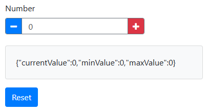
When the button is clicked, the current value of the custom component is sent to the backend, printed, and then reset to 0.
Python Backend
def gui_init(meta_data: dict) -> dict:
    form = Form(from_file=__file__)
    return {"form": form}
- Loads the JSON form definition from the file
- Creates a Form instance
- Returns it to the frontend
def gui_event(meta_data: dict, payload: dict) -> dict:
    value, _ = utils.getSubmissionData(payload, "custom")
    print(value)

    newValue = 0
    utils.setSubmissionData(payload, "custom", newValue)

    return payload
Handles events from the front-end, in this case the button click:
- Retrieves the value of the "custom" field
- Prints it to the console
- Sets the value to 0
- Returns the updated payload
Custom JavaScript
The custom JavaScript code defines a custom Extension component.
function customRender() {
    let value = this.dataValue;
    return `<div>
        <button ... ref="minus">
            <i class="bi bi-dash-square"></i>
        </button>
        <input type="number" ref="number" value=${value} />
        <button ... ref="plus">
            <i class="bi bi-plus-square"></i>
        </button>
    </div>`;
}
Renders the following HTML elements:
- ➖ Minus button
- 🔢 Numeric input field, the value is set to the submission data
- ➕ Plus button
async function customAttach(element) {
    this.loadRefs(element, {
        minus: 'single',
        number: 'single',
        plus: 'single'
    });

    this.refs.minus.addEventListener('click', () =>
        this.setValue(this.getValue() - 1)
    );

    this.refs.number.addEventListener('input', (event) =>
        this.setValue(event.target.valueAsNumber)
    );

    this.refs.plus.addEventListener('click', () =>
        this.setValue(this.getValue() + 1)
    );
}
The customAttach function loads the references defined in the customRender function (ref="..."), and attaches listeners to the elements.
- Clicking ➖ decreases the value by one
- Clicking ➕ increases the value by one
- Typing updates the value in the data model
function customGetValue() {
    return this.refs.number.valueAsNumber;
}
- Returns the numeric value of the input element.
function customSetValue(value, flags) {
    this.refs.number.value = value;
}
- Updates the input field.
JSON Form Definition
{
    "components": [
        {
            "label": "Custom",
            "type": "extension",
            "key": "custom",
            "renderFn": "customRender",
            "attachFn": "customAttach",
            "getValueFn": "customGetValue",
            "setValueFn": "customSetValue",
            "defaultValue": 100
        },
        {
            "label": "Click",
            "type": "button",
            "key": "btn",
            "action": "event",
            "event": "click"
        }
    ]
}
The first component is the custom Extension component:
- Type: "extension"
- Default value: 100
- Defines which custom JavaScript functions to use to specify its behavior
The second component is a Button:
- Type: "button"
- Action: "event"
- Event name: "click"
- When clicked it triggers
gui_eventin Python.
Component nesting
As described in Form structure, when creating a component, you can pass an optional parent as an input after the component's key.
This can be used to add the component directly to the form or to another component as long as the parent component is suitable.
In Components and subsections, you can find which components can contain other components.
These components have a components property as a means to refer to their children and an addComponent method.
Some components can have child components that are not added to the component directly.
These components do not have a components property. For example, the Columns component has a columns property.
Child components are added to a single column instead of to the Columns component.
There is no parent property because components and forms only know about potential child components, not about their own parent.
When the parent of the component to create is left out, the component will not be part of the form until it is added to another component or the form itself.
This can be done using the addComponent method of the parent component.
The following example illustrates how two textfields are created and after that, added to a Panel component.
# Create two textfields without adding them to the form or another component yet.
name = component.TextField('name_field')
color = component.TextField('color_field')
name.label = 'Name'
color.label = 'Favourite color'

# Create a panel in the form and add the textfields to it.
panel = component.Panel('my_panel', form)
panel.label = 'Personal info'
panel.addComponent(name, color)
% Create two textfields without adding them to the form or another component yet.
name        = component.TextField("nameField");
color       = component.TextField("colorField");
name.label  = "Name";
color.label = "Favourite color";

% Create a panel in the form and add the textfields to it.
panel       = component.Panel("myPanel", form);
panel.label = "Personal info";
panel.addComponent(name, color);
The resulting form is as follows:

In this example, it would also have been possible to create the panel first, then create the textfields and provide the parent panel as an input directly:
# Create a panel in the form.
panel = component.Panel('my_panel', form)
panel.label = 'Personal info'

# Create two textfields and add them to the panel.
name = component.TextField('name_field', panel)
color = component.TextField('color_field', panel)
name.label = 'Name'
color.label = 'Favourite color'
% Create a panel in the form.
panel       = component.Panel("myPanel", form);
panel.label = "Personal info";

% Create two textfields and add them to the panel.
name        = component.TextField("nameField", panel);
color       = component.TextField("colorField", panel);
name.label  = "Name";
color.label = "Favourite color";
Component properties
There are several properties of the Component class that may contain objects of specific classes. Each of these classes are described in the sub-sections of this section.
On this page some functionality that is shared between these classes is described.
Custom JavaScript
For more complex applications it is possible to add custom JavaScript code that is executed in the front-end. This can reduce the need for communicating with the back-end. Custom JavaScript code can be used in the following places:
-
Component properties:
-
calculateValueThe JavaScript code must assign a value to variable
value. -
customConditionalThe JavaScript code must assign a boolean to variable
show. Example
component_object.calculateValue = "value = data.other_component + 1;" component_object.customConditional = "show = data.other_component > 0;" -
-
When the
typefield of the action dict/struct is set to 'value' or 'customAction', the JavaScript code in the action's 'value' or 'customAction' field must assign a value to variablevalue. Example -
When the
typefield of the trigger dict/struct is set to 'javascript', the JavaScript code in the trigger's 'javascript' field must assign a boolean to variableresult. Example -
Validate
custompropertyThe JavaScript code must assign a boolean to variable
valid. -
JavaScript code used in string template evaluation blocks.
In the JavaScript code the variables listed in the table below are available for use.
The usage numbers denote which variables are available for the places specified in the above list.
current component refers to the component to which the custom JavaScript applies.
| Variable | Usage | Description |
|---|---|---|
| input | 2, 4 | The new value that was put into the current component. |
| form | 1, 2, 4, 5 | The complete form JSON object. |
| submission | 1, 2, 4, 5 | The complete submission object. |
| data | 1, 2, 3, 4, 5 | The complete submission data object. |
| row | 1, 2, 3, 4, 5 | Contextual "row" data, used within DataGrid, EditGrid, and Container components. |
| rowIndex | 1, 2, 3, 4, 5 | Contextual "row" number (zero-based). Can be used with row. |
| component | 1, 2, 3, 4, 5 | The current component JSON object. |
| instance | 1, 2, 4, 5 | The current component instance. |
| value | 1, 2, 4, 5 | The current value of the component in the submission data. |
| item | - | The Select component values. |
Execution of custom JavaScript depends on the JavaScript support provided by the browser the application is opened in. When the browser does not support JavaScript features that are used, errors and warnings may be printed in the browser's console. The application should continue to function, but functionality may differ from the expected functionality.
Note: For more complex JavaScript, it may be convenient to provide some JavaScript functions for use in any of the above. This can be achieved by providing a Custom JavaScript file.
Validate
Most components are able to perform some validation of the values that are provided by the user of the app. The validation takes place in the browser window, before any submission data is sent to the backend. This makes the validation a very convenient method to give an early warning to the user that a provided value is incorrect, without impacting performance of the application. However, for secure deployment of apps, it is required to also perform validation of user provided values in the backend before using them.
Validation can be configured using the Builder. Each component has a Validation tab that shows the available options.
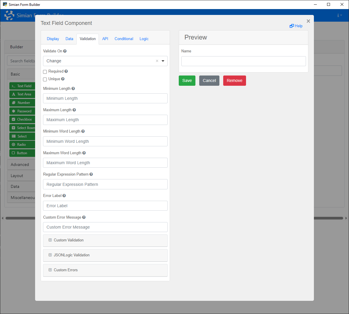
To add validation programmatically, create a Validate object for the component and set its properties to define the validation criteria. Alternatively, use the Component's addValidation method or the static Validate.create method.
Properties
| Name | Description | Datatype | Default |
|---|---|---|---|
| required | When set to true, the component must have a value before the form can be submitted via a button. | Boolean | False |
| minLength | Checks the minimum length for text input. | Integer | |
| maxLength | Checks the maximum length for text input. | Integer | |
| minWords | Checks the minimum number of words for text input. | Integer | |
| maxWords | Checks the maximum number of words for text input. | Integer | |
| pattern | Checks the text input against a regular expression pattern. | String | |
| custom | A custom JavaScript based validation. See section Custom JavaScript. | String | |
| json | Custom validation specified using JSON logic. | Json | |
| customMessage | Specify a custom message to be displayed when the validation fails. For more advanced custom messages, see the Error class. | String | |
| min | For Number components, the minimum value. | Double | |
| max | For Number components, the maximum value. | Double | |
| step | For Number components, the granularity of the input value. | Double | |
| integer | For Number components, whether or not the value must be a whole number. | Boolean |
Methods
| Name | Syntax | Description |
|---|---|---|
| create | create(component, prop=value, ...) | Create a Validation object with the specified settings for the component. |
Example
The following example shows a form with a Password that has a validation on the minimum number of characters in the input.
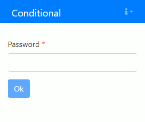
The initialization code is as follows:
passwd = component.Password("passwd", form)
passwd.label = "Password"

passwd.add_validation(
    required=True,
    minLength=8,
    customMessage="Password shall have at least 8 characters.",
)

ok = component.Button("ok", form)
ok.label = "Ok"
ok.disableOnInvalid = True
passwd = component.Password("passwd", form);
passwd.label = "Password";

passwd.addValidation( ...
    required=true, ...
    minLength=8, ...
    customMessage="Password shall have at least 8 characters.");

ok = component.Button("ok", form);
ok.label = "Ok";
ok.disableOnInvalid = true;
Conditional
Some components are only useful when certain criteria are met, for instance because the value is only used when a particular option is selected. These components can be made conditional, such that they only appear on screen when they are needed.
To make a component conditional using the Builder, go to the Conditional tab of the component.
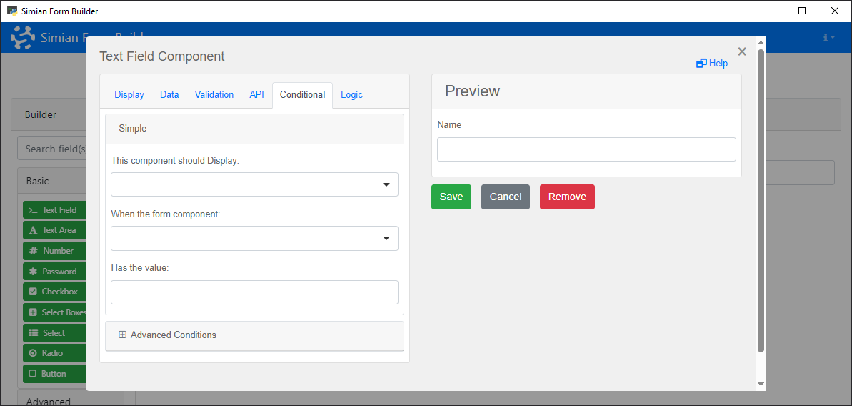
The options on that tab are also available when creating components programmatically. Use the Conditional class to define when the component should be shown or hidden based on data or properties of the form.
With the properties of this class, an equation like show when "NameTextField" equals "Bart" can determine whether or not the component is shown.
Properties
| Name | Description | Datatype | Default |
|---|---|---|---|
| show | Do or do not show when a condition is met. | Boolean | False |
| when | Key of the component whose value to compare to the eq property value. | String | |
| eq | Value to compare the value of the component given in when to. | Unspecified | |
| json | Instead of the show, when, eq approach, you can use JSON logic to determine whether the component must be available (JSONLogic in the Advanced Conditions panel). This facilitates toggling the component based on other properties than the value of the linked component. | String |
It is also possible to specify a customConditional (JavaScript in the Advanced Conditions panel) which evaluates a Javascript expression to determine whether the component should be shown.
When conditional and customConditional are both specified, the latter has precedence.
Examples
The following example shows a form whose Number component is only shown when a checkbox is checked.
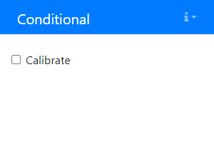
The initialization code is as follows:
# Create a Checkbox.
cb = component.Checkbox('calibration_cb', form)
cb.label = 'Calibrate'

# Create a Number and add a Conditional for toggling its visibility.
nr = component.Number('calibration_number', form)
nr.label = 'Calibration value'
nr_cond = component_properties.Conditional(nr)
nr_cond.show = True
nr_cond.when = 'calibration_cb'
nr_cond.eq = True
% Create a Checkbox.
cb          = component.Checkbox("CalibrateCb", form);
cb.label    = "Calibrate";

% Create a Number and add a Conditional for toggling its visibility.
nr          = component.Number("CalibrationNr", form);
nr.label    = "Calibration value";
nrCond      = componentProperties.Conditional(nr);
nrCond.show = true;
nrCond.when = "CalibrateCb";
nrCond.eq   = true;
The next example show the customConditional property.
For example, if you wish to show a button only when a specific checkbox is checked and a number that is entered is greater than 5, use the following code:
cb = component.Checkbox("TheCheckbox", form)
cb.label = "I agree"

nr = component.Number("TheNumber", form)
nr.label = "Years of experience"

btn = component.Button("TheButton", form)
btn.hidden = True
btn.label = "Continue"
btn.block = True
btn.customConditional = "show = data.TheCheckbox && data.TheNumber > 5;"
cb          = component.Checkbox("TheCheckbox", form);
cb.label    = "I agree";

nr          = component.Number("TheNumber", form);
nr.label    = "Years of experience";

btn         = component.Button("TheButton", form);
btn.hidden  = true;
btn.label   = "Continue";
btn.block   = true;
btn.customConditional = "show = data.TheCheckbox && data.TheNumber > 5;";
The resulting form in action:
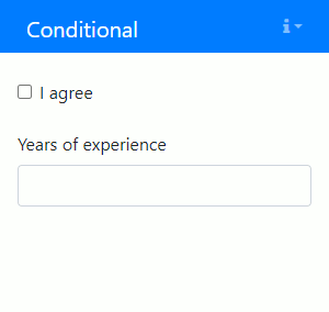
Logic
Adding Logic to a component allows for changing the component definition in reaction to data entered in a form.
For two examples, see the Form.io documentation.
The createLogic and createDisableLogic functions in the componentProperties package/module makes it easier to create Logic objects.
Logic triggers and actions can also be specified in the Builder, on the Logic tab of the component.
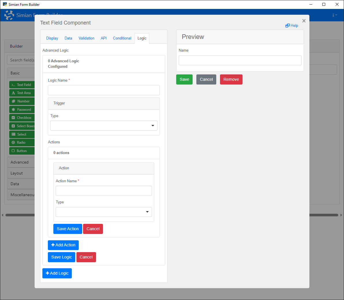
Note that
Logicobjects and the correspondingtriggersare checked on any change in the web app. In larger web apps having manyLogicobjects may cause performance to decrease.
Properties
| Name | Description | Datatype | Default |
|---|---|---|---|
| name | Name of the field logic. | String | 'My logic' |
| trigger | When to trigger actions. Example:
| Dict/Struct | |
| actions | The action(s) to trigger. | cell/list |
Trigger property
The trigger's type field may have the values 'simple', 'javascript' or 'event'. The createTrigger function in the componentProperties package/module simplifies creating a trigger.
-
simple: When the triggertypeis'simple', the trigger dict/struct must contain a fieldsimple. It must contain a dict/struct with fields:show: must contain a boolean,when: must contain the full key of another component andeq: must contain a value that is compared against the value of the component specified inwhen
-
javascript: When the triggertypeis'javascript', the trigger dict/struct must contain a fieldjavascript. It must contain JavaScript code that assigns a boolean to a variableresult. This is described in more detail in section Custom JavaScript. -
event: When the triggertypeis'event', the trigger dict/struct must contain a fieldevent. It must contain the name of an event that is triggered in the form.
Actions property
The actions property must contain a list/cell array containing one or more action dicts/structs.
The action's type field may have the values 'property', 'value' or 'customAction'.
To create a disable action the createDisableAction function in the componentProperties package/module can be used.
-
property: When the actiontypeis'property', the action dict/struct must contain a fieldproperty. It must contain a dict/struct with fields:value: the property to changetype: the data type of the property
The action dict/struct must also contain a field
statecontaining the value the specified property must get when the trigger of the Logic object is triggered. -
value: When the actiontypeis'value', the action dict/struct must contain a fieldvalue. It must contain JavaScript code that assigns a value to a variablevalue. This is described in more detail in section Custom JavaScript. -
customAction: When the actiontypeis'customAction', the action dict/struct must contain a fieldcustomAction. It must contain JavaScript code that assigns a value to a variablevalue. This is described in more detail in section Custom JavaScript.
Utility functions
The component_properties package/module contains some utility functions to make it easier to add Logic to your components.
-
createTrigger: can be used to define when Logic must be applied. It accepts atriggerTypeandtriggerValueinput. The trigger type and value must be one of the following combinations:Trigger type Trigger value Remark event"EventName"Triggers when the event EventNameoccurs.triggertrigger definition dictionary For reusing an existing trigger. The following trigger types and values trigger
Logicwhen the component with key "key" has the given value. Note that data.key does not work in case of intermediate data components.Trigger type Trigger value Remark simple{"key", value}javascript"result = data.key == value"javascript trigger syntax result"data.key == value"Shorter 'javascript' trigger. json'{"==": [{"var": "data.key"}, value]}'Uses JSON Logic syntax trigger = createTrigger("simple", {"enableDrag", false}); -
createDisableAction: creates a component disable action definition that can be used in aLogicobject. When you use the function withdisableTargetinput set tofalse, the created action is an enable action.enableAction = createDisableAction(false); -
createLogic: creates aLogicobject with the specified trigger type and value, and optional actions and component to add it to. The trigger is created by thecreateTriggerfunction, so the input options documented there also apply here.logic = create_logic( logic_name="Drag changed", trigger_type="simple", trigger_value=("enableDrag", false), actions=create_disable_action(), target_component=wind_speed_component);logic = createLogic( ... "Drag changed", ... "simple", ... {"enableDrag", false}, ... createDisableAction(), ... WindSpeedComponent); -
createDisableLogic: creates aLogicobject with disable action with the giventrigger typeandvalue. The trigger is created by thecreateTriggerfunction, so the input options documented there also apply here. When atarget componentis specified, the Logic object is added to that component. When the function is used with thedisableTargetinput set tofalse, the created action is an enable action.Note that adding disable
Logicto a disabled component (and the other way around) does nothing. This function will show a warning on this.logic = create_disable_logic( trigger_type="simple", trigger_value=("enableDrag", false), target_component=wind_speed_component, disable_target=False );logic = createDisableLogic( ... "simple", ... {"enableDrag", false}, ... WindSpeedComponent, false);
Json
This class is used to specify JSON strings that when transformed into JSON, remain JSON strings.
Consider the following MATLAB example where a string is transformed both directly, and as part of a Json object:
str = '{"test":100, "space":"station"}';
obj = componentProperties.Json(str);

>> disp(jsonencode(str))
    "{\"test\":100, \"space\":\"station\"}"
>> disp(jsonencode(obj))
    {"test":100, "space":"station"}
This class is (among others) useful for the Hidden component and for defining custom component Validation.
Error
This class allows customizable errors to be displayed for each component when an error occurs.
These settings can also be specified in the Custom Errors panel of the Validation tab in the Builder.
The Error class has the following properties:
- required
- min
- max
- minLength
- maxLength
- minWords
- maxWords
- invalid_email
- invalid_date
- invalid_day
- mask
- pattern
- custom
The values of these properties are the messages that are displayed when the component value fails the validation of that type. Within the message, there are several string interpolation keywords that you can use to include in the error message.
{{ field }}{{ min }}{{ max }}{{ length }}{{ pattern }}{{ minDate }}{{ maxDate }}{{ minYear }}{{ maxYear }}{{ regex }}
The custom error messages can be set on a Component by creating an Error object and modifying its properties. Alternatively, the error messages can be specified as a dict / struct in the Component's addValidation method, which creates the Error object.
# Using the Error class constructor:
passwd = component.Password("passwd", form)
passwd.add_validation(minLength=8)

error = component_properties.Error(passwd)
error.minLength = "Password shall have at least {{ length }} characters."

# Or using the addValidation method:
passwd = component.Password("passwd", form)
passwd.add_validation(
    minLength=8,
    customMessage={
        "minLength": "Password shall have at least {{ length }} characters.",
    },
)
The following example shows two custom error messages shown when a required component was left empty and when it does not have the minimum length:
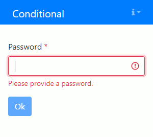
The initialization code is as follows:
passwd = component.Password("passwd", form)
passwd.label = "Password"
passwd.add_validation(
    required=True,
    minLength=8,
    customMessage={
        "required": "Please provide a password.",
        "minLength": "Password shall have at least {{ length }} characters.",
    },
)

ok = component.Button("ok", form)
ok.label = "Ok"
ok.disableOnInvalid = True
passwd = component.Password("passwd", form);
passwd.label = "Password";
passwd.addValidation( ...
    required=true, ...
    minLength=8, ...
    customMessage=struct( ...
        "required",  "Please provide a password.", ...
        "minLength", "Password shall have at least {{ length }} characters.") ...
    );

ok = component.Button("ok", form);
ok.label = "Ok";
ok.disableOnInvalid = true;
Composed components
With the term composed component we mean a component that is composed of multiple other components. The main purpose of composed components is to provide a standardized method for reusing code and integrating it with the Simian Form Builder.
Currently, Simian includes one predefined composed component: StatusIndicator
Generic component
The generic class component.Composed can be used to add a reusable group of components as if they are one component.
In its className property, the fully qualified name of a class can be provided.
If the class exists, its contructor will be called with a single input argument: the instance of component.Composed.
Example
shared/components.py:
class Name:
    def __init__(self, parent: component.Composed):
        # Add components to parent.
        first = component.TextField("first", parent)
        first.label = "First name"

        last = component.TextField("last", parent)
        last.label = "Last name"
app.py:
# In gui_init:
# - Initialize the container with key "name" and add it to the form.
my_name = component.Composed("name", form)

# - Set the className property to call the constructor of shared.components.Name
#   with the object as input argument.
my_name.className = "shared.components.Name"

# In gui_event:
# - Get the value of the composed component.
name, _ = utils.getSubmissionData(payload, "name")
# {'first': 'John', 'last': 'Smith'}
+shared/+components/Name.m:
classdef Name < handle
    methods
        function obj = Name(parent)
            % Add components to parent.
            first       = component.TextField("first", parent);
            first.label = "First name";

            last        = component.TextField("last", parent);
            last.label  = "Last name";
        end
    end
end
+app/guiInit.m:
% Initialize the container with key "name" and add it to the form.
myName = component.Composed("name", form);

# Set the className property to call the constructor of shared.components.Name
# with the object as input argument.
myName.className = "shared.components.Name";
+app/guiEvent.m:
% Get the value of the composed component.
name = utils.getSubmissionData(payload, "name");
% struct("first", "John", "last", "Smith")
When the specified className cannot be resolved, or when calling the constructor results in an error, a placeholder is shown instead.
Parametrization
A reusable component that can be used as-is, is nice to have, but when a component can be parametrized it may be used in different contexts. Instead of hardcoding the labels of the text fields in the contructor of the reusable component, a component initializer can be used to make the labels configurable.
shared/components.py
class Name:
    def __init__(self, parent: component.Composed):
        # Add components to parent.
        first = component.TextField("first", parent)
        first.label = "First name"

        last = component.TextField("last", parent)
        last.label = "Last name"

    @staticmethod
    def create(key, parent, first_label=None, last_label=None):
        # Create the composed component.
        composed = component.Composed(key, parent)
        composed.className = "shared.components.Name"

        Name._initialize_component(composed, first_label, last_label)

        return composed

    @staticmethod
    def get_initializer(first_label=None, last_label=None):
        # Return the initializer with the enclosed parameters.
        return lambda comp: Name._initialize_component(comp, first_label, last_label)

    @staticmethod
    def _initialize_component(comp: component.Composed, first_label, last_label):
        # Set the labels on the text fields.
        [first, last] = comp.components

        if first_label:
            first.label = first_label

        if last_label:
            last.label = last_label
app.py:
# In gui_init:
# - Create two Name components. One with default labels and one customized.
Name.create("name1", form)
Name.create("name2", form, first_label="Forename", last_label="Surname")
+shared/+components/Name.m:
classdef Name < handle
    methods
        function obj = Name(parent)
            % Add components to parent.
            first = component.TextField("first", parent);
            first.label = "First name";

            last = component.TextField("last", parent);
            last.label = "Last name";
        end
    end

    methods (Static)
        function composed = create(key, parent, options)
            arguments
                key
                parent
                options.FirstLabel  (1, 1) string = missing
                options.LastLabel   (1, 1) string = missing
            end

            import shared.components.*;

            % Create the composed component.
            composed            = component.Composed(key, parent);
            composed.className  = "shared.components.Name";

            Name.initializeComponent(composed, options.FirstLabel, options.LastLabel);
        end

        function initializer = getInitializer(options)
            arguments
                options.FirstLabel  (1, 1) string = missing
                options.LastLabel   (1, 1) string = missing
            end

            import shared.components.*;

            % Return the initializer with the enclosed parameters.
            initializer = @(comp) Name.initializeComponent(comp, options.FirstLabel, options.LastLabel);
        end
    end

    methods (Static, Hidden)
        function initializeComponent(comp, firstLabel, lastLabel)
            % Set the labels on the text fields.
            [first, last] = comp.components{:};

            if ~ismissing(firstLabel)
                first.label = firstLabel;
            end

            if ~ismissing(lastLabel)
                last.label  = lastLabel;
            end
        end
    end
end
+app/guiInit.m:
% Create two Name components. One with default labels and one customized.
Name.create("name1", form);
Name.create("name2", form, FirstLabel="Forename", LastLabel="Surname");
Builder
Composed components can also be added in the Simian Builder. The component type can be found in the miscellaneous category.
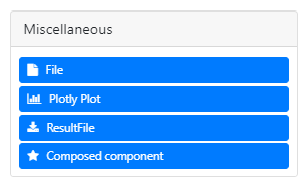
Just like any other component it can be dragged into the form. The settings allow to specify the Class of the composed component and the Display height for the placeholder. The preview will always show the placeholder, since the Builder is unaware of the component's implementation.
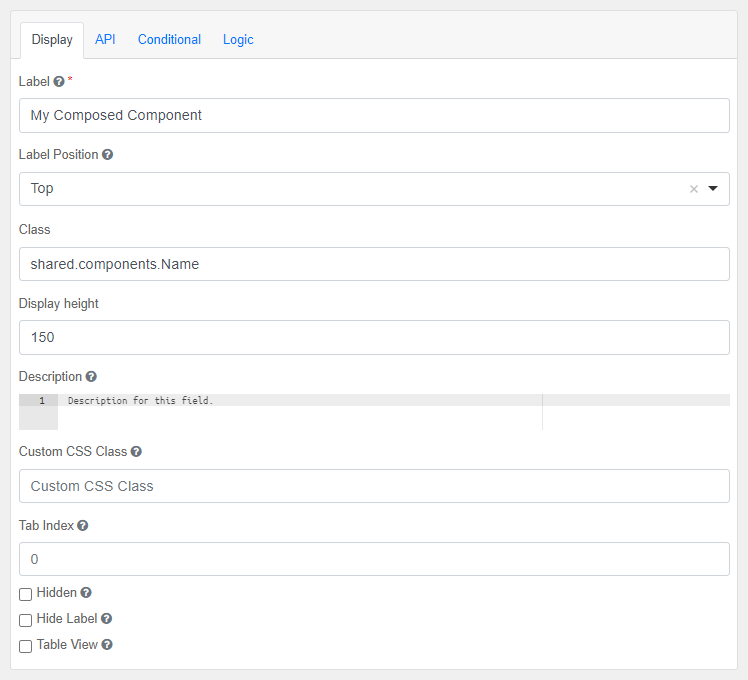
To set parameters, Form.componentInitializer can used to setup the initialization before creating the form.
Form.componentInitializer(
    myComposedComponent=Name.get_initializer("Forename", "Surname")
)
Form.componentInitializer(...
    myComposedComponent=Name.getInitializer("Forename", "Surname"));
PropertyEditor
The PropertyEditor is a composed component, consisting of nested DataGrids that allow for showing and editing scalar and 1D arrays of text, numeric, boolean, and select values. Subclasses of this component can add support for additional data types.

Note that it is recommended to use only one or a few PropertyEditors in your app, as too many PropertyEditors may slow your app down.
In addition to the properties and methods listed below, this component inherits properties and methods from the superclass Component. For example, any PropertyEditor has a label and defaultValue property even though these are not explicitly listed here.
Methods
| Name | Syntax | Description |
|---|---|---|
| addDatatypeUtil | obj.addDatatypeUtil(parent, newDataTypes) | Add property editor components to the property editor in a subclass. |
| getInitializer | getInitializer(defaultValue=null, allowEditing=true, columnLabel="Properties", addAnother="Add value", hideWhenEmpty=true) | Return the parameterized initializer function for the Property Editor. |
| getValues | getValues(tableValues) | Get the values from the property Editor table payload values. |
| prepareValues | prepareValues(propMeta, propValues=null) | Prepare Editor contents for submission data. Note: does not validate values! |
| genericPropSetup | genericPropSetup(parType) | Generic property editor component initializer. |
Supported values
The PropertyEditor supports scalar and one dimensional array values of the following data types. The PropertyEditor dynamically adds rows with the listed Components to show the property values in.
text: values are shown in a TextField component.numeric: values are shown in a Number component.boolean: values are shown in a Checkbox component.select: values are shown in a Select component.
Properties must be specified as a list of dicts / cell array of structs with per property the following (mandatory) settings:
datatypeMandatory, data type of the property that is shown.label: Mandatory, label shown next to the values to inform the user on which property is shown.tooltip: {null}, tooltip to be added to the label of the property.required: {false}, whether the property must have a value.defaultValue: {null}, Value to be shown for the property.min: {null}, minimum value fornumericvalues.max: {null}, maximum value fornumericvalues.decimalLimit: {null}, maximum number of decimals allowed innumericvalues.allowed: {null}, The items that can be selected in aselectvalue.minLength: {1} Scalar, or minimum array length of 0 or more.maxLength: {1} Scalar, or maximum array length of 0 or more.
The PropertyEditor shown above can be created with the following settings. It allows for specifying between 1 and 5 throw attempt speeds and whether to include drag and/or wind in the simulation.
[
    {
        "datatype": "numeric",
        "label": "Throw speed [m/s]",
        "defaultValue": [12.51, 3.8, 5.41],
        "required": true,
        "minLength": 1,
        "maxLength": 5,
        "decimalLimit": 2
    },
    {
        "datatype": "select",
        "label": "Options",
        "allowed": ["None", "Drag", "Drag and wind"],
        "defaultValue": "Drag and wind",
        "required": true
    }
]
Usage
The following subsections describe how you can add the PropertyEditor to your web app and which options you can select, how to fill it and how to get the user selected values from the submission data.
Adding to web app
In the guiInit function of your app add a Composed component and set the className property to the full PropertyEditor class name.
Use the static getInitializer method to configure the PropertyEditor:
defaultValue: {null}, set the default value of thePropertyEditorby using the output of the staticprepareValuesmethod.allowEditing: {true}, set this optional input to false to create a property viewer.columnLabel: {"Properties"}, specify a label to show at the top of the outerDataGrid.addAnother: {"Add value"}, optional input that sets the label on the nestedDataGrid's button that adds new rows.hideWhenEmpty: {true}, ThePropertyEditoris hidden when empty. Set this optional input to false to ensure it is always shown.
Form.componentInitializer(
    editor=PropertyEditor.get_initializer(
        default_value=PropertyEditor.prepare_values([...]),
        column_label="Parameters",
    )
)

editor = component.Composed("editor", form_obj)
editor.className = "simian.gui.composed_component.PropertyEditor"
Form.componentInitializer(
    editor=PropertyEditor.getInitializer(
        defaultValue=PropertyEditor.prepareValues({}),
        columnLabel="Parameters",
    )
)

editor = component.Composed("editor", formObj)
editor.className = "simian.gui.composedComponent.PropertyEditor"
Filling with properties
The PropertyEditor can be filled with default values during initialization, as shown above, and in the callback of an event. To do this use the static prepareValues method and put the output in the submission data with the setSubmissionData utility function.
The prepareValues method accepts the properties' settings and values as separate inputs, making it easier to reuse static property settings. It also ensures that the property settings are divided over the expected locations in the PropertyEditor rows.
prep_values = PropertyEditor.prepare_values(
    prop_meta=[{"datatype": "numeric", "label": "Rotation [deg]"}],
    prop_values=[45],
)
utils.setSubmissionData(payload, key="editor", data=prep_values)
Getting property values
The property values selected by the user can be extracted from the full PropertyEditor submission data by using the static getValues method. The submission data also contains the property settings, which cannot be modified by the user.
table_values, _ = utils.getSubmissionData(payload, key="editor")
value_list = PropertyEditor.get_values(table_values)
Extending the PropertyEditor
When the PropertyEditor does not support all data types you need, you can extend it to add the support.
- create a subclass of the
PropertyEditor, - Extend the mapping of the data types and the unique keys of the corresponding components.
- In Python: extend the class property:
DICT_TYPE_CONTROL - In MATLAB: implement the Constant property:
SUB_STRUCT_TYPE_CONTROL
- In Python: extend the class property:
- In MATLAB: implement static
getValuesandprepareValuesmethods that send their inputs and the class'SUB_STRUCT_TYPE_CONTROLstruct as extra input argument to the corresponding Helper method. - create component objects for the new data types and add them with the addDatatypeUtil. Note that you cannot use initializer functions for these component.
- Note that any validation (including required) must be implemented as custom validation. Meta data is available as
row.meta.
In the guiInit function of your app set the className of the Composed component to the full name of your Editor class.
editor.className = "YourPropertyEditor"
StatusIndicator
The StatusIndicator is a composed component, consisting of a Container that contains an HtmlElement and a Hidden value. It can be used as a visual indication of the state of the data and can be managed on the back-end.
The status indicator as follows, the color depends on the active state:

Initialization
To add a StatusIndicator programmatically, use its static method create, that takes the following input arguments:
| Input | Description | Datatype |
|---|---|---|
| key | Key used to reference the status indicator. Use this key later to update the status. | String |
| parent | The parent component. Can be any component that can contain other components, or the form. | Component/Form |
Additional options can be given as named arguments:
| Name | Description | Datatype | Default |
|---|---|---|---|
| content | Text to display on the status indicator. | String | 'Status' |
| defaultValue | Default status value. | String | 'muted' |
| statuses | Defines the value and theme of every reachable status. Array of structs/dicts that have fields value and theme. An optional field content defines the text to display per status. If the statuses.content field and a defaultValue are provided, this defines the initial text of the status indicator and any content name-value pair is ignored. | Dict/Struct | [{'value': 'muted', 'theme': 'muted'}, {'value': 'primary', 'theme': 'primary'}, {'value': 'success', 'theme': 'success'}, {'value': 'info', 'theme': 'info'}, {'value': 'warning', 'theme': 'warning'}, {'value': 'danger', 'theme': 'danger'}, {'value': 'secondary', 'theme': 'secondary'}, {'value': 'dark', 'theme': 'dark'}, {'value': 'light', 'theme': 'light'}] |
From Json
The StatusIndicator can be added from a Json form definition as a generic Composed component, by specifying its fully qualified className:
{
    "label": "Status",
    "className": "simian.gui.composed_component.StatusIndicator",
    "displayHeight": 40,
    "hideLabel": true,
    "key": "my_status",
    "type": "customcomposed",
}
The component can be initialized using the static method get_initializer that takes the same optional input arguments as create.
Form.componentInitializer(
    my_status=composed_component.StatusIndicator.get_initializer(
        content="Hello, world!", defaultValue="success"
    )
)

form = Form(from_file=__file__)
Form.componentInitializer(...
    my_status=composedComponent.StatusIndicator.getInitializer(...
    content="Hello, world!", defaultValue="success"));

form = Form(FromFile="/path/to/my/form.json");
Updating
Update the status in your gui_event code using:
payload = composed_component.StatusIndicator.update(
    payload,
    key,
    status,
    nestedFormKey,
    parent=parentKey,
)
where key is the key provided when creating the StatusIndicator, status is one of the items of statuses.value and nestedFormKey is an optional nested parent form.
Use the parent name-value pair to further specify which status indicator must be selected.
Example
# Initialize using defaults:
testStatus = composed_component.StatusIndicator.create("testStatus", form)

# Initialize using options:
testStatus = composed_component.StatusIndicator.create(
    "testStatus", form,
    content="Tests",
    defaultValue="notRun",
    statuses=[{
        "value": "notRun",
        "theme": "secondary"
    }, {
        "value": "running",
        "theme": "warning"
    }, {
        "value": "success",
        "theme": "success"
    }, {
        "value": "failed",
        "theme": "danger"
    }]
)

# Update the status:
composed_component.StatusIndicator.update(payload, "testStatus", "failed")
% Initialize using defaults:
testStatus = composedComponent.StatusIndicator.create("testStatus", form);

% Initialize using options:
statuses = struct(...
    "value", {'notRun', 'running', 'success', 'failed'}, ...
    "theme", {'secondary', 'warning', 'success', 'danger'});

testStatus = composedComponent.StatusIndicator.create(...
    "testStatus", form, ...
    "Content", "Tests", ...
    "DefaultValue", "notRun", ...
    "Statuses", statuses);

% Update the status:
payload = composedComponent.StatusIndicator.update(payload, "testStatus", "failed");
Navbar
The navigation bar is shown at the top of the screen. It contains the close button on the right and can be configured to show a configurable logo and title text on the left. The navbar can be specified as follows:
payload["navbar"] = {
    "logo": utils.encodeImage(os.path.join(image_folder, "myCustomLogo.jpg")),
    "title": "Example title",
    "subtitle": "<small>v1.0</small>"
}
payload.navbar.logo     = utils.encodeImage(fullfile(imageFolder, "myCustomLogo.jpg"));
payload.navbar.title    = "Example title";
payload.navbar.subtitle = "<small>v1.0</small>";
Note that the image file used for the logo cannot be specified as a file name, as the image file will not be available in the browser. Instead the information in the image file must be encoded with the encodeImage utility function and put in the form. The image file must be stored near the guiInit code and its absolute path must be used as input for encodeImage.
Show changes
A warning message can be displayed in the navbar, whenever the form has changes.
To enable this feature, specify the showChanged field in the payload.
This feature can be turned on and off during initialisation or events.
The change indication is triggered by the form's pristine flag, which is lowered each time the user changes a value.
Reverting a changed value to the previous value does not raise the pristine flag again.
It is possible to change the pristine flag value during initialisation or events.
payload["showChanged"] = True
payload["pristine"] = True
payload.showChanged = true;
payload.pristine    = true;
Reusing component definitions
When you need to add (sets of) components to your form multiple times with small differences, it is better to use a (configurable) definition that can be reused, instead of copy-pasting the definitions and applying the differences in the copies.
Note that reuse of components can be within an app, but also between (similar) apps. When reusing functionality between apps it should be clearly documented what the reused functionality does, how it should be used and if the app using it must provide information to the reused code.
A couple of important things to note on components:
- Component keys are easiest to use when they are unique. When you try to get the value of a component with a non-unique key, you may get the value of another component with the same key. A nested form or parent key can be used with the key to get the value of a specific component, when this creates a unique combination
- All components must have a parent component and their ultimate ancestor must be the form object of the application. Components without a parent or without a connection to the form object will not be shown in the web app.
Using a function
Components can be added to the form or other components in other functions. These functions can be used multiple times in one app definition to add the same components (with some differences) to the app multiple times.
Use the intended parent component as input in the function, to immediately add the new component(s) to the form:
component.Number(key="number", parent=parent_component)
To ensure the values of the components can be found in the callback functions, you can do the following:
-
Give the function a key prefix or suffix input to give the components a unique key.
component.Number(key=prefix + "_number_" + suffix, parent=parent_component) -
Use the key of the parent as prefix or suffix
component.Number(key=parent_component.key + "_number", parent=parent_component) -
Use a container as parent to give the components a unique key - parent-key combination.
You can add additional input arguments to the function to allow for creating the components with different settings.
An example of adding sets of components (with component key prefix) via a function is the _fill_column function in the Form definition example.
def add_number(parent_component) -> None:
    # Add a Number component with unique key to the given parent component.
    new_nr = component.Number(parent_component.key + "_number", parent_component)
    new_nr.label = "Input value"
Using a JSON form definition
Components can be added to a form or parent component from a JSON form definition definition. These JSON form definitions can be created with the Simian Builder.
def gui_init(meta_data: dict) -> dict:
    form = Form()
    root_container = component.Container("parent_component_key", form)
    root_container.addFromJson("path/to/components_definition.json")
Note that component keys are hardcoded in the JSON form definition and may thus be used multiple times. When you use a Container as parent component, you can use the key of the container to find the value of the component you need.
Reusing initialization functions
When your own web app itself is defined in a JSON form definition, you can use (configurable) Component initialization functions to ensure the components are added to one of the components in the JSON form definition.
In the following example the web app is created from a JSON form definition, and the components that are created in the initialize_action_with_config initialization function are added to the containers identified with the parent_component_key, and other_parent_key key.
def gui_init(meta_data: dict) -> dict:
    Form.componentInitializer(
        parent_component_key=initialize_function,
        other_parent_key=initialize_function,
    )

    # Fill the form with components, including a Container to add other components to.
    form = Form(from_file="path/to/components_definition.json")

    return {"form": form}


def gui_event(meta_data: dict, payload: dict) -> dict:
    # Get the value of the number component that is in the Container.
    value, _ = utils.getSubmissionData(payload, "number", parent="parent_component_key")
    value2, _ = utils.getSubmissionData(payload, "number", parent="other_parent_key")
    return payload


# Potentially in other module / package:
def initialize_function(container_component: Component)
    # Initialization function to execute on the container_component.
    some_number = component.Number("number", parent=container_component)
function payload = guiInit(metaData)
    Form.componentInitializer( ...
        parent_component_key=@initializeFunction, ...
        other_parent_key=@initializeFunction,
    )

    % Fill the form with components, including a Container to add other components to.
    payload.form = Form(FromFile="path/to/components_definition.json")
end

function payload = guiEvent(metaData, payload)
    % Get the value of the number component that is in the Container.
    value = utils.getSubmissionData(payload, "number", parent="parent_component_key")
    value2 = utils.getSubmissionData(payload, "number", parent="other_parent_key")
end

% Potentially in other package:
function payload = initializeFunction(containerComponent)
    % Initialization function to execute on the containerComponent.
    someNumber = component.Number("number", containerComponent)
end
Reusing components in the Builder
The methods described in the previous sections describe methods that reuse definitions by calling the reusable functionality in the Python or MATLAB code.
However, when building an app in the Simian Form Builder it is not possible to add the reusable code to the form, since the builder is unaware of any code that has been written.
For this purpose the component.Composed component has been introduced, which allows adding a reusable component to the form by means of drag-and-drop.
Form refresh
In order to aid rapid iterations during development, the Refresh button has been introduced. Clicking the Refresh button performs all the actions associated with closing the window and opening a new one, except for closing the actual window. Modules are reloaded before re-initializing the form.
The Refresh button is aimed at developers and can be enabled when running locally. There is no equivalent for the deployed application that runs in a web browser.
Python
In Python the refresh button can be enabled by giving the show_refresh named argument to the run function:
run("namespace.app", show_refresh=True)
In order to detect the changes that were made to the app module file after starting Uiformio, importlib.reload is used to reload a number of modules.
- Reload the module with the namespace (first input argument of Uiformio).
- Find the folder of that module and reload all modules found there (or in its subfolders).
- Call the
gui_refreshfunction of the web app module, if it is implemented.
The gui_refresh method is intended for reloading additional modules only. Example:
def gui_refresh():
    importlib.reload(sys.modules["core.algorithm"])
    importlib.reload(sys.modules["shared.components"])
Matlab
In Matlab the refresh button can be enabled by giving the ShowRefresh named argument to the run function:
run("namespace.app", ShowRefresh=true);
In order to detect the changes that were made to the app module file after starting Uiformio, rehash is used to compare the timestamps for loaded functions against their timestamps on disk, and it clears loaded functions if the files on disk are newer.
Since rehash applies to all known files and classes for folders on the search path that are not in matlabroot, there is no Matlab equivalent of gui_refresh.
Handling events
When the user interacts with the user interface (e.g.: clicks on a button,
or changes a value), the back-end application is notified via an event that carries data about the origin of the event and the status of the user interface.
Whenever an event occurs, the gui_event function is called on the server. By implementing this function, user-defined functionality can be provided to the application.
Implementing gui_event
The gui_event function serves as a gateway for all events.
The event must be dispatched to other functions that actually provide the intended functionality for the events. In this section the calling syntax, dispatching techniques, and input and output arguments will be discussed, followed by a small example.
Options for triggering events when a component value is changed or loses focus are described in the Advanced features chapter.
Syntax
def gui_event(meta_data: dict, payload: dict) -> dict:
    ...
    return payload
function payload = guiEvent(metaData, payload)
    ...
end
Register events explicitly
The recommended way to ensure the correct function is executed, is to explicitly register the event handler functions to the events in the gui_event function. The event must then be dispatched to execute the registered function.
In the examples below the static method Form.eventHandler is used to register the event "SayHello" to the say_hello/sayHello function. The dispatch function ensures that the function registered to the event is executed. Note that the eventHandler input arguments can be repeated to register multiple events.
def gui_event(meta_data: dict, payload: dict) -> dict:
    Form.eventHandler(SayHello=say_hello)
    callback = utils.getEventFunction(meta_data, payload)
    return callback(meta_data, payload)

def say_hello(meta_data: dict, payload: dict) -> dict:
    utils.setSubmissionData(payload, "display", "Hello, world!")
    return payload
function payload = guiEvent(metaData, payload)
    Form.eventHandler("SayHello", @sayHello);
    payload = utils.dispatchEvent(metaData, payload);
end

function payload = sayHello(metaData, payload)
    payload = utils.setSubmissionData(payload, "display", "Hello, world!");
end
Note that you can configure the behaviour of the registered event handler functions by adding inputs to a function that wraps the actual function.
def gui_event(meta_data: dict, payload: dict) -> dict:
    Form.eventHandler(
        SayHello=say_something("Hello"),
        SayBye=say_something("Bye"),
    )
    callback = utils.getEventFunction(meta_data, payload)
    return callback(meta_data, payload)


def say_something(word: str) -> Callable:
    def inner(meta_data: dict, payload: dict) -> dict:
        utils.setSubmissionData(payload, "display", word + ", world!")
        return payload
    return inner
function payload = guiEvent(metaData, payload)
    Form.eventHandler( ...
        'SayHello', say_something("Hello"), ...
        'SayBye', say_something("Bye") ...
        );
    payload = utils.dispatchEvent(metaData, payload);
end

function func = say_something(word)
    % Wrapper function to multiply app input value with a configurable factor.
    func = @(metaData, payload) inner(metaData, payload, word);
end

function payload = inner(metaData, payload, word)
    payload = simian.gui.utils.setSubmissionData(payload, "display", word + ", world!");
end
Dispatching events
Using the information in the payload input it is possible to programmatically route events to the correct function with if-else blocks.
Alternatively, you can let Simian dispatch the events to the intended function for you. This can be achieved by using the dispatchEvent or getEventFunction utility functions:
caller = utils.getEventFunction(meta_data, payload)
payload = caller(meta_data, payload)
payload = utils.dispatchEvent(metaData, payload);
Simian will look for and execute the function that:
- is explicitly registered to the event,
- has the same full name (including packages and classes) as the event ("reflection"),
- or throw an error
The dispatchEvent function calls a function equal to the name of the event that was triggered, whereas getEventFunction only returns the function object.
Note: In Python, breakpoints cannot be detected in functions executed via the
dispatchEventfunction. It is therefore recommended to usegetEventFunctioninstead.
The functionality of the dispatching mechanism is further demonstrated in the example below.
Function arguments
meta_data:
Meta data describing the client session.
Dict/struct with fields:
session_id: unique ID for the session, can be used to differentiate between multiple instances of the applicationnamespace: package name of the applicationapplication_data: The application data dictionary / struct. Contains the fields and values set by the Portal or local run call.mode:localordeployedclient_data:authenticated_user: for deployed apps, the portal provides the logged on user infouser_displayname: user name for printing (e.g. "John Smith")username: unique identifier used by the authentication protocol
payload:
When entering the function, this contains the event data containing all values as provided by the client. It is a dict/struct with fields:
action:'event'download: information regarding the download of a file. Empty when no file is being downloaded.event: name of the event that was triggered.followUp(optional): name of a follow-up event that will be triggered after the current one has completed.followUpMessage(optional): message to display on the spinner during the follow-up callback.formMap: Map representing the form definition.key: identifier of the component that triggered the eventsubmission: dict/struct with fields:data: dict/struct with fields:eventCounter: incrementing counter; do not change.<key>: multiple fields containing the values of the components identified by the keys.<nested form key>: See Nested forms for more information. dict/struct with fields:data: dict/struct with fields:<key>: multiple fields containing the values of the components identified by the keys.
updateForm: whentrue, the form definition is sent to the front end. The default value isfalse. Use this only when the form definition changes. Updating the form definition will be slower than only updating the submission data.alerts(optional): array of dict/struct with fields:type: message type, see Alertsmessage: string
In the gui_event function, the submission field may be altered before sending payload back to the front-end in order to present results to the user.
Additionally, the followUp field can be changed, which is described below.
The key is unique for each component within the context of its parent and/or nested form, but event can be shared between components.
This can be useful when multiple components (partially) share functionality. See Example.
Follow-up Event
If the followUp field is added to the payload and set to the name of another event, that event will automatically be executed once the results of the current event are shown in the app. Both the original event and its follow-up share the same component key.
This mechanism is especially useful for workflows that consist of multiple steps, such as long-running calculations or data processing pipelines. It allows you to break the logic into clear stages while keeping the user informed of progress.
During a follow-up callback, you can also customize the spinner text by setting the followUpMessage field. For an even clearer user experience, this works well in combination with the StatusIndicator component.
Below is an example that demonstrates how to chain multiple events using follow-ups.
Example: Multi-stage execution with follow-up events
In this example, a single Run button triggers a three-phase process. Each phase simulates work by pausing for a short time and then schedules the next phase using followUp.
import time


def gui_init(meta_data: dict) -> dict:
    form = Form()
    payload = {"form": form}

    btnLoadData = component.Button("run", form)
    btnLoadData.label = "Run"
    btnLoadData.setEvent("Run")
    btnLoadData.properties = {"eventMessage": "Running phase 1..."}

    return payload


def gui_event(meta_data: dict, payload: dict) -> dict:
    if payload["event"] == "Run":
        time.sleep(1)
        payload["followUp"] = "RunNext"
        payload["followUpMessage"] = "Running phase 2..."
    elif payload["event"] == "RunNext":
        time.sleep(1)
        payload["followUp"] = "RunFinal"
        payload["followUpMessage"] = "Finalizing..."
    elif payload["event"] == "RunFinal":
        time.sleep(2)

    return payload
function payload = guiInit(metaData)
    form            = Form();
    payload.form    = form;

    btnLoadData         = component.Button("run", form);
    btnLoadData.label   = "Run";
    btnLoadData.setEvent("Run");
    btnLoadData.addCustomProperty("eventMessage", "Running phase 1...");
end

function payload = guiEvent(metaData, payload)
    switch payload.event
        case "Run"
            pause(1);
            payload.followUp = "RunNext";
            payload.followUpMessage = "Running phase 2..."

        case "RunNext"
            pause(1);
            payload.followUp = "RunFinal";
            payload.followUpMessage = "Finalizing..."

        case "RunFinal"
            pause(2);
    end
end
How this works:
- When the user clicks the Run button, the
Runevent is triggered. - After completing the first phase, the handler sets
payload.followUptoRunNext, causing that event to execute automatically. - The same pattern is repeated to transition from
RunNexttoRunFinal. - Each phase updates the spinner text via
followUpMessage, giving the user clear feedback about the current stage. - The process ends after the final event completes, with no further follow-ups defined.
This approach keeps complex logic readable and provides a smooth, guided experience for long-running operations.
Example
The following example shows a form with several buttons, each with their own event.
btn1 = component.Button("btn1", parent);
btn1.setEvent("ModelS.getResults");

btn2 = component.Button("btn2", parent);
btn2.setEvent("writeToDatabase");

btn3 = component.Button("btn3", parent);
btn3.setEvent("ModelX.getValue");
The following gui_event functions handle these events, the first one using conditional logic and the second one using the dispatchEvent or getEventFunction functions using event-function name reflection:
Note that the
ModelSclass contains agetResultmethod and theModelXclass agetValuemethod. For reflection, the event name must contain the class name!
def gui_event(meta_data, payload):
    if payload["event"] == "ModelS.getResults":
        ModelS.getResults(meta_data, payload)
    elif payload["event"] == "writeToDatabase":
        writeToDatabase(meta_data, payload)
    elif payload["event"] == "ModelX.getValue":
        ModelX.getValue(meta_data, payload)

def gui_event(meta_data, payload):
    # Use the automatic dispatch.
    caller = utils.getEventFunction(meta_data, payload)
    payload = caller(meta_data, payload)
function payload = guiEvent(metaData, payload)
    switch payload.event
        case "ModelS.getResults"
            payload = ModelS.getResults(metaData, payload);

        case "writeToDatabase"
            payload = writeToDatabase(metaData, payload);

        case "ModelX.getValue"
            payload = ModelX.getValue(metaData, payload);
    end
end

function payload = guiEvent(metaData, payload)
    % Use the automatic dispatch.
    payload = utils.dispatchEvent(metaData, payload);
end
Submission data
Typically, the handling of an event will consist of three steps:
- Get input data provided by the user.
- Perform calculations.
- Send a result back to the user.
In Simian GUI, data is communicated via submission data. In particular when working with nested forms, the submission data can have a deeply nested structure, which makes it cumbersome to work with directly. Therefore, Simian GUI provides some utility functions to address this issue. It is therefore advised to refrain from getting and setting the submission data in your payload directly, and to stick to using these functions:
getSubmissionData:
Obtains submission data from the payload using the component key. You can use this to, for example, get the text entered in a specific textfield. Note that for some components the submission data values are (or can be) automatically converted to a more user-friendly format.
setSubmissionData:
Sets submission data using the component key. If there is already submission data present for the component, it will be replaced.
Use this, for example, to set the text of a specific textfield or to fill a datagrid.
This function may apply changes to the input data to make sure it is understood by the front-end. The changed input data is the second output of the function.
For example, setting the submission data of a DataGrid component allows for entering the data as a numeric list/array.
However, this is transformed into a list of dicts/struct array before being placed in the submission data.
These functions should not be used during initialization (gui_init), but are there for event handling.
The components for which the data type is (or can be) automatically converted in the getSubmissionData and setSubmissionData functions and the corresponding data types are:
| Component | Submission data | getSubmissionData output | setSubmissionData input |
|---|---|---|---|
| DataGrid | list of dicts / struct array | DataFrame / table (opt.) | table-like |
| DataTables | list of dicts / struct array | DataFrame / table (opt.) | table-like |
| DateTime | string | - / datetime | - / datetime, string |
| Day | string | - / datetime | - / datetime, string |
| EditGrid | list of dicts / struct array | - / table (opt.) | table-like |
| Plotly | dict / struct | utils.Plotly | utils.Plotly |
with:
- 'x / y': Python / MATLAB data types. When there is a difference.
- '-': no conversion.
- '(opt.)": optional conversion output type.
- 'table-like': DataFrame, list of dicts, dict with lists, list of lists / table, struct array, 2D-matrix
Syntax
data, is_found = utils.getSubmissionData(payload, key, nested_form, parent)
payload, new_data = utils.setSubmissionData(payload, key, data, nested_form, parent)
[data, isFound] = utils.getSubmissionData(...
    payload, key, "NestedForm", nestedForm, "Parent", parent);
[payload, newData] = utils.setSubmissionData(...
    payload, key, data, "NestedForm", nestedForm, "Parent", parent);
Arguments
payload: the payload contains the submission datakey: the component key for which the value will be retrieveddata: the value of the specified component. When usingsetSubmissionDatain Python ensure that the values are JSON serializable with thejsonmodule. This may require converting values to another data type before using it insetSubmissionData.isFound: boolean value indicating whether the submission data has been found- optional
NestedForm: when working with nested forms, the key of the form can be specified. This input can be omitted if the component is not in a nested form or if the combination ofkeyandParentis unique within the application. - optional
Parent: key of the parent component. Use this for components in Containers, DataGrids, Panels, etc. Some additional notes about this input argument:- This must be the key of an actual component. For example, if you want to get or set the submission data for a component that is in a tab of a Tabs component, this input shall be the key of the Tabs component and there is no need to specify which tab the component is in. Similarly, for a component in a Columns component, you can provide the key of the Columns component and do not have to specify which column the component is in. This is different from the form initialization code, where a single tab or column can be provided as the parent when adding a component to it.
- If a component is directly in a nested form, do not input the nested form's key as the parent. Instead, use the
NestedForminput for this. - This input can be omitted if the component does not have a parent component or if the combination of
keyandNestedFormis unique within the application.
As described above, if there are multiple components with the same key, you can use the NestedForm and Parent inputs to refine the selection.
When the component is directly in the form, do not specify a Parent or NestedForm input.
When zero or more than one components match the key(s) in the inputs, the getSubmissionData function will return a None / [] as data, and false for isFound. When exactly one component matches the key(s) in the inputs, the value of the component is returned and isFound contains true. setSubmissionData errors when not exactly one component is matched.
Please note that in Python, the payload dict returned by the setSubmissionData function is the same object as the input payload.
Example
The three steps described at the top of this page are illustrated with an example below.
def estimate(payload: dict) -> dict:
    # Collect input data provided by the user.
    input_value, _ = utils.getSubmissionData(payload, 'my_input_field')

    # Do the calculations.
    output_value = doSomething(input_value)

    # Send the result back to the user.
    return utils.setSubmissionData(payload, 'my_output_field', output_value)[0]
function payload = estimate(payload)
    % Collect input data provided by the user.
    inputValue = utils.getSubmissionData(payload, "my_input_field");

    % Do the calculations.
    outputValue = doSomething(inputValue);

    % Send the result back to the user.
    payload = utils.setSubmissionData(payload, "my_output_field", outputValue);
end
Caching State
Commonly, a webserver is stateless: after a request has been completed, no data is retained on the server.
This is also the case for the Matlab Production Server and calls to Python via WSGI. Therefore, the calls to gui_event are also stateless.
If it is necessary or desirable to retain the state of the application server-side, Simian GUI provides a caching mechanism that can be used to store and retrieve data for a session.
setCache: Cache data under a given name to be retrieved later.getCache: Get cached data for a given name.
Syntax
utils.setCache(meta_data, name, data)
data, is_found = utils.getCache(meta_data, name)
utils.setCache(metaData, name, data)
[data, isFound] = utils.getCache(metaData, name);
Arguments
metaData: thesession_idfrom the meta data is used to support multiple sessionsname: the name of the cache entrydata: data to store in the cacheisFound: boolean value indicating whether the cache entry was found
Local session
When running an application in Python locally, the cached information is stored in a dictionary object in the Python session. When running an application in Matlab locally, the cache persistently stores the data in the workspace of the Matlab session.
Python - Redis
For applications run from a server (or even locally) it is possible to store the cached data on a Redis server.
To enable Redis caching add a cache key to the meta_data dict containing a dict with key enabled set to True,
a key type set to "redis", and an options dict with key-value pairs being the named inputs of the redis.Redis class constructor of redis-py.
Matlab Production Server
When deploying an application to the Matlab Production Server the cache data is stored in Redis, an open source (BSD licensed), in-memory data structure store, used as a database, cache and message broker.
The default Matlab Production Server Redis cache is configured to not evict any data from memory and the maximum amount of memory is not limited. After a restart of the Redis cache, all cached data is lost.
The maximum size of a value stored in Redis is limited to 512 MiB. Depending on the data type, the required amount of memory for storing the value in cache may be larger or smaller compared to the variable in the Matlab workspace.
Please refer to the Redis documentation and MPS documentation for more information about the Redis cache on the Matlab Production Server.
Error Handling
When an uncaught error occurs during the execution of gui_event, Simian GUI automatically shows an alert message to the user. The user gets the option to reload or close the app.
In local mode, the error message including stack trace can be found in the console / command window.
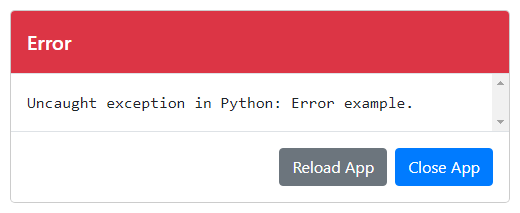
It is recommended to prevent errors from happening as much as possible. When there are situations where errors may occur, it is recommended to catch the error and handle it appropriately.
Alerts
To indicate success or failure of a calculation, dismissable alerts can be displayed above the form.
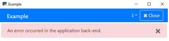
The alerts can be defined by specifying payload.alerts.
The value must be a list of dictionaries (Python) or a cell array of structs (MATLAB) with fields type and message, where type can be danger, warning, success, info, primary, secondary, dark or light. The utils.addAlert function can be used to add alerts to the payload.
Example
payload = utils.addAlert(
    payload,
    "An error occurred in the application back-end.",
    "danger",
)
payload = utils.addAlert(...
    payload, ...
    "An error occurred in the application back-end.", ...
    "danger");
gui_upload
In many cases it is better to use a File component instead of a
gui_uploadfunction.
The gui_upload function can be used to upload content to the form.
It is triggered instead of gui_event when a button is clicked that had the setUpload method called on it during form initialization.
Before the function is called, the user will have had the opportunity to select the file to upload.
Upon arrival in the function, the payload will have a field upload that has the following fields:
contentType: The content type specified with thesetUploadmethod.fileContents: Base64 encoded version of the file's contents.fileName: The name of the file including extension.filePath: The full path of the file including extension.
Similar to the gui_event function, you can choose what happens depending on the event that is triggered.
Alternatively, the File component can be used to upload files.
Syntax
The syntax of the gui_upload function is similar to that of gui_event as shown in the example below. It shows the initialization code of a button setup for uploading an Excel file. The gui_upload function reads the contents of the file and calls a plotting function to plot the data in the form. The definition of the plotting component is not shown in the initialization code.
def gui_init(meta_data: dict) -> dict:
    form = Form()
    btn = component.Button("stage_1_upload", form)
    btn.label = "Upload analysis - stage 1"
    btn.setEvent("UploadAnalysis")
    btn.setUpload(".json")
    return {"form": form}

def gui_upload(meta_data: dict, payload: dict) -> dict:
    if payload["event"] == "UploadAnalysis":
        with open(payload["upload"]["filePath"], "r") as file:
            data = json.load(file)

        plot_stage_1(payload, data)
    else:
        # Handle other upload actions.
        pass

    return payload
function payload = guiInit(metaData)
    form        = Form();
    btn         = component.Button("stage_1_upload", form);
    btn.label   = "Upload analysis - stage 1";
    btn.setEvent("UploadAnalysis")
    btn.setUpload(".json")
    payload.form = form;
end

function payload = guiUpload(metaData, payload)
    switch payload.event
        case "UploadAnalysis"
            data    = jsondecode(fileread(payload.upload.filePath));
            payload = plotStage1(payload, data);
        otherwise
            % Handle other upload actions.
    end
end
gui_download
In many cases it is better to use a ResultFile component instead of a
gui_downloadfunction.
The gui_download function is used to download data from the application to the location selected by the user.
Downloading data is quite straightforward in local mode, but because the same code should also work in deployed mode, some extra steps need to be taken. The workflow is as follows:
- The user clicks a button that triggers event
downloadStart. Ingui_init, you can callmyButton.setEvent("downloadStart")to set this event for a specific button. - Application-specific function
gui_downloadis triggered. This function should define the file name and the data to return in the payload. This is described below. - Simian GUI creates a file from the data specified by
gui_download. - The user selects the location to save the file.
The gui_download function should assign the download field of the payload. The download field is a dict/struct with the following fields:
fileContents: Base64 encoded version of the data to download. In Matlab, you can use thematlab.net.base64encodefunction to Base64-encode a bytestream representing the data you want to encode.fileName: The name of the file to download. This includes an extension but excludes a path.fileContentType: The content type. For example'*.zip'.
Multiple files can be downloaded at once using a zip-file.
The following example illustrates how this could be achieved with gui_download:
import base64
import os.path
from pandas import DataFrame
import shutil
import tempfile

def gui_download(meta_data: dict, payload: dict) -> dict:
    """Download Example."""
    # Create a dummy table for the example.
    ones_table = DataFrame(
        [[1] * 4] * 3, columns=['A', 'B', 'C', 'D'], index=["Row 1", "Row 2", "Row 3"])

    # Create a temporary folder and create a csv and json file with the DataFrame in it.
    session_folder = utils.getSessionFolder(meta_data, create=True)
    temp_folder = tempfile.TemporaryDirectory(dir=session_folder)
    ones_table.to_csv(os.path.join(temp_folder.name, 'ones_table.csv'))
    ones_table.to_json(os.path.join(temp_folder.name, 'ones_table.json'))

    # Create a new temp folder to create the zip file in. (If you reuse the previous temp
    # folder, the zip file would contain a stub version of itself.)
    temp_zip_file = os.path.join(tempfile.TemporaryDirectory(dir=session_folder).name, 'Results')

    with open(shutil.make_archive(temp_zip_file, "zip", temp_folder.name), 'rb') as file:
        # Open the zip file as a binary file, read its contents and base64 encode it.
        encoded = base64.b64encode(file.read())
        payload = {
            'download': {
                'fileContents': encoded.decode("utf-8"),
                'fileContentType': 'application/zip',
                'fileName': "Results.zip"
            }
        }

    return payload
function payload = guiDownload(metaData, payload)
    % Save the data to multiple files.
    sessionFolder   = utils.getSessionFolder(metaData, "Create", true);
    csvFile         = fullfile(sessionFolder, "Measurements.csv");
    coeffFile       = fullfile(sessionFolder, "Coefficients.txt");
    writetable(myTable, csvFile)
    writematrix(myCoefficients, coeffFile)

    % Create a zip file.
    zipFileName     = "Results.zip";
    zipFileNameFull = fullfile(sessionFolder, zipFileName);
    zip(zipFileNameFull, [csvFile, coeffFile]);

    % Base64-encode the zip file.
    fid             = fopen(zipFileNameFull, "r");
    fileContents    = fread(fid, "uint8=>uint8");
    fclose(fid);

    payload.download.fileContents       = matlab.net.base64encode(fileContents);
    payload.download.fileContentType    = "*.zip";
    payload.download.fileName           = zipFileName;
end
The code above uses utility function getSessionFolder. Its syntax is:
session_folder = utils.getSessionFolder(meta_data, create=True)
sessionFolder = utils.getSessionFolder(metaData, "Create", true);
The first input is the metadata. Optionally, specify whether to create the session folder if it does not exist yet.
When there are multiple different download options, each with their own button, they all have to trigger a downloadStart event.
You can differentiate between them by looking at payload.key, which is the key of the button that was pushed.
Note: The session folder will be removed when the session is ended using the Close button. For files in other locations, it is the responsiblity of the developer to ensure they are cleaned up appropriately, for instance using gui_close.
Nested forms
Nested forms are forms within forms. Simian GUI supports nesting forms and provides utilities to manage forms that are nested one level deep. By toggling the visibility of the nested forms, the user interface can be separated into multiple pages. When using nested forms to group components, the submission data follows the same nesting structure (see Submission data).
Form and Form
Simian GUI has two Form classes:
Form: This is the application form, the top level of the user interface.component.Form: This is a nested form, which is used as a component in the application form.
Although they both refer to the same type of form eventually, the properties and data associated with both classes are different.
Initialization
A nested form can be added to the application form in gui_init in a similar fashion as any other component.
nestedForm = component.Form(nestedFormKey, formObj)
However, the recommended method to add nested forms is addNestedForms:
formObj.addNestedForms(formKeys, createFcns, inputs, targetComponent)
where
formObjis the applicationFormobject.formKeysis an list/array of strings that are used as keys for the nested forms.createFcnsis a list of Callables (Python) or an array of function handles (MATLAB). Each of the functions is called to fill the corresponding nested form. The functions must accept their nested form object as first input argument, and the corresponding (optional)inputs. In the function components can be added to the nested form object.inputsis a list of inputs (Python) or a cell array (MATLAB) to be used in thecreateFcns. This allows you to use the samecreateFcnmore than once, but with different parameters.targetComponentis the component to add the nested forms to. This input is optional and when no component is specified, the nested forms are added to the applicationForm.
The first nested form will be visible on initialization, while the others are hidden. The benefits of using this method are:
- Manages switching behaviour (showing one nested form and hiding the others).
- Less boilerplate code.
Note that you can only use the addNestedForms method once per application.
An example of how it can be used is given below.
form_defs = [
    # Key                       Create function                     Inputs
    ["mainForm",                guiLibrary.createMain,              []],
    ["inputForm",               guiLibrary.createInputPhase,        []],
    ["swapExemptionForm",       guiLibrary.createSwapExclusion,     []],
    ["createPhaseAsset",        guiLibrary.createCreatePhase,       ["Asset"]],
    ["createPhaseLiability",    guiLibrary.createCreatePhase,       ["Liability"]],
    ["testPhaseAsset",          guiLibrary.createTestPhase,         ["Asset"]],
    ["testPhaseLiability",      guiLibrary.createTestPhase,         ["Liability"]],
    ]

appForm.addNestedForms(*zip(*form_defs))
formDefs = {
    % Key                       Create function                     Inputs
    "mainForm"                  @guiLibrary.createMain              {}
    "inputForm"                 @guiLibrary.createInputPhase        {}
    "swapExemptionForm"         @guiLibrary.createSwapExclusion     {}
    "createPhaseAsset"          @guiLibrary.createCreatePhase       {"Asset"}
    "createPhaseLiability"      @guiLibrary.createCreatePhase       {"Liability"}
    "testPhaseAsset"            @guiLibrary.createTestPhase         {"Asset"}
    "testPhaseLiability"        @guiLibrary.createTestPhase         {"Liability"}
    };

appForm.addNestedForms([formDefs{:, 1}], formDefs(:, 2), formDefs(:, 3));
This creates seven nested forms, the first of which will be visible after initializing the application.
Switching Forms
For forms that have been added to the application using addNestedForms it is possible to switch between the forms using switchForms in gui_event.
After event handling has completed, the selected form (identified by its key) will be displayed. Other nested forms will be hidden.
utils.switchForms(payload, "inputForm")
payload = utils.switchForms(payload, "inputForm");
The key of the currently visible form can be found as follows (with "currentFormKey" always the same):
current_form_key = utils.getSubmissionData(payload, "currentFormKey")
currentFormKey = utils.getSubmissionData(payload, "currentFormKey");
You can check if a given form is the nested form currently shown by using:
isShown = utils.isCurrentForm(payload, formKey)
Advanced features
This chapter describes a number of advanced features such as how to use your own css classes for your forms or how to trigger events when specific components lose focus.
Use CSS classes
The appearance of components can be changed by adding CSS classes to the components. You can provide your own custom CSS classes, or use those defined in the Bootstrap theme that is provided with Simian.
Using CSS classes
Each of the component objects has a customClass property that can be leveraged to alter the appearance of the components by using CSS classes.
Use spaces to separate classes. For example, by using the following code, you can make the font of the label of a TextField component smaller and italic:
occupationTextField.addCustomClass("small", "font-italic")

% Alternatively:
occupationTextField.customClass = "small font-italic";
The textfields with and without custom classes are shown below.

Add your own CSS
You can add your own styles as well. This can be done in two ways:
- Add static CSS files.
- Use
FormmethodaddCustomCss.
CSS files
Create a css folder in the same (package) folder your gui_init and gui_event functions are in.
All files with .css extension will be added automatically.

Consider the following .css file in the css folder:
.bigButton {
    color: black;
    font-size: 28pt;
    height: 80px;
    width: 200px;
    text-align: left;
}
Add the class to your button:
finishButton.customClass = "bigButton";
A comparison between buttons with and without custom classes:

A special CSS class that can be used is the "form-check-inline" class.
When this class is added to all components in a grouping component (like a Container or Panel), the components are laid out horizontally instead of vertically.
You can also add it to the individual components you wish to lay out horizontally. In the Example, two CheckBoxes in a Container have this CSS class:

addCustomCss method
The Form static method addCustomCss can be used to programmatically add custom CSS. This may be convenient when developing reusable components that need some custom CSS to be available when they are used.
The custom CSS is added in a <style> element in the header of the form.
Optionally, attributes for the <style> can be specified as a dictionary, where the values must be (convertible to) strings. For attributes that do not have a value, use None/missing.
When the href argument is specified, a <link rel="stylesheet" href="_"> element is created, that can be used for externally hosted stylesheets1.
Form.addCustomCss(".black-box {border: 1px solid black;}")

Form.addCustomCss(
    ".black-box {border: 1px solid black;}",
    attributes={"media": "print"},
)

Form.addCustomCss("", href="https://example.com/css/styles.css")
Form.addCustomCss(".black-box {border: 1px solid black;}");

Form.addCustomCss(...
    ".black-box {border: 1px solid black;}", ...
    "Attributes", struct("media", "print"));

Form.addCustomCss("", "Href", "https://example.com/css/styles.css");
Extra examples
In-line placing of components
How to place a Button next to a TextField
Removing inner border
In a component allowing multiple values to be set the extra border between the values may be removed with:
number.customClass = "no-inner-border"
Making your app narrower
Per default the contents of your app are laid out over the whole width of the screen. On wide screens this may result in a less usable app as components are spaced further apart.
To make the main contents of your app take up less screen width, you can use a FieldSet component with its customClass property set to 'container' and add the form contents to this FieldSet component.
Alternatively, you can add custom CSS definitions to your app and use those to make the app narrower. The following CSS snippet sets the maximum width of the app contents to '1000px'. To make the width scale with the font size, you can use '70rem'.
If you also want to make the Navbar use the same maximum width, put the contents of the .form-wrapper block in an html block.
.form-wrapper {
    max-width: 1000px;
    justify-self: center;
    margin-right: auto;
    margin-left: auto;
}
Note that cross-site protections may restrict access to certain domains, e.g.: MATLAB's uihtml restricts access to local files and some MathWorks domains. Discuss with your Simian Portal admin for options when deploying apps.
Use custom Javascript
Custom JavaScript can be provided to use in component properties. This can be done in two ways:
- Add static JavaScript files.
- Use
FormmethodaddCustomJavaScript.
JavaScript Files
Create a js folder in the same (package) folder your gui_init and gui_event functions are in.
All files with .js extension will be added automatically.
The functions and variables defined in the Javascript files will be available for global use in custom validators, callbacks, etc.

addCustomJavaScript method
The Form static method addCustomJavaScript can be used to programmatically add custom JavaScript. This may be convenient when developing reusable components that need some custom JavaScript to be available when they are used.
The custom JavaScript is added in a <script> element in the header of the form.
Optionally, attributes for the <script> can be specified as a dictionary, where the values must be (convertible to) strings. For attributes that do not have a value, use None/missing.
A special case it the src attribute, that can be used for externally hosted scripts1. In that case the script contents can be left empty.
Form.addCustomJavaScript("alert('Hello, world!');")

Form.addCustomJavaScript("", attributes={"src": "https://example.com/js/lib.js"})
Form.addCustomJavaScript("alert('Hello, world!');");

Form.addCustomJavaScript(...
    "", ...
    "Attributes", struct("src", "https://example.com/css/styles.css"));
Note that cross-site protections may restrict access to certain domains, e.g.: MATLAB's uihtml restricts access to local files and some MathWorks domains. Discuss with your Simian Portal admin for options when deploying apps.
Trigger an event when a component loses focus
For components that contain a value, it is possible to trigger an event when the component loses focus.
By simply adding the EventOnBlur class to the components of your choice, you enable this feature for those components.
For instance: myTextField.customClass = "EventOnBlur".
By adding the class to a parent component, for example a DataGrid, all child components on any level will trigger the event when they lose focus.
The event that is triggered will end up in the gui_event function of the form. The payload will contain the following information on the event:
action: "event"event: "blur"key: <path_to_component>, where<path_to_component>is the path to the component. A focus lost event from a cell in a table may for instance get:key: [mydatagrid][3][age]. In this case,mydatagridis the key of the parent DataGrid,3represents the row number (zero-based!) andageis the key of the column that was edited. A focus lost event from a simple textfield directly in the form may for instance get:key: [surname], wheresurnameis the key of the textfield.
Note that adding this custom class to a component only results in triggering an event when the component loses focus, so not every time its value changes. For triggering an event every time a component's value changes (for example for Checkbox components), see the next section. A combination of both these features can be imagined as well.
Trigger an event when a component's value changes
Components that contain a value can trigger an event whenever that value changes by using the following command on them:
obj.properties = {"triggerHappy": True}
obj.properties = {"triggerHappy": "my.module.change"}
obj.addCustomProperty("triggerHappy", true);
obj.addCustomProperty("triggerHappy", "my.package.change");
The event that is triggered will end up in the gui_event function of the form. The payload will contain the following information on the event:
action:"event"event:"change"whentriggerHappyis true, or thetriggerHappyvalue when it is a stringkey: key of the component whose value has changed
Note that using this option causes the component to trigger an event for every value change.
This is convenient for checkboxes and similar components.
However, for example for TextField components, an event will be triggered after every keystroke.
In order to only trigger an event when the user is done editing a field, it is advised to use the EventOnBlur option for components with entered text.
Unlike that feature, this option does not apply to child components.
Debouncing
Some components may emit many change events in rapid succession (e.g. a slider being dragged more than one step). When such a component has triggerHappy configured, multiple calls to the back-end may be queued without waiting for the back-end to respond, causing unpredictable behaviour, such as infinite loops switching between a number of values.
To prevent multiple change events being sent at the same time, a debounceTime (in milliseconds) can be specified to delay calling the back-end. When other change events occur during the delay, only the latest event is let through.
obj.properties = {"triggerHappy": True, "debounceTime": 1000}
obj.addCustomProperty("triggerHappy", true, "debounceTime", 1000);
String evaluation
Simian string evaluation can be added to component properties containing strings with the following delimiters:
- evaluate: "{% %}: Content is evaluated, but kept out of the result. Useful for making template content conditional.
- interpolate: "{{ }}": Content is evaluated and is part of the result. Useful for making content dependent on values of other components.
In the next sections the applications of these string evaluation syntaxes are described.
Filling templates
String templates can be used in the:
- Content html property.
- EditGrid templates properties.
- HtmlElement content property.
- Select template property.
String templates may contain JavaScript functionality in "{% %}" evaluation delimiters to add logic to the template. In combination with data tokens this allows for creating dynamic content that changes with the values of other components.
In the example below the HtmlElement content is changed based on the selection in the Checkbox.
Note that the refreshOnChange property must be set to the "enableAuto" component key or True to ensure that the HtmlElement component is refreshed when the checkbox value is changed. When setting the property to True, the HtmlElement is redrawn on any value change, whereas setting it to a component key only refreshes it when the value of that component changes.
enable_auto_save = component.Checkbox("enableAuto", form)
enable_auto_save.defaultValue = True
enable_auto_save.label = "Enable auto-save"

element = component.HtmlElement("action", form)
element.refreshOnChange = "enableAuto"
element.content = """
{% if (data.enableAuto === true) { %}
    <p>Auto-save is enabled.</p>
{% } else { %}
    <p>Auto-save is not enabled.</p>
{% } %}
"""
Templates can also embed values of other components by using interpolate delimiters with the data tokens. In the example below the value from the checkbox is converted to a "true" / "false" representation in the HtmlElement.
element.content = """
{% if (data.enableAuto !== undefined) { %}
<p>Auto-save enabled: {{ data.enableAuto.toString() }}</p>
{% } %}
"""
Dependent Component properties
Component properties that contain a string value can use string interpolation to make the property depend on changed values of another component. Note that on initialization the raw interpolation string is shown. When the value is changed from the back-end, the dependent property is interpolated and shown as expected.
In the example below the label of the button can be changed by changing the value of the Hidden component from the back-end. The front-end will use the new value to update the label.
button_label = component.Hidden("buttonLabel", form)
button_label.defaultValue = "Click me"
button = component.Button("action", form)
button.label = "{{ data.buttonLabel }}"
Note that evaluation delimiters are shown as-is in the component property.
Tables
Simian GUI supports initializing and updating tables of various forms. The most prevalent use cases are described in this chapter.
Regular-sized, editable tables
If you want to include a table in your form whose values must be editable by a user (possibly including adding and removing rows), you can use a DataGrid or EditGrid. The DataGrid supports in-line editing whereas the EditGrid lets the user expand a row and edit it that way. Both these components support child components of any kind: textfields, checkboxes, select components etc. Performance of the form may deteriorate when the table contains a lot of rows or columns (100+). If you encounter this, please refer to one of the other options described in this chapter.
Layout components in a grid
The Table component allows for adding components in a table/grid directly. However, this is mostly useful for defining the layout of the form, not for creating tables with a variable number of elements or for tables with more than a few rows. In order to display data entered from the back-end, use one of the other options described in this chapter.
DataTables
The DataTables component offers many features for tables. It supports editing, sorting and searching of data and handles large amounts of data through pagination. Various options for customisation are available. The great flexibility of options does cause higher complexity in the setup and usage of the component.
Non-editable tables
If you would like to include a table of any size in your form that does not need to be editable by the user, it is advised to do so by using the HtmlTable component. The content of the table can still be filled and updated from the back-end.
Editable tables with many rows
If you want an editable table in your form that can have many rows (100+), it is advised to use a DataTables component. In addition to all kinds of customization functionality, it provides pagination for maintaining performance.
Editable tables with many columns
If you want an editable table in your form that has many columns (50+), you can simply use a DataTables, DataGrid or EditGrid component for this. A DataTables component will perform better than DataGrid or EditGrid components if there are many columns. For non-editable tables with many columns, the HtmlTable component may be useful.
Deployment
The graphical user interfaces created with Simian GUI together with your underlying model or application can be deployed on a server. The benefits of deployment and how to approach it are described in this chapter. How to deploy your Python applications is described here and for MATLAB, this information is presented here.
Note that when your Simian web app code is deployed on your deployment environment, you need to add a configuration to your Simian Portal to ensure that it is available there and can communicate with the deployed code. Users can reach the web app when they have sufficient access rights to use the app.
Key business value
The key business value of deploying your models and applications on a server are:
- Models and applications are kept in production in a governed way. This holds for both the underlying code as well as (intermediate) results.
- Any stakeholder with sufficient access rights can use the applications and run the models. 'Local runs' are also supported for developers. Both operational modes (local and deployed) look and behave nearly identical.
- The computational power of your deployment server can be exploited instead of having to use that of your user’s machines.
- Only one code base must be maintained for both local and deployed mode.
- Applications developed using Python and MATLAB both have the same look and feel.
- MATLAB:
- No MATLAB license required per user when using the deployed application.
- Multiple MATLAB Runtime versions are managed simultaneously. This means that models and applications developed in different MATLAB releases can be used next to each other.
Python
Some things to take into account before deploying:
- When you run your app locally, everything happens in the same Python session. When you deploy your app, the deployment server may use multiple Python sessions (workers) to process the requests. So, make sure that information that must persist between events is stored in the submission data or is cached.
- Note that deployment environments may reuse Python instances to respond to requests, potentially from multiple users, faster. Therefore, do not use constructs that rely on objects being deleted and recreated between requests.
- It is recommended to fix your dependencies to specific versions to enforce that the exact same versions are installed when a new Python environment is created on the deployment server. This ensures your deployed app runs with tested dependencies and reduces the risk of error or incorrect results.
Deployment process
Deployment of web apps created with Simian GUI generally consists of the following steps:
- Prepare the environment for the deployment of a new web app.
- Add
simian-guito your dependencies to ensure it will be available in the deployed Python environment.- To install from our PyPi server use the
pipoption--extra-index-url https://pypiserver.monkeyproofsolutions.nl/simple/ - For testing with the Ball Thrower example, add
simian-examplesto the dependencies of your deployed Python environment.
- To install from our PyPi server use the
- Ensure that requests to the deployed code are going to the
entrypointmodule. (Examples below) - The output from the
entrypointmodule needs to be returned as a response (with status code 200). In case of an error in the backend, the output contains an 'error' field with a message that will be shown in the GUI (see the Ball Thrower for an example). - Deploy the web app code to the deployment environment.
- Configure your Simian Portal to add a link to the deployed web app for the users. This is documented in the
Simian Portal Administration Guideavailable from the Simian Web apps documentation website.
The files that need to be deployed on the server are:
- Web app definition file(s)
- Model/back-end. (Alternatively API calls can be used to connect with a model on a different server.)
- Deployment target specific
entry_point_deploywrapper function. (Examples below)- To connect to your own web app, replace the "simian.examples.ballthrower" name with its fully qualified module name.
Since there is no standard method for deploying Python code, a number of potential methods are discussed in the following sections:
Other deployment targets should also be possible, but they will require their own version of what is described below.
To test whether the deployed web apps work, send a POST request with json body ["config", {}, {}] to the deployment host and port. You should get a response with a stringified json dictionary containing a session_id and some other fields.
Azure Functions
GUIs created with Simian GUI can be deployed as Azure functions:
-
Create an Azure Functions project.
Include
simian-gui(and optionallysimian-examples) in the Azure Functions requirements file to ensure that the required modules for Simian are installed in the Azure environment. -
Put all the necessary files as described above in the project folder.
-
In the Azure Functions v2 programming model's
function_app.pyfile, the Azure Functions HttpRequests need to be processed and Responses need to be created. See the example code below on how to make Azure Functions communicate with Simian GUI. For your own GUIs ensure that the fully qualified name of your own GUI is used.To ensure all Simian GUI and GUI definition files can be found and used they need to be on the Python path.
-
Publish the project on Azure and deploy to the Function App.
# Use back-end type `python_azure_functions_v2` in the portal configuration.
import json
import azure.functions as func
from simian.entrypoint import entry_point_deploy
app = func.FunctionApp(http_auth_level=func.AuthLevel.ANONYMOUS)
@app.route(route="httpTrigger")
def httpTrigger(req: func.HttpRequest) -> func.HttpResponse:
request_data = req.get_json()
response = entry_point_deploy("simian.examples.ballthrower", request_data)
return func.HttpResponse(json.dumps(response), status_code=200)
ownR
GUIs created with Simian GUI can be deployed as ownR applications:
-
Create a new ownR application as documented on the Functional Analytics wiki (account required).
-
Put the necessary files as described above into the repository of the ownR application.
Ensure the requirements.txt file of Simian GUI is on the root level and add
simian-gui(and optionallysimian-examples) to it. This will ensure that ownR can use it to install the required modules in the Python environment. -
ownR requires a module to exist at the root level that has the same name as the application. In this module import Simian GUI's
entrypointmodule and route the requests from the ownR environment to Simian GUI'sentry_point_deployfunction as illustrated below. For your own GUIs ensure that the fully qualified name of your own GUI is used.To ensure all Simian GUI and GUI definition files can be found and used they need to be on the Python path.
-
Commit and push the changes to the repository. This will trigger a rebuild of the application and your changes to become available.
# Use back-end type `python_ownr` in the portal configuration.
from simian.entrypoint import entry_point_deploy
def entry_point(operation: str, meta_data: dict, payload_in: dict) -> dict:
"""Route the request to the entrypoint module."""
return entry_point_deploy(
"simian.examples.ballthrower",
operation=operation,
meta_data=meta_data,
payload_in=payload_in
)
FastAPI - uvicorn
GUIs created with Simian GUI can be deployed with FastAPI and uvicorn.
-
Install
simian-gui,fastapi, anduvicornin your Python environment. -
Put all the necessary files as described above in a folder.
-
Create a fastapi_deploy.py file as shown below. For your own GUIs ensure that the fully qualified name of your own GUI is used.
-
You can use the procedure as described on the uvicorn quickstart page to run your app.
Hosting the app with multiple workers is supported with gunicorn.
# Use back-end type `python_fastapi` in the portal configuration.
from fastapi import Body, FastAPI
from fastapi.responses import JSONResponse
from simian.entrypoint import entry_point_deploy
app = FastAPI()
@app.post("/apps/ballthrower", response_class=JSONResponse)
def route_app_requests(request_data: list = Body()) -> dict:
"""Route requests to ballthrower GUI and return the response."""
return entry_point_deploy("simian.examples.ballthrower", request_data)
Flask
GUIs created with Simian GUI can be deployed with Flask. Note that Flask is not recommended to be used for production.
-
Install Flask in your Python environment.
-
Put all the necessary files as described above in a folder.
-
Create a flask_hosting.py file as shown below. For your own GUIs modify the secret key (or store it elsewhere) and ensure that the fully qualified name of your own GUI is used.
-
You can use the procedure as described on the Flask website to run Flask.
# Use back-end type `python_flask_v2` in the portal configuration.
from flask import Flask, request
from simian.entrypoint import entry_point_deploy
def create_app() -> Flask:
"""Create Flask App for hosting a webGUI."""
# create and configure the app
app = Flask(__name__)
# Store secret key elsewhere.
app.secret_key = b'_8#h3S"T7U9z\n\xec]/'
@app.route('/apps/ballthrower', methods=('POST', ))
def route_app_requests() -> dict:
return entry_point_deploy("simian.examples.ballthrower", request.data)
return app
MATLAB
Prerequisites
The minimum requirements for deploying your web application developed in MATLAB are as follows:
- MATLAB R2022a or newer is required for Simian GUI
- MATLAB Production Server
- MATLAB Production Server Dashboard
- MATLAB Runtime corresponding to the MATLAB release
- MATLAB Compiler SDK
- Redis is used as a caching mechanism between calls to the MATLAB Production Server
Deployment workflow
Setting up a MATLAB Production Server is thoroughly described in the Mathworks documentation.
Once your MATLAB Production Server is set up, deploying your application on it can be achieved through the following steps:
- Prepare your code for deployment.
- Compile your application into a deployable archive using MATLAB Compiler and MATLAB Compiler SDK.
- Deploy on MATLAB Production Server.
- Configure the Simian Portal to connect with the deployed code.
These items are described in more detail below.
Prepare your code for deployment
Before compiling your application into a deployable archive, the code must be made compilable. There are some things to take into consideration.
MATLAB Compiler supports most of the MATLAB language including objects, most MATLAB toolboxes, and user-developed user interfaces. The capabilities and limitations per toolbox are found in the Mathworks documentation. A non-exhaustive list of functions that are not supported for compilation by MATLAB Compiler and MATLAB Compiler SDK is found here.
Compile your application
First create a new function based on the entrypoint example function below, which will be the entry point for communication with your deployable archive.
Make sure the namespace field of the metaData struct contains the namespace of your own form.
Note that the simian.gui_v3_2_0 package contains a version number that may be different in the version you are including in your archive.
entrypoint.m
function payloadOut = entrypoint(operation, metaData, payloadIn)
%% Entrypoint.
% Containing package +my\+name\+space becomes "my.name.space".
import simian.gui_v3_2_0.*;
% Put package name into metaData (2nd input to callbackWrapper().
metaData.namespace = "my.name.space"; % Replace with your own form namespace
payloadOut = internal.callbackWrapper(operation, metaData, payloadIn);
end
The actual archive can be created in several ways described in the next two sections.
Using buildArchive utility
Compiling your application to a deployable archive can be done with the simian.gui_v3_2_0.buildArchive function (MATLAB R2020b+). The syntax is: results = simian.gui_v3_2_0.buildArchive(entrypointFcn, options) with entrypointFcn the absolute path to the entrypoint function and option a set of optional name-value pairs for compiler.build.ProductionServerArchiveOptions. For example:
root = "C:\Files\BallThrower";
archiveName = "BallThrower";
outDir = fullfile(root, "CTFs");
entrypoint = fullfile(root, "entrypoint.m");
additionalFiles = fullfile(root, ["+ballthrower", "@BallThrower"]);
results = simian.gui_v3_2_0.buildArchive(entrypoint, ...
"OutputDir", outDir, ...
"ArchiveName", archiveName, ...
"AdditionalFiles", additionalFiles);
This is equivalent to the following mcc command in MATLAB:
mcc("-W", "CTF:" + archiveName, ...
"-d", outDir, ...
"-Z", "autodetect", ...
"-U", entrypoint, ...
"-a", additionalFiles(1), "-a", additionalFiles(2), ...
"-a", which("mps.cache.connect"), ...
"-a", <rootOfSimianGui>\config.json, ...
"-a", <rootOfSimianGui>\+simian\+gui_v3_2_0)
On MATLAB releases R2021b and newer, the buildArchive function outputs a compiler.build.productionServerArchive object. On releases R2020b and R2021a, the function outputs the mcc command that was executed by buildArchive.
The workflow for using this function is as follows:
-
Select the
entrypoint.mfunction as the first input of thebuildArchivefunction. -
Define what folders and files must be included in the archive. This can be frontend and back-end code, but also for example static data. This set of folders and files constitutes the
AdditionalFilesprovided tobuildArchive. ThebuildArchivefunction will automatically add the required Simian GUI folders and files to the archive for you (as well as Simian Wrapper code, if applicable), so these do not have to be specified in yourAdditionalFiles. -
Call the
buildArchivefunction to build the deployable archive.
Using MATLAB functionality
Aside from the buildArchive function, you can also use the MATLAB Production Server Compiler (MPS Compiler) or the MATLAB mcc function. The workflow is similar to using the buildArchive function:
-
If you are using the MPS Compiler, the
entrypoint.mfunction file should be selected as an "Exported Function". When using themccfunction, this function file should be one of the standard inputs. -
Add the code to the archive:
- The package(s) and/or folder(s) with the form code and back-end code.
- Done automatically by the
buildArchivefunction, but a required step when using the MPS Compiler ormcc: The MATLAB Simian GUI'sconfig.jsonfile+simianpackage folder
In the MPS Compiler, add these files and folders to the "Additional files" section. In the
mccfunction add these files using the-aoption. -
Done automatically by the
buildArchivefunction, but a required step when using the MPS Compiler ormcc: To enable caching to a Redis database, the following option needs to be added to the MPS Compiler's settings or themccfunction call:-a mps.cache.connect -
Create a new archive with these settings.
Deploy on MATLAB Production Server
Deployment of the created archives depends on the location and configuration of the MATLAB Production Server. This is documented in the MATLAB documentation in Deploy Archive to MATLAB Production Server and on other pages in the MATLAB documentation.
Configure Simian Portal
The deployed code must be made available from the Simian Portal by adding a configuration. This is documented in the Simian Portal Administration Guide available from the Simian Web apps documentation website.
Example
In this chapter the Ball Thrower example GUI shipped with Simian GUI is described. For new users of Simian GUI the code of this example and the descriptions in this chapter may offer a good starting point to start using Simian GUI.
Ball Thrower
The Ball Thrower example contains a form that facilitates running a Ball Thrower simulation model. The model uses the MATLAB ode45 or scipy.integrate.solve_ivp solver to calculate the trajectory of the ball. The application upon startup looks as follows:

The model allows for simulating the throw of a ball in an idealised situation without drag and wind and can optionally be run to also simulate the effects of drag and wind on the ball.
The model also has inputs for the throw speed, ball radius, mass and drag coefficient, wind speed, gravity and air density. These inputs can be set from the form.
The following sections describe how to run this example, the most interesting features of the form and the physics and math behind the ball thrower model.
Running the example
To start the form in a pywebview window, make sure Simian GUI is on the Python path and run the following command in Python:
import simian.local
simian.local.run("simian.examples.ballthrower")
To run the Ball Thrower example in a local MATLAB session, ensure that Simian GUI and the Ball Thrower example files are on the MATLAB path and run the following command:
simian.local_v3_2_0.run("simian.examples_v3_2_0.ballthrower");
To simulate the throw of a ball, click the "Throw" Button.
The trajectory of the ball will be shown in the plot and the settings are stored in the table in the "Used settings" tab.
The speed with which the ball is thrown and the gravity can be modified to simulate the effect of these parameters on the trajectory of the ball.
To simulate the effects of wind and/or drag on the throw, tick the corresponding options.
These options will enable more settings that can be modified, which will have their own effect on the trajectory of the ball.
BallThrower files
The files making up the Ball Thrower example are stored in the simian-examples folder.
The form functions are in the ballthrower module:
ballthrower.py:gui_init: contains the form definition.gui_event: contains the callbacks of the throw and clear buttons and connects with the model to simulate the ball's trajectory.
logo.png: image shown in the header of the form.
The model for simulating a ball throw is in the ballthrower_engine module:
BallThrower: ballThrower class definition. Needs to be instantiated before you can call the throwBall method._drag_ball: method creating the set of differential equations that need to be solved for the throw.throw_ball: method starting the simulation of the trajectory of the ball._zero_crossing: method for determining the ground contact point boundary condition of the throw.
The MATLAB Ball Thrower contains the same functionality, but the functions have their own function files.
Features
The most interesting features of the example are discussed in the following subsections. Where possible code snippets from the example are included (sometimes slightly modified for readability) to illustrate how these features end up in code. The descriptions also contain links to other parts of the documentation where more information can be found.
We will discuss how the Ball Thrower example can conditionally enable and hide controls, conditionally override a value, add client side validation, prevent runs with invalid settings, and make parameters required. We will also show how to plot and tabulate data, add an image to the form and how we created the form's layout.
Conditionally enabled state
Wind cannot be simulated without simulating drag, as without drag the wind has no effect on the ball.
To capture this in the form the "Enable wind" Checkbox is only enabled when the "Enable drag" checkbox is enabled.

To get this behaviour we set the disabled state of the "Enable wind" checkbox to true and add a Logic object to the "Enable wind" checkbox.
Each Logic object needs a trigger and one or more actions. The trigger describes under which circumstances the actions in the logic object should be executed.
To ease disabling components with a trigger, the disableWhen method is available for each component. It uses the createDisableLogic function from the componentProperties package/module to disable the component when the trigger is triggered.
enable_wind_checkbox.disable_when(
trigger_type="simple", trigger_value=["enableDrag", False]
)
enableWindCheckbox.disableWhen("simple", {"enableDrag", false})
Alternatively, when adding components from a table we can create a Logic object and put it in a dict/struct for the options column.
wind_logic = component_properties.create_disable_logic(
trigger_type="simple", trigger_value=["enableDrag", False]
)
wind_options["logic"] = wind_logic
windLogic = componentProperties.createDisableLogic(...
"simple", {"enableDrag", false});
windOptions.logic = windLogic;
Conditionally override a value
Disabling the "Enable wind" checkbox alone is not enough. It may already have been ticked, so we also need to ensure it is unticked when the "Enable drag" option is unticked.
For this we create an untick action. This action should change the checkbox's value property to false.
We simply add this new action to the actions property of the existing Logic object of the "Enable wind" control, as it already has the correct trigger for this action.
wind_logic.actions.append(
{
"type": "value",
"value": "value = false"
}
)
windLogic.actions{end + 1} = struct( ...
"type", "value", ...
"value", "value = false");
Conditionally hide controls
When drag and or wind are disabled, the controls for the ball properties and the wind speed are not needed and can be hidden.
For this we do not use a Logic object, but a Conditional object which has a more concise definition.
First the Conditional object is created with the control we want to hide as input. Then we put the key of the control the hiding depends on in the when property.
The value of that control for which our control is to be hidden is put in the eq property.
The following statements hide the ballPanel Panel when the "Enable drag" checkbox is unticked:
# Hide ball panel when drag is not enabled.
drag_enabled = component_properties.Conditional(ballPanel)
drag_enabled.when = "enableDrag"
drag_enabled.eq = False
# Or when using table's 'options' column:
ball_options = {"conditional": {"when": "enableDrag", "eq": False}}
% Hide ball panel when drag is not enabled.
ballCondition = componentProperties.Conditional(ballPanel);
ballCondition.when = "enableDrag";
ballCondition.eq = false;
% Or when using table's 'options' column:
ballOptions.conditional.when = "enableDrag";
ballOptions.conditional.eq = false;
Client side validation
For some controls we need to limit the range of values that can be entered.
The ball's radius for instance should not be negative. To enforce this we can add a Validate object to a control.
For the ball radius text field we create a Validate object with the control as input and set the min property to zero.
This will ensure that when negative values are entered an error message is shown to highlight the problem.
This type of validation can also be done in the back-end, but doing it in the form provides quicker feedback and shows it close to the invalid value:

# Allow values greater than 0.
ball_radius_validate = component_properties.Validate(ballRadius)
ball_radius_validate.min = 0
# Or when using the Component's add_validation method.
ballRadius.add_validation(min=0)
# Or when using table's 'options' column:
radius_options = {"validate": {"min": 0}}
% Allow values greater than 0.
radiusValidate = componentProperties.Validate(ballRadius);
radiusValidate.min = 0;
% Or when using the Component's add_validation method.
ballRadius.addValidation(min=0);
% Or when using table's 'options' column:
radiusOptions.validate.min = 0;
Prevent run with invalid settings
To prevent running the model with values that are flagged invalid by the validation the "Throw" Button is disabled.
This can simply be done by setting the disableOnInvalid property of the throw button control to true.
This ensures that when the validations in the form detects an invalid value, the throw button is automatically disabled and only enabled again when all values in the form are valid.

throw_button.disableOnInvalid = True
throwButton.disableOnInvalid = true;
Required parameters
When empty values are not allowed for a setting, using the setRequired() method of the component will ensure that empty values are marked invalid.
The setRequired() method creates a Validate object for the control (if none exist yet) and sets the required property to true (default is false).
When you add a new Validate object to the control after using the setRequired() method, the control will lose its required state.
Alternatively you can directly set the required property of the Validate object to true.
Controls that have a required value are indicated with a red asterisk and empty values are marked invalid.
ball_radius = component.Number("ballRadius")
ball_radius.setRequired()
# or
ball_radius_validate = component_properties.Validate(ball_radius)
ball_radius_validate.required = True
# Or when using table's 'options' column:
radius_options["validate"].update({"required": True})
ballRadius = component.Number("ballRadius");
ballRadius.setRequired();
% or
ballRadiusValidate = componentProperties.Validate(ballRadius);
ballRadiusValidate.required = true;
% Or when using table's 'options' column:
radiusOptions.validate.required = true;
Plotting results
To plot ball trajectories in the form after clicking the "Throw" button, we add a Plotly object in the definition of the form
and set its "title", "xaxis" and "yaxis" properties to make it look nicer:
# Create a plot window to plot the ball trajectories in.
my_plot = component.Plotly("plot", column_2)
my_plot.defaultValue['data'] = []
my_plot.defaultValue['layout'] = {
"title": {"text": "Balls thrown"},
"xaxis": {"title": "Distance [m]"},
"yaxis": {"title": "Height [m]"},
"margin": {"t": 40, "b": 30, "l": 50}
}
my_plot.defaultValue['config'] = {
"displaylogo": False
}
% Create a plot window to plot the ball trajectories in.
myPlot = component.Plotly("plot", column_2);
myPlot.defaultValue.data = {};
myPlot.defaultValue.layout = struct(...
"title", struct("text", "Balls thrown"), ...
"xaxis", struct("title", "Distance [m]"), ...
"yaxis", struct("title", "Height [m]"));
myPlot.defaultValue.config = struct(...
"displaylogo", false);
To plot a ball trajectory in the form we create a Plotly object from the data in the form via the getSubmissionData utility function. We can then use the Plotly Figure.add_scatter() method (Python) or utils.Plotly.plot() method (MATLAB) to plot the x and y values that were returned by the BallThrower model.
We then put the Plotly object in the payload using the setSubmissionData utility function.
In MATLAB we can extend the legend by first getting its existing values and then recreating the legend with the existing and new values. In Python the legend is automatically extended with the name of the added scatter trace.

# Create a Plotly object from the information in the payload.
plot_obj = utils.getSubmissionData(payload, key='plot')[0]
# Plot the new newly calculated x and y values, append the legend and put the plotly
# object in the submission data.
nr = len(plot_obj.figure.data) + 1
plot_obj.figure.add_scatter(x=x, y=y, name=f"Attempt {nr}", mode="lines")
utils.setSubmissionData(payload, key='plot', data=plot_obj)
% Create a plotly object from the data in the form, put the current data in the plotly
% object and get the legends.
plotly = utils.getSubmissionData(payload, "plot");
dataSpec = plotly.data;
existingNames = cellfun(@(x) x.name, plotly.data, "UniformOutput", false);
% Plot the newly calculated x and y values, append the legend and put the plotly
% object in the submission data.
nr = numel(dataSpec) + 1;
plotly.plot(x, y)
plotly.legend(existingNames{:}, sprintf("Attempt %d", nr));
payload = utils.setSubmissionData(payload, "plot", plotly);
Tabulating used settings
To keep track of the settings used for the simulations of the throws, we can add them to a table.
In the form definition we create a DataGrid and use its setContent method to add nine non-editable columns with TextFields.
# Create a table to store the throw settings in.
table_out = component.DataGrid("summary", tab_b)
table_out.setContent(
labels=["Attempt", "Horizontal speed", "Vertical speed", "Wind speed", "Ball mass",
"Radius","Drag Coeff.", "Gravity", "Air density"],
keys=["nr", "u0", "v0", "w", "m", "r", "Cd", "g", "rho"],
component_types=["TextField"] * 9,
is_editable=[False] * 9)
table_out.label = "Used settings per throw"
% Create a table to store the throw settings in.
tableOut = component.DataGrid("summary", tabB);
tableOut.label = "Used settings per throw";
tableOut.setContent(...
["Attempt", "Horizontal speed", "Vertical speed", "Wind speed", "Ball mass", ...
"Radius", "Drag Coeff.", "Gravity", "Air density"], ...
["nr", "u0", "v0", "w", "m", "r", "Cd", "g", "rho"], ...
repmat("TextField", 1, 9), ...
false(1, 9));
When the Throw button is clicked we create a new row with the settings that were used in the simulation.
This new row is appended to the values already in the table and using the setSubmissionData() function in the utils, it is added to the payload that will be sent to the form.

# Update the table with the settings used for the throws.
new_row = [nr, hor_speed, ver_speed, wind_speed, mass_ball, radius_ball, drag_coeff,
gravity, rho_air]
if nr == 1:
# First throw. Only put the new row in the table.
new_table_values = [new_row]
else:
# Extra row. Append the row to the DataFrame from the submission data.
new_table_values = utils.getSubmissionData(payload, key="summary")[0]
new_table_values = new_table_values.append(
DataFrame(data=[new_row], columns=new_table_values.columns))
utils.setSubmissionData(payload, key="summary", data=new_table_values)
% Update the table with the settings used for the throws.
newRow = {nr, horSpeed, verSpeed, windSpeed, massBall, radiusBall, dragCoeff, ...
gravity, rhoAir};
if nr == 1
% First throw. Only put the new row in the table.
newTableValues = newRow;
else
tableValues = sub_getTableValues(payload, "summary");
newTableValues = [tableValues; newRow];
end
payload = utils.setSubmissionData(payload, "summary", newTableValues);
Layout of controls
Controls in the form can be laid out using panels, containers, columns, tables and tabs.
Panels allow for grouping controls and allow for hiding them by collapsing the panel.
Containers allow for grouping controls without adding borders or background colors.
Columns allow for putting controls and panels next to each-other, making better use of the space in the form.
When the window containing the form gets smaller, the contents of the columns are placed below each-other to reduce horizontal scrolling.
Tables allow for laying components out in a grid.
Tabs allow for grouping and showing/hiding larger parts of the form.
Background
In this section the physics and math side of throwing a ball are discussed for an idealized situation without drag and wind, and for situations where drag, and wind and drag are simulated.
Idealized situation
Let"s throw a ball in an ideal world without drag and wind. Defining a starting point, throwing speed and gravitation will do the trick:
\[\sum \vec{F} = m \cdot \vec{g},\]
therefore, we can derive that:
\[ \begin{align} x & = u_0 t \\ y & = v_0 t - \frac{1}{2}gt^2 \end{align} \]
This can be solved analytically:
\[
\frac{d^2}{dt^2}
\begin{bmatrix}
x \\ y
\end{bmatrix}
=
\begin{bmatrix}
0 \\ -g
\end{bmatrix}
\]
The begin position and speed are enough to determine the final result:
\[x_0, y_0, u_0, v_0\]
Such that:
\[
\begin{align}
x(t) & = x_0 + u_0 t \\
y(t) & = y_0 + v_0 t - \frac{1}{2}gt^2 \\
u(t) & = u_0 \\
v(t) & = v_0 - gt \\
\end{align}
\]
Adding drag
When we add drag to the idealized situation, things become more complicated:
\[\vec{F}_{drag} = -\frac{1}{2} \rho A |\vec{v}|^2 C_d \hat{v} \]
And thus: \[\sum \vec{F} = \vec{F}_{drag} + \vec{F}_g.\]
This can no longer be solved analytically, this can only be solved numerically. Therefore we need to solve the following equations using a differential equation solver.
\[
\dfrac{d}{dt}
\begin{bmatrix}
x \\ \dot{x} \\ y \\ \dot{y}
\end{bmatrix}
=
\begin{bmatrix}
\dot{x} \\
-\frac{1}{2m} \rho \dot{x}^2 C_d A \dfrac{\dot{x}}{|\dot{x}|} \\
\dot{y} \\
-\frac{1}{2m} \rho \dot{y}^2 C_d A \dfrac{\dot{y}}{|\dot{y}|} + g
\end{bmatrix}
\]
The begin position and speed are not enough to determine the final result:
\[x_0, y_0, u_0, v_0\]
For this situation we need more parameters:
- \( m \): Mass of the ball
- \( \rho \): Air density
- \( r \): Area of the surface, assumed a sphere here, so radius is asked
Adding wind
When we add wind, the equations become slightly more complicated.
\[\vec{F}_{drag + wind} = -\frac{1}{2} \rho A |\vec{v_r}|^2 C_d \hat{v_r} \]
where \(\vec{v_r} = \vec{v} + \vec{w}\), and
\[\sum \vec{F} = \vec{F}_{drag + wind} + \vec{F}_g.\]
The equations using that need to be solved with the ode45 solver become:
\[
\dfrac{d}{dt}\begin{bmatrix}
x \\ \dot{x} \\ y \\ \dot{y}
\end{bmatrix}
=
\begin{bmatrix}
\dot{x} \\
-\frac{1}{2m} \rho (\dot{x} - w)^2 C_d A \dfrac{\dot{x} - w}{|\dot{x} - w|} \\
\dot{y} \\
-\frac{1}{2m} \rho \dot{y}^2 C_d A \dfrac{\dot{y}}{|\dot{y}|} + g
\end{bmatrix}
\]
The begin position and speed are not enough to determine the final result: \[x_0, y_0, u_0, v_0\]
For this situation we need more parameters:
- \( m \): Mass of the ball
- \( \rho \): Air density
- \( r \): Area of the surface, assumed a sphere here, so radius is asked
- \( w \): Wind Speed
How to
In this chapter, you can find the answers to questions on how to achieve certain things with Simian GUI that may not be so straightforward. Examples include conditionally disabling a component or displaying components side by side.
How to add a piece of uneditable text?
You can use a component's label property to set the text displayed with the component.
Multiple component types support setting the labelPosition so that you can change the position of the label with respect to the component.
Alternatively, you can set the description property to display text a bit more subtle, under the component.
If this does not meet your demands, you can use an HtmlElement component. For example:
h = component.HtmlElement("Title", form)
h.content = "Page title"
h.tag = "h1"
h = component.HtmlElement("Title", form);
h.content = "Page title";
h.tag = "h1";
The resulting title is:

How to place a button next to a textfield?
Normally when adding multiple components to a form, they are placed below one another. If you wish to add multiple components side by side, there are a few ways of doing this.
One of them is using the form-check-inline class as described in Advanced features. This approach is used to place a button next to a textfield in the following example:
txt = component.TextField("name", form)
txt.label = "Name"
txt.customClass = "form-check-inline"
txt.labelPosition = "left-left"
btn = component.Button("check", form)
btn.label = "Check"
btn.customClass = "form-check-inline"
txt = component.TextField("name", form);
txt.label = "Name";
txt.customClass = "form-check-inline";
txt.labelPosition = "left-left";
btn = component.Button("check", form);
btn.label = "Check";
btn.customClass = "form-check-inline";

An alternative approach is to use a Columns component to place the components side by side. If we wish to display the textfield's label above the component instead of next to it, we have to specify the label separately in order to maintain horizontal alignment between the textfield and the button:
# Separately define a label for the textfield.
lbl = component.HtmlElement("txt_label", form)
lbl.content = "Name"
# Keep the TextField's label empty.
txt = component.TextField("name")
btn = component.Button("check")
btn.label = "Check"
cols = component.Columns("my_columns", form)
cols.setContent([txt, btn], [2, 1])
% Separately define a label for the textfield.
lbl = component.HtmlElement("txt_label", form);
lbl.content = "Name";
% Keep the TextField's label empty.
txt = component.TextField("name");
btn = component.Button("check");
btn.label = "Check";
cols = component.Columns("my_columns", form);
cols.setContent({txt, btn}, [2, 1])

How to disable a component unless a condition is met?
The enabled state of a component can be changed based on the values of other components by giving the component a Logic object. This Logic object has a trigger property where you can specify when the state must be changed, and an actions property where you specify what must be changed.
In the example below we create a checkbox and a number component for input fields, and a button that is enabled when the checkbox is ticked and the number exceeds five. To get this behaviour we use the disableWhen function that all components have. Refer to createDisableLogic for more information on the shared inputs.
cb = component.Checkbox("TheCheckbox", form)
cb.label = "I agree"
nr = component.Number("TheNumber", form)
nr.label = "Years of experience"
btn = component.Button("TheButton", form)
btn.label = "Continue"
btn.block = True
btn.disabled = True
# Add enable Logic.
btn.disable_when("javascript", "result = data.TheCheckbox && data.TheNumber > 5", False)
cb = component.Checkbox("TheCheckbox", form);
cb.label = "I agree";
nr = component.Number("TheNumber", form);
nr.label = "Years of experience";
btn = component.Button("TheButton", form);
btn.label = "Continue";
btn.block = true;
btn.disabled = true;
% Add enable Logic.
btn.disableWhen("javascript", "result = data.TheCheckbox && data.TheNumber > 5", false)
The resulting form in action:
Note that only for Buttons the same can be achieved by using the customConditional property, similar to how this property can be used to hide components.
btn.customConditional = "component.disabled = data.TheCheckbox && data.TheNumber > 5";
Buttons also have the disableOnInvalid property (default false). When set to true, this disables the button when any value in the form does not meet its component's validation criteria.
How to send an update to the form and immediately continue calculations?
This is explained in the Follow-up Event section.
How to change the options of my Select component?
You can change the selectable options and their corresponding values of a Select component after initializing the form by following these steps:
- In the initialization code:
- Add a Hidden component. The Select component will obtain its options from it.
- Optionally set the
defaultValueproperty of the Hidden component as default options for the Select component. - Add a Select component and make it reference the Hidden component for its options. This is done by setting the Select component's
dataSrcproperty to 'custom' and filling itsdataproperty with a dict/struct with keycustomand JavaScript code that references the data of the Hidden component.
- In the event handling code:
- Update the value of the Hidden component to update the options of the Select component.
These steps are illustrated in an example below. First, we give the initialization code:
# This hidden component holds information on the options of the Select.
hidden_key = "HiddenKey"
value_field_name = "value"
hid = component.Hidden(hidden_key, form)
hid.defaultValue = [
{"label": "Option 1", value_field_name: "opt1"},
{"label": "Option 2", value_field_name: "opt2"}
]
# Create the Select component and make it reference the Hidden component.
sel = component.Select("s", form)
sel.dataSrc = "custom"
sel.data = {"custom": "values = data." + hidden_key}
sel.valueProperty = value_field_name
% This hidden component holds information on the options of the Select.
hiddenKey = "HiddenKey";
valueFieldName = "value";
hid = component.Hidden(hiddenKey, form);
hid.defaultValue = struct( ...
"label", {"Option 1", "Option 2"}, ...
valueFieldName, {"opt1", "opt2"} ...
);
% Create the Select component and make it reference the Hidden component.
sel = component.Select("s", form);
sel.dataSrc = "custom";
sel.data.custom = "values = data." + hiddenKey;
sel.valueProperty = valueFieldName;
The event code becomes:
val = [
{"label": "New option 1", "value": "value1"},
{"label": "New option 2", "value": "value2"}
]
utils.setSubmissionData(payload, "HiddenKey", val)
val = struct( ...
"label", {"New option 1", "New option 2"}, ...
"value", {"value1", "value2"} ...
);
payload = utils.setSubmissionData(payload, "HiddenKey", val);
In a similar fashion, the options of a Selectboxes component can be changed after initialization as described here.
How to change the options of my Selectboxes component?
You can change the selectable options and their corresponding values of a Selectboxes component after initializing the form by following these steps:
- In the initialization code:
- Add a Hidden component. The Selectboxes component will obtain its options from it.
- Optionally set the
defaultValueproperty of the Hidden component as default options for the Selectboxes component. - Add a Selectboxes component and add a Logic object to make it reference the Hidden component for its options.
- In the event handling code:
- Update the value of the Hidden component to update the options of the Selectboxes.
These steps are illustrated in an example below. First, we give the initialization code:
# This hidden component holds information on the options of the Selectboxes.
hidden_key = "HiddenKey"
hid = component.Hidden(hidden_key, form)
hid.defaultValue = [
{"label": "Option 1", value_field_name: "opt1"},
{"label": "Option 2", "value": "opt2"}
]
# Create the Selectboxes component and make it reference the Hidden component.
sel = component.Selectboxes("s", form)
sel.label = "Make selection"
sel.redrawOn = hidden_key
# Add logic that always holds. The Selectboxes values shall come from the Hidden value.
logic = component_properties.Logic(sel)
logic.trigger = {
"type": "javascript",
"javascript": "result = true;"
}
logic.actions = {
"name": "a",
"type": "customAction",
"customAction": "component.values = data." + hiddenKey
}
% This hidden component holds information on the options of the Selectboxes.
hiddenKey = "HiddenKey";
hid = component.Hidden(hiddenKey, form);
hid.defaultValue = struct( ...
"label", {"Option 1", "Option 2"}, ...
"value", {"opt1", "opt2"} ...
);
% Create the Selectboxes component and make it reference the Hidden component.
sel = component.Selectboxes("sel", form);
sel.label = "Make selection";
sel.redrawOn = hiddenKey;
% Add logic that always holds. The Selectboxes values shall come from the Hidden value.
logic = componentProperties.Logic(sel);
logic.trigger = struct( ...
"type", "javascript", ...
"javascript", "result = true;" ...
);
logic.actions = {struct( ...
"name", "a", ...
"type", "customAction", ...
"customAction", "component.values = data." + hiddenKey ...
)};
The event code becomes:
val = [
{"label": "New option 1", "value": "value1"},
{"label": "New option 2", "value": "value2"}
]
utils.setSubmissionData(payload, "HiddenKey", val)
val = struct( ...
"label", {"New option 1", "New option 2"}, ...
"value", {"value1", "value2"} ...
);
payload = utils.setSubmissionData(payload, "HiddenKey", val);
In a similar fashion, the options of a Select component can be changed after initialization as described here.
How to use numbers with scientific notation?
The Number component does not support exponential notation (like "2.1e5"). As a workaround a TextField with custom validation can be used.
The following snippets show how to use JavaScript's Number and isNaN functions to validate the numeric input in the TextField.
gui_init
number = component.TextField("number", form)
number.add_validation(
custom="valid = isNaN(Number(input)) ? 'Not a valid number.' : true;"
)
number = component.TextField("number", form);
number.addValidation( ...
custom="valid = isNaN(Number(input)) ? 'Not a valid number.' : true;");
Note that the validation does not convert the string to a numeric value. Hence, the value in the submission data must be converted before it can be used.
gui_event
number = utils.getSubmissionData(payload, "number")[0]
number = float(number)
number = utils.getSubmissionData(payload, "number");
number = str2double(number);
How to add an image?
Store the image file near the guiInit function and ensure that it is distributed with the app code.
The file itself cannot be sent to the browser. Instead the information in the image must be encoded with the encodeImage util:
encoded_value = utils.encodeImage(
os.path.join(os.path.dirname(__file__), "logo.png")
)
encodedValue = utils.encodeImage( ...
fullfile(fileparts(mfilename("fullpath")), "logo.png"));
The encoded value can then be sent to the browser.
Note that the encodeImage function expects the absolute path to the file. For portability it is best to derive the absolute path from the path relative to the file where the function is used. In the examples above the "logo.png" file is stored next to the file where util is called.
The image can be:
- shown as a logo in the app's navigation bar.
- shown in the app in a HtmlElement. Its
setLocalImagemethod does the encoding for you. - made available to other components by putting the encoded value in a Hidden component.
Testing your application
The functionality described in this chapter allows you to programmatically test the interaction between the frontend and backend of your applications. It allows you to mock end-user inputs in your app and verify that the backend returns the expected result. Note that frontend only functionality like validations, or conditional hiding or disabling of components cannot be tested in this way.
The descriptions here are based on the functionality in MATLAB. The functionality in Python is mostly the same, so only significant differences are described here.
In Python a pytest fixture (with scope 'function' and autouse set to True) creates the form object tree if the form is on the path.
If you are using a testing framework other than pytest, call the _initialize() method of the Testing class in your test method setup code to get the same behaviour.
In MATLAB, Simian GUI provides a testing framework that works similar to the MATLAB App Testing Framework.
Mocking user actions
There are three types of user actions you can mock in the tests:
choose: Choosing an option from multiple possibilities. For example, selecting one of multiple radio buttons.press: Pressing a button, checkbox etc.type: Typing text in a component, for example in a TextField or Number component.
The submission data is updated when one of the actions is performed. When a button is pressed using press, the corresponding event is triggered and the registered function is executed via the gui_event function of your app.
When a component is configured to trigger an event when its value is changed, this event is triggered when the value is changed in the test.
The table below shows you what actions are available for which components. If a component is not listed in the table, no actions are available for it.
Note: this testing framework does not create an actual instance of your application. Instead, the form object tree of the form being tested is created using the gui_init method during the setup of the test method.
In MATLAB this is done in a TestMethodSetup method. In Python a test function setup fixture is used.
| Component | choose | press | type | Comment |
|---|---|---|---|---|
| Address | ✓ | |||
| Button | ✓ | |||
| Checkbox | ✓ | ✓ | choose: Provide the target value (true/false).press: Toggles the checkbox. | |
| ColorPicker | ✓ | choose the color string. | ||
| Currency | ✓ | |||
| DataGrid | ✓ | Perform an action on a child component by providing this component as a parent. For example: testCase.type("textfield_key", "Text to type", "Parent", "my_datagrid"); | ||
| DataTables | ✓ | |||
| DateTime | ✓ | |||
| Day | ✓ | |||
| EditGrid | ✓ | Perform an action on a child component by providing this component as a parent. For example: testCase.type("textfield_key", "Text to type", "Parent", "my_editgrid"); | ||
| ✓ | ||||
| File | ✓ | choose the full file path(s) | ||
| Number | ✓ | The value can be numerical or a string that is convertible to a number. | ||
| Password | ✓ | |||
| PhoneNumber | ✓ | The value to type must be a string. | ||
| Radio | ✓ | The option to choose can be either the label or the value. | ||
| Select | ✓ | The option to choose can be either the label or the value. | ||
| Selectboxes | ✓ | ✓ | choose: testCase.choose(key, true/false, "Label", optionLabel)press: testCase.press(key, optionLabel) | |
| Slider | ✓ | |||
| Survey | ✓ | Syntax: testCase.choose(key, value, "Question", question) where value can be the label or the value of the answer and question can be the label or value of the question to answer. | ||
| Tags | ✓ | ✓ | Enter tags one by one with multiple actions. Remove tags with press. | |
| TextArea | ✓ | |||
| TextField | ✓ | |||
| Time | ✓ | The value to type must be a string. | ||
| Toggle | ✓ | |||
| Url | ✓ |
Note that these action methods are generic Testing class methods. To identify the intended component they must be called with the key of the component, and optionally with the parent or nested form key.
For tabular components or components with multiple values, the optional index input can be used to select a row or cell in the submission data and change only that value.
In addition to these actions, you can use the following methods:
| Name | Syntax | Description |
|---|---|---|
| getSubmissionData | [data, isFound] = testCase.getSubmissionData(key, options) | Return the submission data for the component with the given key. Optional name-value pairs are:
|
| verifySubmissionData | testCase.verifySubmissionData(key, expected, message, options) | Verify that the submission data for the component with the given key equals the expected value. When the values are not equal, the optional message is added to the diagnostics of the test. This takes the same optional input arguments as the getSubmissionData method above. |
Workflow
Consider the following Python and MATLAB forms where two numbers and an operation can be selected. By clicking the Calculate button, the calculation is performed.
def gui_init(payload: dict) -> dict:
form = Form()
payload["form"] = form
numberOne = component.Number("number_one", form)
numberOne.label = "First number"
numberOne.defaultValue = 0
numberTwo = component.Number("number_two", form)
numberTwo.label = "Second number"
numberTwo.defaultValue = 0
operation = component.Radio("radio_operation", form)
operation.label = "Operation"
operation.inline = True
operation.setValues(["Add", "Subtract", "Multiply"], ["plus", "minus", "times"])
calculateButton = component.Button("calculate_button", form)
calculateButton.label = "Calculate"
calculateButton.setEvent("Calculate")
numberThree = component.Number("number_three", form)
numberThree.label = "Answer"
numberThree.disabled = True
return payload
function payload = guiInit(metaData)
form = Form();
payload.form = form;
numberOne = component.Number("number_one", form);
numberOne.label = "First number";
numberOne.defaultValue = 0;
numberTwo = component.Number("number_two", form);
numberTwo.label = "Second number";
numberTwo.defaultValue = 0;
operation = component.Radio("radio_operation", form);
operation.label = "Operation";
operation.inline = true;
operation.setValues(["Add", "Subtract", "Multiply"], ["plus", "minus", "times"]);
calculateButton = component.Button("calculate_button", form);
calculateButton.label = "Calculate";
calculateButton.setEvent("Calculate");
numberThree = component.Number("number_three", form);
numberThree.label = "Answer";
numberThree.disabled = true;
end
The resulting form looks as follows:

The gui_event functions as shown below perform the calculations and put the answer in the bottom Answer component:
def gui_event(meta_data: dict, payload: dict) -> dict:
num_one, _ = utils.getSubmissionData(payload, "number_one")
num_two, _ = utils.getSubmissionData(payload, "number_two")
operation, _ = utils.getSubmissionData(payload, "radio_operation")
if operation == "plus":
answer = num_one + num_two
elif operation == "minus":
answer = num_one - num_two
elif operation == "times":
answer = num_one * num_two
else:
raise RuntimeError(f"Unknown operation '{operation}'")
utils.setSubmissionData(payload, "number_three", answer)
return payload
function payload = guiEvent(metaData, payload)
numOne = getSubmissionData(payload, "number_one");
numTwo = getSubmissionData(payload, "number_two");
operation = getSubmissionData(payload, "radio_operation");
switch operation
case "plus"
answer = numOne + numTwo;
case "minus"
answer = numOne - numTwo;
case "times"
answer = numOne * numTwo;
otherwise
error("Unknown operation '%s'.", operation)
end
payload = setSubmissionData(payload, "number_three", answer);
end
Testing in Python
The calculator form above can be tested in Python as follows: Create a class that inherits from testing.Testing.
Your class must implement a property namespace that contains the namespace of your form. After this you can start defining test methods using the methods described above. Optionally, fill the add_meta_data property with metaData properties that would normally be set by the Portal or local run call.
For the above calculator form we can create a test method to test whether the multiplication of the example is properly executed.
Let us enter some values using the type method, choose the operation with choose and press the calculate button using the press method.
After that we can verify whether the value of the third Number component is set to the value we are expecting.
from simian.gui import testing
class testExample(testing.Testing):
namespace = "myprogram.calculator"
add_meta_data = {"application_data": {"brand": "new"}}
def test_multiplication(self):
"""Test whether multiplication is properly executed."""
self.type("number_one", 3)
self.type("number_two", 8)
self.choose("radio_operator", "Multiply")
self.press("button_calculate")
self.verifySubmissionData("number_three", 24, "Multiplication failed")
Testing in MATLAB
This application can be tested in MATLAB as follows: Create a class that inherits from simian.gui.Testing.
In turn, that class inherits from matlab.unittest.TestCase,
so all testing-related functionality will be available. Your class must implement a property namespace that has no attributes and assign a default (string) value to it.
Optionally, define an addMetaData property with metaData properties that would normally be set by the Portal or local run call.
Create a test method to test whether the multiplication of the example is properly executed. Enter values using the type method, choose the operation with choose and press the button using the press method.
Verify that the value of the third Number component is correctly set after pressing the button.
classdef testExample < Testing
properties
namespace = "myprogram.calculator"
addMetaData = struct("application_data": struct("brand", "new"))
end
methods (Test)
function testMultiplication(testCase)
% Test whether multiplication is properly executed.
testCase.type("number_one", 3);
testCase.type("number_two", 8);
testCase.choose("radio_operator", "Multiply");
testCase.press("button_calculate");
testCase.verifySubmissionData("number_three", 24, "Multiplication failed");
end
end
end
Frequently asked questions (FAQ)
This chapter is divided into two parts:
- Form definition: questions about initialization and form design.
- Runtime: questions on problems that may occur while the application is running.
Form definition
Why does my component not show up in the application?
It can happen that your component does not show up in the application after initializing, even though you have defined it in your gui_init function.
This may be because the component was not added to a parent.
As described in component nesting, you can provide a parent at the moment of creation, or add the component to the parent later on.
If you do neither of these two, the component object is created, but it will not be part of the form.
If you did add the component to the form, it may be because you have specified a Conditional whose condition is not met, or perhaps the component's hidden property is set to false.
Why do I get an infinite recursion error when initializing my application?
This is most likely caused by trying to add a component to itself or to one of its descendants. In that case, the error stack will point you to where things go wrong. For example, this would cause such an error:
myColumns = component.Columns("col_key")
myColumns.setContent([myColumns], 12)
myColumns = component.Columns("col_key");
myColumns.setContent({myColumns}, 12)
Runtime
Why is my application slow?
Forms with many components in them could become sluggish, which can make navigating them a frustrating task. For example, switching tabs could take one or two seconds. Additionally, after handling an event with the back-end, the form may take a moment before rendering the updates and giving back control to the user. Here are some tips on what might be the cause of these problems and potential approaches for alleviating them:
Many DataGrids/EditGrids
The DataGrid and EditGrid can be very useful for making editable tables in your form. However, each of their columns becomes a component that needs to be initialized and kept track of while the application is running. This means that if you have many DataGrids or EditGrids, the number of components grows strongly. If these components are filled with data from the back-end, the time it takes to render the updates (if any) after the calculations are done might not be negligible any more.
Oftentimes, these tables do not need to be editable by the user. In that case, it is advised to use an HtmlTable instead. This functionality does not create a component for every single column and there will not be as much validation performed when the data changes. This can drastically improve the performance of your application.
If the tables need to be editable, you could try to reduce the number of columns per table, or reduce the number of tables.
Custom logic/conditionals
If you are using Logic or Conditional to change certain aspects of a component based on buttons being clicked or components attaining specific values, the form may become sluggish if there are too many components listening for such events. Other than reducing the number of components listening for the events, there is no proper solution for this problem.
Large DataGrids (many rows)
Having a DataGrid with many rows will impact the responsiveness of your application detrimentally. Therefore, it is advised to use a DataTables component instead. The pagination functionality reduces the number of elements visible on the screen and the application's performance can be maintained.
Why does the data I enter in the back-end not show up in the form?
In Python, the payload is a dict, which is a handle object. This means that the output does not need to be assigned in order to work:
utils.setSubmissionData(payload, key, data, nested_form, parent)
In MATLAB, if you have called the setSubmissionData utility function to set the value of a component, but it seems to have no effect,
this may be because the output of setSubmissionData was not assigned to the payload. The correct syntax is:
payload = utils.setSubmissionData(payload, key, ...
data, "NestedForm", nestedForm, "Parent", parent);
If this does not fix the problem, it may be related to a component that expects the data in a specific format or shape, such as a DataGrid, EditGrid, Plotly or DataTables component. If the data you enter for such a component does not have the right shape or structure, it might not show up in the form as well. This holds for both updating the content, as well as setting the default value. For DataGrid/EditGrid/DataTables components, make sure that if you enter a list of dicts (Python) or a struct array or table (MATLAB), the fields/keys match the keys of the child components.
Why is the back-end never done processing one of my events?
If the back-end is processing an event, you will see a spinner in front of the application and the application cannot be used. If the spinner remains indefinitely, it means that the front-end has not yet received a response from the back-end that is understood. One of these could be the case:
- The
payloadof thegui_event,gui_downloadorgui_uploadfunction is invalid. This can be the case if it does not have the right structure, or if the submission data could not be understood. Reconsider your latest changes to find what is causing the problem. - The calculations may simply still be running. For example, this can be the case if there is an infinite while-loop, if a lot of data is being obtained from a database or if the calculations simply take a long time.
- Quitting a debug session (so without continuing the run) results in an indefinite spinner because the front-end never receives a proper response.
Why does my component move to a different parent after an event?
As described in Form structure, it is advised to use globally unique component keys. If components move to different parent components after an event occurs, it may be because both parent components were given the same key during initialization. This problem can be easily resolved by changing the keys in gui_init such that they are globally unique.
Why do I get a TypeError after an event in Python?
In Python putting data in the submission data that is not JSON serializable will trigger the following exception:
TypeError: Object of type <type> is not JSON serializable
Solution: review the data that you are putting in the submission data and ensure that everything is serializable with the json module. This may involve converting data to standard Python data types. E.g. the numpy.int64 data type is not JSON serializable and should be converted to a Python int data type.
Release notes
Release 3.3.0 (February 2026)
Added
- Dark theme support.
Changed
- (Python) Supported versions: 3.10–3.13.
- (MATLAB) Supported releases: R2022b–R2025b.
- (Python) Uses Cythonized wheels instead of Pyarmor.
- Rewritten Extension component.
- The Builder now includes a dropdown in the Load panel, listing the 20 most recently opened app and composed component definitions.
Fixed
- Invalid columns in the default value of DataGrid, DataTables and EditGrid components are now ignored instead of throwing an error.
- The
meta_datafor locally run apps now includes the same fields as when the app is run through the Portal.
Release 3.2.0 (May 2025)
Added
- Extension component for custom JavaScript components.
- Added
addValidationmethod on theComponentclass to ease defining validation conditions. - Simian-local apps can now be started by using the
simian.local.runfunction with the same inputs as theUiformioclass.
Changed
- User portal can show apps in categories.
- Authorization mechanism has been updated. Apps that do not have any authorization groups or categories specified are no longer accessible.
- Updated front-end version.
- Updated FontAwesome to version 6.
getSubmissionDataandsetSubmissionDataonDataGrids andEditGrids perform the necessary conversions on their child components' values in the submission data.Form.addFromStructreturns a dict/struct with the added components.- Simian-local apps can add
app_dataanduserarguments in thesimian.local.runfunction, which the Simian Portal was already filling.
Fixed
- (Python) Fixed PropertyEditor
get_valuesmethod for non-scalar parameters.
Release 3.1.0 (September 2024)
Added
- Support for drawing shapes in Plotly components.
- Added Property Editor composed component.
- Added the
customDefaultValueproperty.
Changed
- User portal uses tiles to display apps.
- Removed deprecation of
Addresscomponent. The default is to use OpenStreetMap Nominatim.
Fixed
- Navbar resizing behavior with long titles.
Release 3.0.1 (June 2024)
Fixed
- Meta data processing in deployed apps.
Release 3.0.0 (June 2024)
Added
- Added refresh button for developers.
- Added option to specify sanitizeOptions in Html component.
- Added composed components.
- Added ColorPicker component.
- Added Slider component.
- Added Toggle component.
- Added
aspectRatioproperty for Plotly component. - Simian Builder can now be used to create web apps and composed components for Python and MATLAB.
Changed
- Removed requirement for external license.
- (MATLAB) Dropped support for versions before R2022a.
- The StatusIndicator component now has a method
createthat should be used instead of the constructor.
Release 2.2.0 (January 2024)
Added
- Form.componentInitializer function can be used to add initialization functions to a component with a specific key.
- Form.eventHandler function can be used to add event handling functions to an event with a specific name.
- Utility functions for adding disable
Logicto components. - The Component method
disableWhen/disable_whencan be used to add disable logic to a component. - (Python) deployment integration code can be simplified by using the
simian.entrypoint.entry_point_deployfunction. - The Url component.
- The utils.addAlert function can be used to add alerts to the payload.
- (Python)
simian.builder(beta) module can be used to build Simian web app Python modules. Formnow takes an optional named argumentFromFile(MATLAB) orfrom_file(Python) to initialize the form from a JSON form definition file.Component.addFromJsonadd the components defined in a JSON form definition file to a parent component.
Changed
- triggerHappy can now take an event name as value, allowing it to be combined with the event dispatch mechanism.
- After
triggerHappycomponents trigger a callback on the back-end, they lose focus to prevent sending multiple events simultaneously. - For
Formscontaining nested forms components in the rootFormare now fully supported. - (Python) The pywebview default renderer is no longer imposed. Instead the system default renderer is used.
Fixed
- (Python) Improved
datetimevalidation for timezone aware/naive dates. - (Python) Added MIME-type association for
.js-files. - (MATLAB)
hideLabelproperty ofDataTables,Html,PlotlyandResultFilecomponents.
Release 2.1.0 (June 2023)
Added
- The 'options' column for adding components from table allows for setting the property values of the components from a struct/dict. For examples see the documentation section and the Ball Thrower example code.
- Component properties
Conditional,Errors,Logic, andValidatecan be specified as struct/dict instead of the actual objects via the 'options' column, when adding components from table. See example. - (MATLAB):
utils.Plotlyclass is extended with preparePayloadValue() method, similar to Python. - New properties have been added to the Component classes due to an upgrade to Form.io 4.14.
Changed
DataMap's valueComponent no longer shows its label.ResultFileandFilecomponents have options to append new files to the existing lists of files. Earlier the previous uploaded files were dropped from the list.- (Python):
DateTimecomponent values can be put in the submission as datetime.datetime objects, which are converted to ISO format string for the front-end. - (MATLAB):
Surveycomponent'squestionsproperty can be changed directly in the object and no longer requires thesetQuestionsmethod to be used.
Deprecated
- (Python): debugging functions used as inputs in the
Form.addNestedFormsandTabs.fillTabsis not possible. This and workarounds are now documented in the functions' help.
Release 2.0.0 (February 2023)
Breaking Changes
- The framework has been renamed "Simian" and namespaces have adjusted accordingly:
simian.gui.*contains the majority of the classes, all components and utility functions can be found here.simian.local.*contains the code to run an app locally.simian.examples.*contains the examples.
- The
jsonfield in the payload produced byguiInithas been renamed toformto better reflect its contents. - The composed component
HtmlTablehas been removed, use the componentHtmlTableinstead.- Accordingly the
Content.createTable,Content.updateTable,utils.createCustomTableandutils.updateTablefunctions have been removed.
- Accordingly the
- The
FontSizeoptions forEditGridandDataGridhave been removed. - (Python): Deprecated
Plotlymethods have been removed:Plotly.fromPayloadis replaced byutils.getSubmissionData.Plotly.updatePayloadis replaced byutils.setSubmissionData.
getSubmissionDataforDataGrid,DataTablesandEditGridby default returns a list of dicts (Python) or a struct array (MATLAB).- The
setOutputAsmethod can be used to return a pandasDataFrameor a MATLABtable.
- The
getSubmissionDataforDateTimeandDayby default returns a string.- The
setOutputAsmethod can be used to return adatetimeobject.
- The
- The positional argument
keysinTabs.setContentis now an optional, named argument.
Changed
- (MATLAB): The
DateandDateTimeobjects now use data typedatetime. - (MATLAB):
utils.getSubmissionDatareturns astructforDataGrid,DataTables,EditGridandPages.- The output type can be changed to table using
obj.setOutputAs("table").
- The output type can be changed to table using
- (MATLAB): the Component's
attributesproperty may now also contain acontainers.Mapvalue. - (MATLAB): The figure window is not maximized at startup.
- Use the
Uiformio(_, Fullscreen=true)to set the window full screen. - Use the
Uiformio(_, Maximized=true)to maximize the window. - Use the
Uiformio(_, Size=[width, height])to set the window size.
- Use the
- The
Pagescomposed component is deprecated. - The deployment portal now includes a caching option for back-ends that have no access to Redis or drive.
- File caching saves the cache in the home folder by default.
Release 1.5.0 (October 2022)
Added
addComponentsFromTablefunction for building forms using a table/DataFrame.Filecomponent support.ResultFilecustom component.- Improved getting and setting submission data for
Plotlycomponent. - Callback dispatching for button events.
getSessionFolderfunction.- getNewRows method of the DataTables component.
- (MATLAB): Support for setting the data of a DataTables component using string, logical, and numeric arrays.
- (MATLAB): The
buildArchivefunction for conveniently building a deployable archive (available as of MATLAB R2020b). - Significant improvements to documentation:
- Added Python code snippets to the BallThrower example.
- Clarified setup and deployment.
- Added more details and options for multiple components and functions.
- Significant improvements to the deployment portal:
- Built-in user/group management authentication/authorization.
- Azure_AD authentication/authorization.
- Improved visibility of front-end versions used by apps.
- Added a going down for maintenance switch.
- Instance management in admin portal.
- Added an overview of what Simian Suite releases there are and how they can be combined.
- Improved application instance handling.
- Improved nginx configuration primer including caching of static data.
Changed
- (Python): Added support for Python 3.10.
- (MATLAB): Added support for MATLAB release R2022b.
- Python deployment entrypoint wrapper functions add an extra layer to the root of their responses to improve handling of errors encountered in the back-end. Existing wrapper functions keep working with their current back-end type. For
AzureandFlaskan_v2version is available that uses the new wrapper version. TheownRback-end type works for both response structures.FastAPIis new.
Deprecated
- The
Addresscomponent.
Fixed
- (Python): An error no longer occurs when initializing an application with a namespace consisting of multiple parts (
apps_collection.MyApp). - (MATLAB): The
valueinput of thechooseandtypegestures of the testing functionality now support char arrays as inputs in addition to strings. - Setting submission data for EditGrid components if layout components are involved.
- Error handling when using Redis cache.
- Behavior of applications holding multiple editable DataTables components.
Release 1.4.1 (April 2022)
Fixed
- Forms being emptied after reloading the application.
- (MATLAB): Error dialogs popping up multiple times after clicking Reload App in local mode.
- Update behaviour of calculated values and custom logic.
Release 1.4.0 (April 2022)
Added
- The
ScaleToParentWidthoption for thesetLocalImagemethod of the HtmlElement component. - DataTables:
- (MATLAB): Getting the data of a DataTables component when its default value (no rows) is set now returns a table with 0 rows instead of triggering an error.
- (MATLAB): If a DataTables component has one row and an event is triggered, the row no longer disappears.
- Documentation on how to dynamically change the options of a Selectboxes component.
- More validation to the inputs of the
setSubmissionDatautility function for DataGrid, EditGrid and DataTables components. Keys of the value to set must match those of the columns of the component being set. - The Html component for displaying HTML that can be set through the submission data.
- The HtmlTable component for displaying HTML tables that can be set through the submission data.
Changed
- (MATLAB): Added support for MATLAB release R2022a.
- The custom table functionality will be deprecated in a future release.
- The new HtmlTable component is now the preferred way of displaying HTML tables in your application (as opposed to composed component HtmlTable).
Release 1.3.1 (March 2022)
Changed
- No
downloadEndevent is triggered any more.
Fixed
- (MATLAB): The
getSubmissionDatautility function for table-like components (such as DataGrids) that have one row where at least one of the columns has an empty value. - The triggerHappy functionality when there is a DataTables component with editable rows and no other event has taken place yet.
Release 1.3.0 (February 2022)
Added
- Support for providing a parent component when performing gestures using the testing functionality.
- The
addCustomClassmethod for all components for adding custom classes to your components. - (MATLAB): The
DefaultValuename-value pair of the Pages component for setting an initial value of the component. - (MATLAB): The
FontSizename-value pair of the Pages and EditGrid components for setting the font-size of the data in the table. - A Frequently Asked Questions (FAQ) and How to section to the documentation.
- (Python): The
HtmlTablecomponent, which was already available in MATLAB. - Documentation for Component properties:
customConditionalmultipleprefixsuffixtabindex
- Documentation on the customization of DateTime components.
- The
showCharCountandshowWordCountproperties for the TextArea component. - The
Parentname-value pair for theupdatemethod of the StatusIndicator component. - The
getColumnmethod for the DataGrid and EditGrid components. - The
addTab,getTabandfillTabsmethods for the Tabs component. - The
collapsedproperty for the Panel component. - Collapsible Panels can be initially collapsed.
- The navbar now has a configurable logo, title and subtitle.
- Dismissable alert messages can be shown.
- Button setEvent() method now checks whether the event name is reserved by Form.io, and if so throws an error.
- When the configured cache cannot be reached from the webframework back-end, an alert is shown under the navigation bar.
- DataTables can now be used to create and configure tables. DataTables have built-in options for sorting, filtering, search, pagination and more.
- Changes to the settings in the form can now be flagged in the navigation bar.
- utils.encodeImage function can encode image files, so that they can be put in the payload and be shown in the form.
Changed
- The documentation has been updated and expanded to incorporate the changes that were made to the webframework. Users new to the webframework should now also have better guidance in understanding the webframework and setting up their first forms.
- (MATLAB): Functions related to the Pages, StatusIndicator, and Uiformio classes now accept
UpperCamelCasedname-value pairs. In a future release,lowerCamelCasedname-value pairs will no longer be supported by these functions. - The
setContentmethod of the Columns component now supports creating the columns without components in them and outputs theColumnobjects that are created. This allows for a more top-down approach in which the columns are created before filling them with child components. - (MATLAB): The
defaultValueproperty of a Plotly is now an object ofutils.Plotly, allowing for easy plotting during initialization. - (MATLAB): Supports MATLAB release R2021b.
- When an error is caught by the framework, an alert message will be shown to the user.
- Ball Thrower example has a button to illustrate the error handling for errors thrown from the back-end.
- utils.setSubmissionData() now has two outputs. The first one is still the payload. The second output contains the modified data input, in the form it was put in the payload by setSubmissionData.
- (MATLAB) Error class now allows string values for its attributes.
- DatePickerConfiguration now checks whether the minimum and maximum dates are formatted correctly and whether the minimum date is not greater than the maximum date.
- DataMap now has a TextField component as its default valueComponent.
- EditGrid templates modified to use the
tableViewproperty of the child components to determine the contents of the collapsed rows in the EditGrid component.
Fixed
- The
getSubmissionDataandsetSubmissionDatautility functions for combinations of Container, DataGrid and EditGrid components. - The
setRowGroupsmethod for the DataGrid for single row groups. - The
CurrencyandPhoneNumberclasses for testing your application. - (MATLAB): The
setValuesmethod of the Selectboxes now supports cell array inputs. - (MATLAB): When the
utils.Plotly.getObjmethod could not find data for the given combination of key, nested form and parent, an error is thrown instead of simply ignoring it. See the Plotly component. - Handling of the
Parentname-value pair by thesetSubmissionDatautility function. - The
setSubmissionDatautility function for non-unique combinations of parent and nested forms. - The Pages component no longer triggers an infinite update loop when an invalid value is put in it.
Release 1.2.1 (August 2021)
Fixed
- The ballthrower example
guiEventcode. - The
installscript for adding the right folders to the MATLAB path. - The
simian.gui_v2_0_0.docfunction for opening the documentation.
Release 1.2.0 (July 2021)
Added
- Calling the
setSubmissionDatautility now works for numeric arrays when filling DataGrids or EditGrids. - Displaying data can now be done efficiently using the
HtmlTablecomposed component. Values can be highlighted using font coloring.
Changed
- The default value of the
clearOnHideproperty is nowfalseto avoid unexpected behavior.
Deprecated
- Highlighting of data in DataGrids. Use the composed component
HtmlTablefor this. Note that these are not editable.
Fixed
- When using the
EventOnBlurclass, events are now only triggered when the value has actually changed.
Release 1.1.0 (June 2021)
Added
- The
customoption for theactionof a Button component. - The
decimalLimitproperty for Number components. - The
labelPositionproperty for the following components:
Changed
- When using the
EventOnBlurclass to trigger events when specific components lose focus:- Instead of empty,
payload.keyis now[path][rowNr][componentKey]withrowNr0-based. - An event is only triggered when the value has actually changed, not when the value is non-empty.
- Instead of empty,
- Performance of the
getSubmissionDataandsetSubmissionDatautility functions is drastically improved. - In local MATLAB mode, the form no longer automatically regains focus when MATLAB is done handling an event.
- Syntax for highlighting values of components and improved its performance.
Deprecated
- The
labelPositionproperty for Checkbox components.
Fixed
- Applying custom css in deployed mode.
- The
labelPositionproperty.
Known issues & limitations
| Issue or limitation | Description |
|---|---|
| Errors are shown when initializing Plotly components. | During initialization, Plotly components can trigger the following error in the log:ERROR TypeError: ctx.value is undefinedThe errors can be ignored. |
| MATLAB: Plotly components may be emptied when switching forms. | If a Plotly component in a nested form has only one plot (one line, one set of bars etc.), the plot may be emptied if the user switches forms and the plot was not updated. |
MATLAB: portal and file cache modes only support base64 file upload/download. | Files can be uploaded to the portal, or included in the submission data as a base64 encoded string. Due to limitations of the MATLAB Production Server, the first option can only be supported with a Redis cache. |