Error
This class allows customizable errors to be displayed for each component when an error occurs.
These settings can also be specified in the Custom Errors panel of the Validation tab in the Builder.
The Error class has the following properties:
- required
- min
- max
- minLength
- maxLength
- minWords
- maxWords
- invalid_email
- invalid_date
- invalid_day
- mask
- pattern
- custom
The values of these properties are the messages that are displayed when the component value fails the validation of that type. Within the message, there are several string interpolation keywords that you can use to include in the error message.
{{ field }}{{ min }}{{ max }}{{ length }}{{ pattern }}{{ minDate }}{{ maxDate }}{{ minYear }}{{ maxYear }}{{ regex }}
The custom error messages can be set on a Component by creating an Error object and modifying its properties. Alternatively, the error messages can be specified as a dict / struct in the Component's addValidation method, which creates the Error object.
# Using the Error class constructor:
passwd = component.Password("passwd", form)
passwd.add_validation(minLength=8)

error = component_properties.Error(passwd)
error.minLength = "Password shall have at least {{ length }} characters."

# Or using the addValidation method:
passwd = component.Password("passwd", form)
passwd.add_validation(
    minLength=8,
    customMessage={
        "minLength": "Password shall have at least {{ length }} characters.",
    },
)
The following example shows two custom error messages shown when a required component was left empty and when it does not have the minimum length:
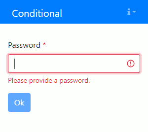
The initialization code is as follows:
passwd = component.Password("passwd", form)
passwd.label = "Password"
passwd.add_validation(
    required=True,
    minLength=8,
    customMessage={
        "required": "Please provide a password.",
        "minLength": "Password shall have at least {{ length }} characters.",
    },
)

ok = component.Button("ok", form)
ok.label = "Ok"
ok.disableOnInvalid = True
passwd = component.Password("passwd", form);
passwd.label = "Password";
passwd.addValidation( ...
    required=true, ...
    minLength=8, ...
    customMessage=struct( ...
        "required",  "Please provide a password.", ...
        "minLength", "Password shall have at least {{ length }} characters.") ...
    );

ok = component.Button("ok", form);
ok.label = "Ok";
ok.disableOnInvalid = true;