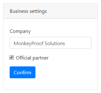
The Panel component
Panels can be used to wrap groups of components with a label and styling.

In addition to the properties and methods listed below, this component inherits properties and methods from the superclass Component. For example, any Panel component has a label and hidden property even though these are not explicitly listed here.
Properties
| Name | Description | Datatype | Default |
|---|---|---|---|
| theme | The theme/style of the Panel. Any valid Bootstrap Panel theme can be selected: primary, success, default etc. | String | 'default' |
| collapsible | Whether or not the Panel can be collapsed and expanded. | Boolean | False |
| collapsed | Whether or not the Panel is collapsed when the form is initialized. This is ignored when the collapsible property is set to false. | Boolean | False |
| tableView | When true and the component is part of an EditGrid, the component's value is shown (simplified) in the collapsed row of the EditGrid. | Boolean | False |
Methods
| Name | Syntax | Description |
|---|---|---|
| addComponent | obj.addComponent(component1, component2) | Add components to the Panel. |
See also
- Component nesting
- Container and Well components can be used in a similar fashion.