The DataTables component
The DataTables component uses datatables.net to efficiently render an HTML table. It is a highly customizable component featuring support for pagination, searching, sorting and editing of its contents. Unlike the other tables in Simian GUI, the DataTables component does not contain any subcomponents. This implies that validation, conditionals, etc. for columns or cells works differently than with the native Form.io tables and grids.
This component inherits properties and methods from the superclass Component. For example, any DataTables component has a label and hidden property even though these are not explicitly listed here.
Properties
| Name | Description | Datatype | Default |
|---|---|---|---|
| tableView | When true and the component is part of an EditGrid, the component's value is shown (simplified) in the collapsed row of the EditGrid. | Boolean | False |
Methods
| Name | Syntax | Description |
|---|---|---|
| setOutputAs | obj.setOutputAs(outputType) | Set the output type used by getSubmissionData. The default is a list of dicts (in Python) or a struct array (in MATLAB). The value can be converted to a pandas DataFrame or a MATLAB table. |
Basic use
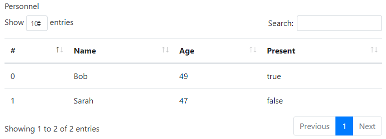
The basic creation of a datatables component with all default settings is as follows:
# Create the component and set the label.
dt = component.DataTables('dt', form)
dt.label = 'Personnel'

# Specify the column titles and names.
dt.setColumns(['#', 'Name', 'Age', 'Present'], ['id', 'name', 'age', 'present'])

# The value is a list of objects. The fields must match the column names.
# The first column with name 'id' is mandatory and must contain unique values.
dt.defaultValue = [
    {'id': 0, 'name': 'Bob', 'age': 49, 'present': True},
    {'id': 1, 'name': 'Sarah', 'age': 47, 'present': False}
]
% Create the component and set the label.
dt          = component.DataTables('dt', form);
dt.label    = 'Personnel';

% Specify the column titles and names.
dt.setColumns({'#', 'Name', 'Age', 'Present'}, {'id', 'name', 'age', 'present'});

% The value is an array of objects. The fields must match the column names.
% The first column with name 'id' is mandatory and must contain unique values.
dt.defaultValue = struct(...
    'id', {0, 1}, ...
    'name', {'Bob', 'Sarah'}, ...
    'age', {49, 47}, ...
    'present', {true, false});
In order for DataTables to identify the individual rows, it is mandatory that the first column is named id and contains unique values. The column may be hidden if that is preferrable. Furthermore, the fields/keys entered in your default values must match the columns you have specified when calling the setColumns method. It is therefore highly recommended to call setColumns before setting the default value of the DataTables component.
Note: the value and options for the datatable must adhere to the DataTables API. Failing to do so may lead to incorrect rendering of the table or warning dialogs popping up.
Reading the data
After initialization, the current data of a DataTables component can be obtained by using the getSubmissionData utility function.
In Python, this returns a pandas DataFrame. MATLAB returns a table. The syntax for both languages is the same:
data = utils.getSubmissionData(payload, "my_key");
New rows can be obtained using the static method getNewRows:
payload, new_rows = component.DataTables.getNewRows(payload, key,
    parent=parent_key, nested_form=nested_form_key)
[payload, newRows] = component.DataTables.getNewRows(payload, key, ...
    "Parent", parentKey, "NestedForm", nestedFormKey);
For this method, new rows is defined as all rows added by the user since the last time this method was called (or since initialization if it is the first call). This means that if you call this method twice during a single gui_event, the second call will not return any new rows.
The inputs to this method are the same as those for getSubmissionData. It outputs the payload and the new rows. In MATLAB, this returns a table. Python returns a pandas DataFrame. New rows obtained with this method will have a UUID in their id column. New rows that are not obtained using this method, but through using getSubmissionData, will have that UUID prefixed with new-.
Setting the data
After initialization, the data of a DataTables component can be set from the back-end by using the setSubmissionData utility function.
In Python the data may be:
- A list of lists with the inner lists being the values per row.
- A list of dicts with a dict per row and the dict's keys named after the keys of the columns.
- A dict of lists with the dict's keys named after the keys of the columns. The lists are the columns' contents.
- A pandas DataFrame with columns named after the keys of the DataTable's columns.
In MATLAB, the data can have the following shapes:
- Cell/string/numeric/logical array with one element per cell in the DataTables component.
- Table with variable names equal to the keys of the columns.
- Struct with fields named after the keys of the columns.
The syntax is:
utils.setSubmissionData(payload, "my_key", data)
payload = utils.setSubmissionData(payload, "my_key", data);
Pagination
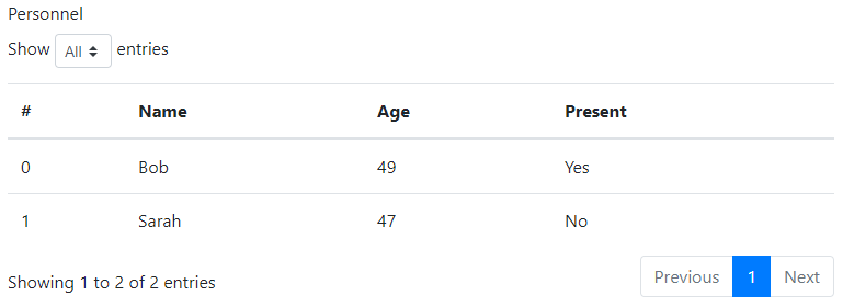
Without configuration, pagination is enabled. It allows the user to choose between 10 (default), 25, 50 or 100 entries per page.
Pagination can be disabled with dt.setFeatures(paging=False).
The dropdown menu to choose the page length can be disabled with dt.setFeatures(lengthChange=False).
The options in the dropdown menu can be customized with the lengthMenu option, for example:
dt.setOptions(lengthMenu=[[10, 25, 50, -1], [10, 25, 50, "All"]])
dt.setOptions('lengthMenu', {{10, 25, 50, -1}, {10, 25, 50, "All"}});
The default number of entries on a page can be specified with dt.setOptions(pageLength=25).
Searching

Without configuration, searching is enabled for all columns.
Searching can be disabled with dt.setFeatures(searching=False).
To only search in selected columns, use the searchable option of the colums:
dt.setColumns(
    ['#', 'Name', 'Age', 'Present'],
    ['id', 'name', 'age', 'present'],
    searchable=[False, True, True, False]
)
dt.setColumns(...
    {'#', 'Name', 'Age', 'Present'}, ...
    {'id', 'name', 'age', 'present'}, ...
    'searchable', [false, true, true, false]);
Other searching options can be specified with dt.setOptions(search=<string>, caseInsensitive=<boolean>, ...) and dt.setOptions(searchCols=[...]). The input given must follow the datatables.net reference.
Ordering

Without configuration, ordering is enabled for all columns.
Ordering can be disabled with dt.setFeatures(ordering=False).
To only enable ordering for selected columns, use the orderable option of the colums:
dt.setColumns(
    ['#', 'Name', 'Age', 'Present'],
    ['id', 'name', 'age', 'present'],
    orderable=[False, True, True, False]
)
dt.setColumns(...
    {'#', 'Name', 'Age', 'Present'}, ...
    {'id', 'name', 'age', 'present'}, ...
    'orderable', [false, true, true, false]);
A default sorting order can be specified with dt.setOptions(order=[[0, 'asc'], [1, 'desc']])
For other ordering options for the datatables or its columns please see the datatables.net reference.
Hidden columns
Columns can be hidden using the visible option of the columns. Note that hidden columns are still searchable but can be disabled as described here
dt.setColumns(
    ['#', 'Name', 'Age', 'Present'],
    ['id', 'name', 'age', 'present'],
    visible=[False, True, True, True]
)
dt.setColumns(...
    {'#', 'Name', 'Age', 'Present'}, ...
    {'id', 'name', 'age', 'present'}, ...
    'visible', [false, true, true, true]);
Editing
DataTables has several methods of editing, that can be enabled or disabled with dt.setEditorMode(<bool>). As additional arguments can be specified:
enableAddButtonshows the New button, which opens a dialog to create a new row.enableEditButtonshows the Edit button, which opens a dialog to edit the selected row(s). When the edit button is not enabled, inline editing is enabled.enableDelButtonshows the Delete button, which deletes row(s) after confirmation.enableKeyNavigation, in combination with inline editing, allows the user to navigate the table using the arrow keys.cssSelectorForInlineModeallows the user to specify a CSS selector to determine which columns can be edited.
The default for boolean arguments is false. The cssSelectorForInlineMode allows editing all columns except id.
Inline editing
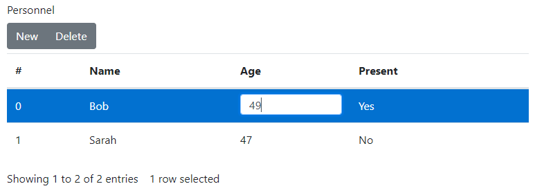
The default mode is inline editing. This mode is activated when the enableEditButton option is false or undefined.
Without further configuration, all but the first column are editable.
To confirm the new value, the user must press enter. All other actions, such as tabbing or stepping out of the field, cancel the change.
dt.setEditorMode(True, enableAddButton=True, enableDelButton=True)
dt.setEditorMode(true, 'enableAddButton', true, 'enableDelButton', true);
Modal editing
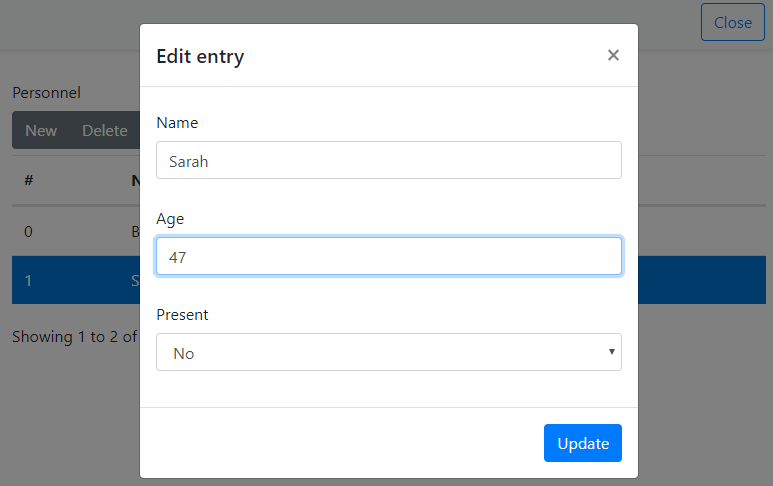
The alternative to inline editing is modal editing. This mode is activated when the enableEditButton option is true. Without further configuration, all but the first column are editable. To edit, select a row and click the edit button.
dt.setEditorMode(
    True,
    enableAddButton=True,
    enableEditButton=True,
    enableDelButton=True
)
dt.setEditorMode(...
    true, ...
    'enableAddButton', true, ...
    'enableEditButton', true, ...
    'enableDelButton', true);
Disable columns
Let's say that only the Age field may be edited by the user. To indicate the inaccessible columns, they get the muted-text CSS class.
dt.setColumns(
    ['#', 'Name', 'Age', 'Present'],
    ['id', 'name', 'age', 'present'],
    className=['text-muted', 'text-muted', None, 'text-muted']
)
dt.setColumns(...
    {'#', 'Name', 'Age', 'Present'}, ...
    {'id', 'name', 'age', 'present'}, ...
    'className', {'text-muted', 'text-muted', missing, 'text-muted'});
To disable inline editing this class is used to exclude the columns using a CSS selector. Note that this has no effect on the modal editing or creating new rows.
dt.setEditorMode(True, cssSelectorForInlineMode=':not(.text-muted)')
dt.setEditorMode(true, 'cssSelectorForInlineMode', ':not(.text-muted)');
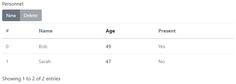
To disable modal editing the editor fields need to be specified. This can be done using the setEditorFields method. The types of the noneditable fields are set to readonly or hidden.
dt.setEditorFields(type=["hidden", "readonly", "", "hidden"])
dt.setEditorFields("type", ["hidden", "readonly", missing(), "hidden"])
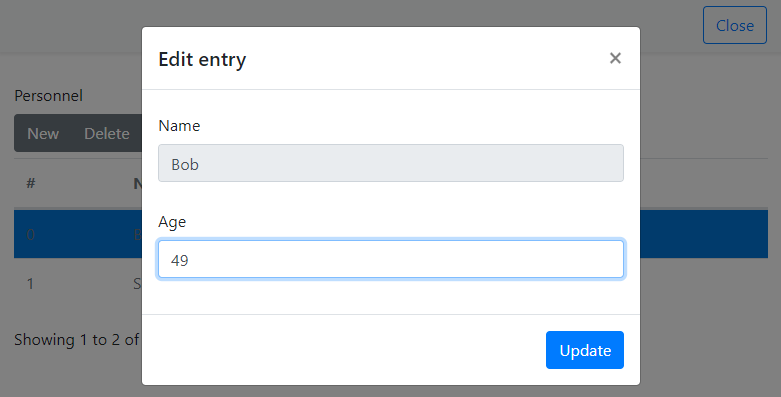
Custom rendering and editing
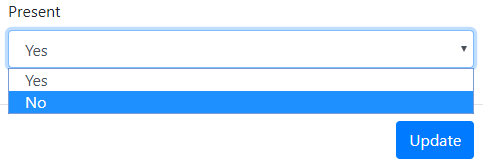
Sometimes, columns have a datatype that only takes a limited number of values, such as an enumeration or boolean. In these cases a text field is not the most user friendly way to let the user specify a value. DataTables supports various kinds of input fields, in this example the select box is shown.
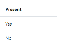
The Present field in the example is a boolean. Without customization it would be a text field containing "true" or "false" as text value.
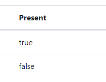
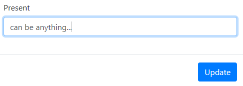
To show the value as "Yes" or "No" instead, a custom renderer can be used.
This requires adding a custom Javascript function as described in Use custom Javascript.
The getBooleanRenderer function returns an inner function that can be used by DataTables' columns.render.
The inner function can access variables in the parent scope, in this case used for t and f.
function getBooleanRenderer(t, f) {
    return function (data, type, row) {
        if (type === 'display') {
            return data ? t : f;
        }

        return data;
    };
}
To tell the table to use the custom renderer for the Present column, the render option is set on the last column.
dt.setColumns(
    ['#', 'Name', 'Age', 'Present'], ['id', 'name', 'age', 'present'],
    render=[
        None,
        None,
        None, {
            'function': 'getBooleanRenderer',
            'arguments': ['Yes', 'No']
        }
    ]
)
dt.setColumns(...
    {'#', 'Name', 'Age', 'Present'}, {'id', 'name', 'age', 'present'}, ...
    'render', struct(...
    'function', {missing, missing, missing, 'getBooleanRenderer'}, ...
    'arguments', {missing, missing, missing, {'Yes', 'No'}}));
In order to edit the value using a select box, the editor fields need to be manually specified. This works for both editor modes.
The boolean field is set to 'type': 'select' and options are specified to configure it (see DataTables' select)
dt.setEditorFields(type=["hidden", "text", "text", "select"],
    options=[{}, {}, {}, {"Yes": True, "No": False}])
dt.setEditorFields("type", ["hidden", "text", "text", "select"], ...
    "options", {[], [], [], struct("Yes", true, "No", false)});
Large tables
For tables that contain a large amount of data, it is recommended to only render one page at a time, using the deferRender feature.
dt.setFeatures(deferRender=True)
dt.setFeatures('deferRender', true);
Other options
DataTables have many options and we cannot support all of them. However, we allow a large subset to be specified. Note: error checking and validation for the various options ranges from non-existent to incomplete. Incorrect settings may cause rendering issues, Javascript errors or popup alerts. Use on your own responsibility.
The tables in the following sections show a mapping of the options that can be set using the provided functions. The section name refers to the function that can be used to specify the options. This function name in turn refers to a section in the datatables reference or datatables editor reference.
The left column is the name of the name-value argument to specify in the function. The right column is the name of the corresponding option(s) in the datatables options.
setFeatures
| Parameter key | DataTables reference |
|---|---|
| autoWidth | autoWidth |
| deferRender | deferRender |
| info | info |
| lengthChange | lengthChange |
| ordering | ordering |
| paging | paging |
| processing | processing |
| scrollX | scrollX |
| scrollY | scrollY |
| searching | searching |
| serverSide | serverSide |
| stateSave | stateSave |
setCallbacks
| Parameter key | DataTables reference |
|---|---|
| createdRow | createdRow |
| drawCallback | drawCallback |
| footerCallback | footerCallback |
| formatNumber | formatNumber |
| headerCallback | headerCallback |
| infoCallback | infoCallback |
| initComplete | initComplete |
| preDrawCallback | preDrawCallback |
| rowCallback | rowCallback |
| stateLoadCallback | stateLoadCallback |
| stateLoadParams | stateLoadParams |
| stateLoaded | stateLoaded |
| stateSaveCallback | stateSaveCallback |
| stateSaveParams | stateSaveParams |
setOptions
| Parameter key | DataTables reference |
|---|---|
| deferLoading | deferLoading |
| displayStart | displayStart |
| lengthMenu | lengthMenu |
| order | order |
| orderCellsTop | orderCellsTop |
| orderClasses | orderClasses |
| orderFixed | orderFixed |
| orderMulti | orderMulti |
| pageLength | pageLength |
| pagingType | pagingType |
| scrollCollapse | scrollCollapse |
| searchCols | searchCols |
| searchDelay | searchDelay |
| stateDuration | stateDuration |
| stripeClasses | stripeClasses |
| tabIndex | tabIndex |
| caseInsensitive | search.caseInsensitive |
| regex | search.regex |
| return (Python) | search.return (Matlab) _return |
| search | search.search |
| smart | search.smart |
setColumns
| Parameter key | DataTables reference |
|---|---|
| ariaTitle | ariaTitle |
| className | className |
| contentPadding | contentPadding |
| defaultContent | defaultContent |
| orderData | orderData |
| orderDataType | orderDataType |
| orderSequence | orderSequence |
| orderable | orderable |
| searchable | searchable |
| type | type |
| visible | visible |
| width | width |
| createdCell | createdCell |
| render | render |
setEditorFields
| Parameter key | DataTables reference |
|---|---|
| className | fields.className |
| default | fields.def |
| fieldInfo | fields.fieldInfo |
| labelInfo | fields.labelInfo |
| message | fields.message |
| multiEditable | fields.multiEditable |
| nullDefault | fields.nullDefault |
| type | fields.type |
| options | fields.options |
setInternationalisation
| Parameter key | DataTables reference |
|---|---|
| decimal | language.decimal |
| emptyTable | language.emptyTable |
| info | language.info |
| infoEmpty | language.infoEmpty |
| infoFiltered | language.infoFiltered |
| infoPostFix | language.infoPostFix |
| lengthMenu | language.lengthMenu |
| loadingRecords | language.loadingRecords |
| processing | language.processing |
| search | language.search |
| searchPlaceholder | language.searchPlaceholder |
| thousands | language.thousands |
| url | language.url |
| zeroRecords | language.zeroRecords |
| sortAscending | language.aria.sortAscending |
| sortDescending | language.aria.sortDescending |
| first | language.paginate.first |
| last | language.paginate.last |
| next | language.paginate.next |
| previous | language.paginate.previous |
setSelect
| Parameter key | DataTables reference |
|---|---|
| blurable | blurable |
| className | className |
| info | info |
| items | items |
| selector | selector |
| style | style |
| toggleable | toggleable |
setEditorInternationalisation
| Parameter key | DataTables reference |
|---|---|
| close | close |
| create | create |
| datetime | datetime |
| edit | edit |
| error | error |
| multi | multi |
| remove | remove |