The DataGrid component
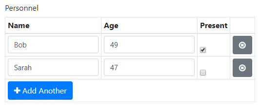
The DataGrid component is a table with components that are set per column.
Users can add, remove and edit rows.
The DataGrid can also be filled from the back-end by setting values for all table cells in the submission data.
Use the setContent method to automatically create the components for the DataGrid without filling them with data.
Note that you can use Layout components to create more elaborate cell contents.

In addition to the properties and methods listed below, this component inherits properties and methods from the superclass Component. For example, any DataGrid component has a label and tooltip property even though these are not explicitly listed here.
Properties
| Name | Description | Datatype | Default |
|---|---|---|---|
| addAnother | Text to display on the button for adding more rows. | String | 'Add another' |
| addAnotherPosition | Position of the buttons for adding or removing rows. | String | 'bottom' |
| condensed | Whether or not the rows are condensed (narrow). | Boolean | False |
| disableAddingRemovingRows | When set to true, users cannot add or remove rows, only edit the existing ones. | Boolean | False |
| enableRowGroups | Whether to enable groups of rows in the DataGrid. See the rowGroups property. | Boolean | False |
| hover | Whether or not rows are highlighted when a user hovers over them. | Boolean | False |
| initEmpty | Whether to initialize the DataGrid without rows. | Boolean | False |
| layoutFixed | When set to true, the widths of all columns are equal. | Boolean | False |
| reorder | Whether or not rows are allowed to be reordered by the user. | Boolean | False |
| rowGroups | Create groups of rows in the DataGrid with this property. Must be list of dicts / an array of structs with fields:
setRowGroups method. | Dict/Struct | |
| striped | Whether or not the rows should be striped in an alternating way (white-gray). | Boolean | False |
| tableView | When true and the component is part of an EditGrid, the component's value is shown (simplified) in the collapsed row of the EditGrid. | Boolean | False |
Methods
| Name | Syntax | Description |
|---|---|---|
| getColumn | column = obj.getColumn(keyOrLabel) | Returns the component of the DataGrid's column with the given key or label. Tries to match keyOrLabel with the component keys first and if no matches were found, matches the labels. |
| setContent | obj.setContent(labels, keys, types, editable, options) | Add components to a DataGrid component with given column labels and component keys, types and editability. When the editability is left out, all components will be editable for users. |
| setOutputAs | obj.setOutputAs(outputType) | Set the output type used by getSubmissionData. The default is a list of dicts (in Python) or a struct array (in MATLAB). The value can be converted to a pandas DataFrame or a MATLAB table. |
| setRowGroups | obj.setRowGroups(labels, nRowsPerGroup, rowNames) | Set the DataGrid component to use row groups with given labels and number of rows. Optionally, the DataGrid is initialized with row names in the first column. An example on using this method is given below. |
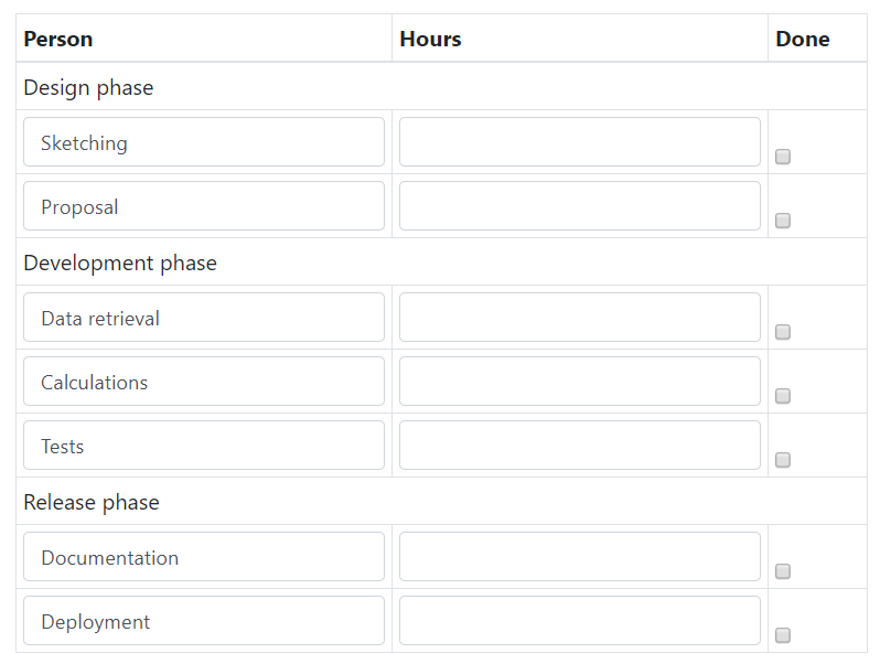
An example of how the setRowGroups method can be used is shown below:
colNames = ["Person", "Hours", "Done"]
keys = [col.lower() for col in colNames]
loggingTable = component.DataGrid("logging", form)
loggingTable.setContent(colNames, keys, ["TextField", "Number", "Checkbox"])

groupLabels = ["Design phase", "Development phase", "Release phase"]
nRowsPerGroup = [2, 3, 2]
rowNames = ["Sketching", "Proposal", "Data retrieval", "Calculations",
    "Tests", "Documentation", "Deployment"]
loggingTable.setRowGroups(groupLabels, nRowsPerGroup, rowNames)
colNames        = ["Person", "Hours", "Done"];
loggingTable    = component.DataGrid("logging", form);
loggingTable.setContent(colNames, lower(colNames), ["TextField", "Number", "Checkbox"]);

groupLabels     = ["Design phase", "Development phase", "Release phase"];
nRowsPerGroup   = [2, 3, 2];
rowNames        = ["Sketching", "Proposal", "Data retrieval", "Calculations", ...
    "Tests", "Documentation", "Deployment"];
loggingTable.setRowGroups(groupLabels, nRowsPerGroup, rowNames);
The resulting DataGrid after initialization is as follows:

When using this method, the number of group labels must match the number of elements in nRowsPerGroup.
If the rowNames input is used, the first component of the DataGrid must be a TextField and the number of row names must be equal to the sum of nRowsPerGroup.
Default value
You can set the initial value of the DataGrid (and EditGrid) by setting the defaultValue property of the component.
In MATLAB, this can be a table with columns named after the keys of the components that you provided when calling setContent.
Alternatively, it can be a list of dicts (Python) or a struct array (MATLAB), with fields equal to the keys of the DataGrid's components.
columnNames = ["Name", "Age", "Available"]
keys        = [x.lower() for x in columnNames]
users       = component.DataGrid("users", form)
users.setContent(columnNames, keys, ["TextField", "Number", "Checkbox"])

users.defaultValue = [{
    keys[0]: "Marie",
    keys[1]: 39,
    keys[2]: False}, {
    keys[0]: "Hank",
    keys[1]: 43,
    keys[2]: True}
]
columnNames = ["Name", "Age", "Available"];
keys        = lower(columnNames);
users       = component.DataGrid("users", form);
users.setContent(columnNames, keys, ["TextField", "Number", "Checkbox"]);

% Two ways of setting the default value of the DataGrid.
users.defaultValue = struct(keys(1), {"Marie", "Hank"}, keys(2), {39, 43}, ...
    keys(3), {false, true});
users.defaultValue = table(["Marie"; "Hank"], [39; 43], [false; true], ...
    'VariableNames', keys);
The default values of rows added by the user (if enabled) can be set by setting the defaultValue property of the relevant component:
users.disableAddingRemovingRows = False
users.components[1].defaultValue = 18
users.components[2].defaultValue = True
users.disableAddingRemovingRows = false;
users.components{2}.defaultValue = 18;
users.components{3}.defaultValue = true;
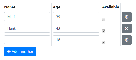
Initializing the DataGrid using the default values above and then adding one row yields:

See also
- The EditGrid component is very similar to the DataGrid, but has an expandable row in which elements can be edited.
- If your DataGrid has many rows, performance may be improved by using a DataTables component instead of a DataGrid. This also provides many additional features for displaying and editing table data.