MATLAB
The Plotly component creates a Plotly figure in which data can be visualized.
In addition to the properties and methods listed below, this component inherits properties and methods from the superclass Component. For example, any Plotly component has a label and hidden property even though these are not explicitly listed here.
Properties
| Name | Description | Datatype | Default |
|---|---|---|---|
| defaultValue | Default settings for the Plotly figure. This will be an object of type utils.Plotly (described below) by default. An example on how to use this property to create an initial plot is given below. | utils.Plotly | utils.PlotlyThis hides the Plotly logo in the toolbar at the top. |
| tableView | When true and the component is part of an EditGrid, the component's value is shown (simplified) in the collapsed row of the EditGrid. | Boolean | False |
utils.Plotly
The utils.Plotly class provides methods that resemble MATLAB plotting functions with which data can be presented in several chart types.
When the Plotly utils class object is put in the payload and returned to the form, the created plot is shown in the form.
Since the data to plot is often calculated based on certain inputs, the Plotly utils class object is often added in the guiEvent function, as illustrated by the example below the properties and methods described next.
utils.Plotly properties
| Name | Description | Datatype | Default |
|---|---|---|---|
| config | Additional configuration of the plot such as toggling responsiveness or zooming. | Struct | struct("displaylogo", false) |
| data | Data to be shown in the figure. | Cell | {} |
| layout | Layout to be used in the figure | Struct | struct() |
utils.Plotly methods
| Name | Syntax | Description |
|---|---|---|
| area | obj.area(varargin) | Add a series to an area plot. |
| bar | obj.bar(varargin) | Add a series to a bar plot. |
| boxplot | obj.boxplot(varargin) | Add a box to a box plot. |
| bubblechart | obj.bubblechart(varargin) | Add bubbles to the bubble chart. |
| contour | obj.contour(varargin) | Add a series to a contour plot. |
| clf | obj.clf(keepLayout) | Clear the plot. Use obj.clf(true) to keep the title, legend, etc. and only reset the data and config properties. |
| legend | obj.legend(varargin) | Add a legend to a plot. |
| loglog | obj.loglog(varargin) | Add a series to a 2-D plot. |
| pie | obj.pie(varargin) | Add a series to a pie chart. |
| plot | obj.plot(varargin) | Add a series to a 2-D plot. |
| plot3 | obj.plot3(varargin) | Add a series to a 3-D plot. |
| polarplot | obj.polarplot(varargin) | Add a series to a 2-D polarplot. |
| semilogx | obj.semilogx(varargin) | Add a series to a 2-D plot. |
| semilogy | obj.semilogy(varargin) | Add a series to a 2-D plot. |
| surf | obj.surf(varargin) | Add a series to a surface plot |
| title | obj.title(varargin) | Add a title to a plot. |
| xlabel | obj.xlabel(varargin) | Add a xlabel to a plot. |
| ylabel | obj.ylabel(varargin) | Add a ylabel to a plot. |
| preparePayloadValue | plot_dict = preparePayloadValue(self) | Prepares a dict representation of the figure in the Plotly component, which can be put in the payload without using setSubmissionData. |
| addShape | obj.addShape(data, advancedPaths=false) | Add a shape to the Plotly figure. Where data is a cell array of structs. |
| getShapes | shapes = obj.getShapes(advancedPaths=false) | Process the raw shape definitions to get x and y data in a cell array of structs. |
Usage
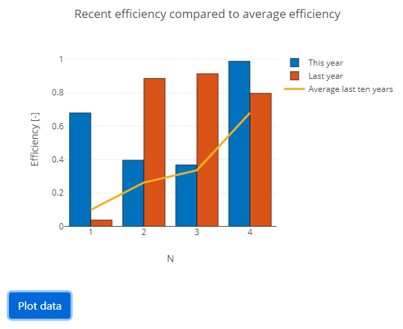
Below is an example illustrating the MATLAB plotly functionality. You can call multiple plotting functions on the same Plotly object to plot multiple things in the same figure. The resulting plot is shown below the code.
function payload = guiInit(metaData)
    form            = Form();
    payload.form    = form;
    component.Plotly("my_plot", form);

    % When this button is clicked, the data is plotted.
    btn         = component.Button("plot_data", form);
    btn.label   = "Plot data";
    btn.setEvent("PlotData");
end
function payload = guiEvent(metaData, payload)
    plotObj = utils.getSubmissionData(payload, "my_plot");
    plotObj.clf();

    % Add a line plot and a bar chart in the same figure.
    nPoints = 4;
    plotObj.bar(1:nPoints, rand(nPoints, 2));
    plotObj.plot(1:nPoints, rand(nPoints, 1), "LineWidth", 3);

    % Add peripherals such as labels etc.
    plotObj.title("Recent efficiency compared to average efficiency");
    plotObj.xlabel("N");
    plotObj.ylabel("Efficiency [-]");
    plotObj.legend("This year", "Last year", "Average last ten years");

    payload = utils.setSubmissionData(payload, "my_plot", plotObj);
end

The same plot can also be achieved during initialization by calling the methods above on the object in the defaultValue property of the Plotly component object:
function payload = guiInit(metaData)
    form            = Form();
    payload.form    = form;

    % Add a Plotly component and add a line plot and a bar chart in the same figure.
    comp    = component.Plotly("plot", form);
    nPoints = 4;
    comp.defaultValue.bar(1:nPoints, rand(nPoints, 2));
    comp.defaultValue.plot(1:nPoints, rand(nPoints, 1), "LineWidth", 3);

    % Add peripherals such as labels etc.
    comp.defaultValue.title("Recent efficiency compared to average efficiency");
    comp.defaultValue.xlabel("N");
    comp.defaultValue.ylabel("Efficiency [-]");
    comp.defaultValue.legend("This year", "Last year", "Average last ten years");

    % When this button is clicked, the data is plotted.
    btn         = component.Button("plot_data", form);
    btn.label   = "Plot data";
    btn.setEvent("PlotData");
end
In addition to the chart types available through the methods of the Plotly class,
you can use all functionality from the Python Plotly library if you set the submission data such that it can be interpreted as a Plotly component correctly.
For example, you can change the font-size of the ticks on the x-axis using plotObj.layout.xaxis.tickfont.size = 10;.