Validate
Most components are able to perform some validation of the values that are provided by the user of the app. The validation takes place in the browser window, before any submission data is sent to the backend. This makes the validation a very convenient method to give an early warning to the user that a provided value is incorrect, without impacting performance of the application. However, for secure deployment of apps, it is required to also perform validation of user provided values in the backend before using them.
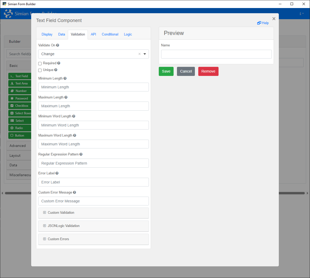
Validation can be configured using the Builder. Each component has a Validation tab that shows the available options.
To add validation programmatically, create a Validate object for the component and set its properties to define the validation criteria. Alternatively, use the Component's addValidation method or the static Validate.create method.
Properties
| Name | Description | Datatype | Default |
|---|---|---|---|
| required | When set to true, the component must have a value before the form can be submitted via a button. | Boolean | False |
| minLength | Checks the minimum length for text input. | Integer | |
| maxLength | Checks the maximum length for text input. | Integer | |
| minWords | Checks the minimum number of words for text input. | Integer | |
| maxWords | Checks the maximum number of words for text input. | Integer | |
| pattern | Checks the text input against a regular expression pattern. | String | |
| custom | A custom JavaScript based validation. See section Custom JavaScript. | String | |
| json | Custom validation specified using JSON logic. | Json | |
| customMessage | Specify a custom message to be displayed when the validation fails. For more advanced custom messages, see the Error class. | String | |
| min | For Number components, the minimum value. | Double | |
| max | For Number components, the maximum value. | Double | |
| step | For Number components, the granularity of the input value. | Double | |
| integer | For Number components, whether or not the value must be a whole number. | Boolean |
Methods
| Name | Syntax | Description |
|---|---|---|
| create | create(component, prop=value, ...) | Create a Validation object with the specified settings for the component. |
Example
The following example shows a form with a Password that has a validation on the minimum number of characters in the input.
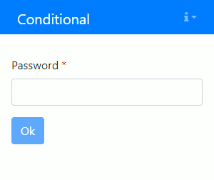
The initialization code is as follows:
passwd = component.Password("passwd", form)
passwd.label = "Password"

passwd.add_validation(
    required=True,
    minLength=8,
    customMessage="Password shall have at least 8 characters.",
)

ok = component.Button("ok", form)
ok.label = "Ok"
ok.disableOnInvalid = True
passwd = component.Password("passwd", form);
passwd.label = "Password";

passwd.addValidation( ...
    required=true, ...
    minLength=8, ...
    customMessage="Password shall have at least 8 characters.");

ok = component.Button("ok", form);
ok.label = "Ok";
ok.disableOnInvalid = true;