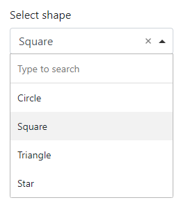
The Select component
Use the Select component to let the user select an option from a dropdown list.

In addition to the properties and methods listed below, this component inherits properties and methods from the superclass Component. For example, any Select component has a label and defaultValue property even though these are not explicitly listed here.
Properties
| Name | Description | Datatype | Default |
|---|---|---|---|
| dataSrc | Source of the data to show as options. Can be 'values', 'json', 'url', 'resource' or 'custom'. At the moment, only the 'values' and 'custom' options are supported. | String | 'values' |
| data | The data to use for the options of the Select component. See below for more details | Dict/Struct | |
| refreshOn | The key of a field within the form that will trigger a refresh for this field if its value changes. | String | |
| searchEnabled | Whether to allow searching for an option. | Boolean | True |
| template | HTML template that defines how the Select options are shown. You can use the item variable to access the selectable objects. | string | "<span>{{ item.label }}</span>" |
| valueProperty | The property of the selectable items to store as the value of this component. This is useful when the selectable items are objects, but only one property of the object is to be used as the value of this component. | String | |
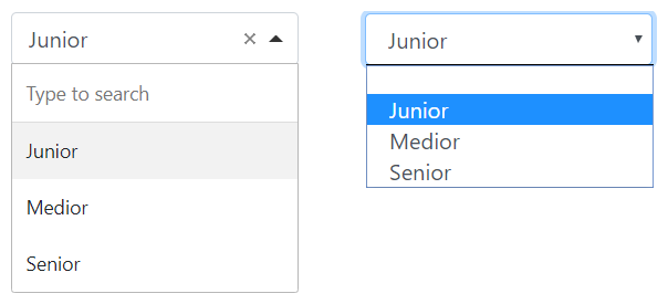
| widget | The type of widget to use for this component. Can be choicesjs and html5. The difference between the two is shown below. | String | "choicesjs" |
Methods
| Name | Syntax | Description |
|---|---|---|
| setValues | obj.setValues(labels, values, default) | Set the labels and accompanying values. This sets the values property of the Select component. dataSrc is set to 'values'. Optionally, provide the label or value of the option to choose by default. |
The data property
The data property contains the values that are available in the Select component.
-
When
dataSrcis set to'values', thedataproperty must contain a dict/struct with key'values', which must contain an list/array of dicts/structs with fields:-
label: Text to display for the option. -
value: Value of the option.The
setValuesmethod provides a simpler way to define the labels and values.
-
-
When
dataSrcis set to'custom', thedataproperty must contain a dict/struct with key'custom', which may contain JavaScript code that fills avaluesvariable with:-
a list of objects. For instance:
```JavaScript values = [ {"label": "A", "value": "a"}, {"label": "B", "value": "b"}, {"label": "C", "value": "c"} ]; ``` The labels of the objects are shown in the Select component. The selected value depends on the Select component's `valueProperty` setting. -
a list of labels. For instance:
```JavaScript values = ["A", "B", "C"]; ``` This puts the letters A to C in the Select component and also uses the labels as values. -
a reference to data of other components in the form. For instance:
```JavaScript
values = data.other_component_key;
```

This allows for changing the selectable options "after initialization", as described in [How to](../how_to/update_select.md).
-
The widget property
The widget property can be used to switch between a Choices.js widget and a regular HTML 5 select widget.
The visual difference between the two can be seen below, with on the left the Choices.js widget and on the right, the HTML 5 select widget.
The Choices.js widget allows the user to search for an option, whereas the HTML 5 widget does not.

See also
- Use the triggerHappy functionality to trigger an event whenever the value of the Select component is changed by the user.
- Change the options of a Select component after initialization as described in How to.