Use CSS classes
The appearance of components can be changed by adding CSS classes to the components. You can provide your own custom CSS classes, or use those defined in the Bootstrap theme that is provided with Simian.
Using CSS classes
Each of the component objects has a customClass property that can be leveraged to alter the appearance of the components by using CSS classes.
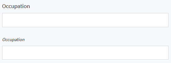
Use spaces to separate classes. For example, by using the following code, you can make the font of the label of a TextField component smaller and italic:
occupationTextField.addCustomClass("small", "font-italic")

% Alternatively:
occupationTextField.customClass = "small font-italic";
The textfields with and without custom classes are shown below.

Add your own CSS
You can add your own styles as well. This can be done in two ways:
- Add static CSS files.
- Use
FormmethodaddCustomCss.
CSS files
Create a css folder in the same (package) folder your gui_init and gui_event functions are in.
All files with .css extension will be added automatically.

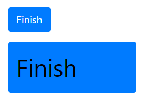
Consider the following .css file in the css folder:
.bigButton {
    color: black;
    font-size: 28pt;
    height: 80px;
    width: 200px;
    text-align: left;
}
Add the class to your button:
finishButton.customClass = "bigButton";
A comparison between buttons with and without custom classes:

A special CSS class that can be used is the "form-check-inline" class.
When this class is added to all components in a grouping component (like a Container or Panel), the components are laid out horizontally instead of vertically.
You can also add it to the individual components you wish to lay out horizontally. In the Example, two CheckBoxes in a Container have this CSS class:

addCustomCss method
The Form static method addCustomCss can be used to programmatically add custom CSS. This may be convenient when developing reusable components that need some custom CSS to be available when they are used.
The custom CSS is added in a <style> element in the header of the form.
Optionally, attributes for the <style> can be specified as a dictionary, where the values must be (convertible to) strings. For attributes that do not have a value, use None/missing.
When the href argument is specified, a <link rel="stylesheet" href="_"> element is created, that can be used for externally hosted stylesheets1.
Form.addCustomCss(".black-box {border: 1px solid black;}")

Form.addCustomCss(
    ".black-box {border: 1px solid black;}",
    attributes={"media": "print"},
)

Form.addCustomCss("", href="https://example.com/css/styles.css")
Form.addCustomCss(".black-box {border: 1px solid black;}");

Form.addCustomCss(...
    ".black-box {border: 1px solid black;}", ...
    "Attributes", struct("media", "print"));

Form.addCustomCss("", "Href", "https://example.com/css/styles.css");
Extra examples
In-line placing of components
How to place a Button next to a TextField
Removing inner border
In a component allowing multiple values to be set the extra border between the values may be removed with:
number.customClass = "no-inner-border"
Making your app narrower
Per default the contents of your app are laid out over the whole width of the screen. On wide screens this may result in a less usable app as components are spaced further apart.
To make the main contents of your app take up less screen width, you can use a FieldSet component with its customClass property set to 'container' and add the form contents to this FieldSet component.
Alternatively, you can add custom CSS definitions to your app and use those to make the app narrower. The following CSS snippet sets the maximum width of the app contents to '1000px'. To make the width scale with the font size, you can use '70rem'.
If you also want to make the Navbar use the same maximum width, put the contents of the .form-wrapper block in an html block.
.form-wrapper {
    max-width: 1000px;
    justify-self: center;
    margin-right: auto;
    margin-left: auto;
}
Note that cross-site protections may restrict access to certain domains, e.g.: MATLAB's uihtml restricts access to local files and some MathWorks domains. Discuss with your Simian Portal admin for options when deploying apps.