PropertyEditor
The PropertyEditor is a composed component, consisting of nested DataGrids that allow for showing and editing scalar and 1D arrays of text, numeric, boolean, and select values. Subclasses of this component can add support for additional data types.

Note that it is recommended to use only one or a few PropertyEditors in your app, as too many PropertyEditors may slow your app down.
In addition to the properties and methods listed below, this component inherits properties and methods from the superclass Component. For example, any PropertyEditor has a label and defaultValue property even though these are not explicitly listed here.
Methods
| Name | Syntax | Description |
|---|---|---|
| addDatatypeUtil | obj.addDatatypeUtil(parent, newDataTypes) | Add property editor components to the property editor in a subclass. |
| getInitializer | getInitializer(defaultValue=null, allowEditing=true, columnLabel="Properties", addAnother="Add value", hideWhenEmpty=true) | Return the parameterized initializer function for the Property Editor. |
| getValues | getValues(tableValues) | Get the values from the property Editor table payload values. |
| prepareValues | prepareValues(propMeta, propValues=null) | Prepare Editor contents for submission data. Note: does not validate values! |
| genericPropSetup | genericPropSetup(parType) | Generic property editor component initializer. |
Supported values
The PropertyEditor supports scalar and one dimensional array values of the following data types. The PropertyEditor dynamically adds rows with the listed Components to show the property values in.
text: values are shown in a TextField component.numeric: values are shown in a Number component.boolean: values are shown in a Checkbox component.select: values are shown in a Select component.
Properties must be specified as a list of dicts / cell array of structs with per property the following (mandatory) settings:
datatypeMandatory, data type of the property that is shown.label: Mandatory, label shown next to the values to inform the user on which property is shown.tooltip: {null}, tooltip to be added to the label of the property.required: {false}, whether the property must have a value.defaultValue: {null}, Value to be shown for the property.min: {null}, minimum value fornumericvalues.max: {null}, maximum value fornumericvalues.decimalLimit: {null}, maximum number of decimals allowed innumericvalues.allowed: {null}, The items that can be selected in aselectvalue.minLength: {1} Scalar, or minimum array length of 0 or more.maxLength: {1} Scalar, or maximum array length of 0 or more.
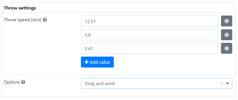
The PropertyEditor shown above can be created with the following settings. It allows for specifying between 1 and 5 throw attempt speeds and whether to include drag and/or wind in the simulation.
[
    {
        "datatype": "numeric",
        "label": "Throw speed [m/s]",
        "defaultValue": [12.51, 3.8, 5.41],
        "required": true,
        "minLength": 1,
        "maxLength": 5,
        "decimalLimit": 2
    },
    {
        "datatype": "select",
        "label": "Options",
        "allowed": ["None", "Drag", "Drag and wind"],
        "defaultValue": "Drag and wind",
        "required": true
    }
]
Usage
The following subsections describe how you can add the PropertyEditor to your web app and which options you can select, how to fill it and how to get the user selected values from the submission data.
Adding to web app
In the guiInit function of your app add a Composed component and set the className property to the full PropertyEditor class name.
Use the static getInitializer method to configure the PropertyEditor:
defaultValue: {null}, set the default value of thePropertyEditorby using the output of the staticprepareValuesmethod.allowEditing: {true}, set this optional input to false to create a property viewer.columnLabel: {"Properties"}, specify a label to show at the top of the outerDataGrid.addAnother: {"Add value"}, optional input that sets the label on the nestedDataGrid's button that adds new rows.hideWhenEmpty: {true}, ThePropertyEditoris hidden when empty. Set this optional input to false to ensure it is always shown.
Form.componentInitializer(
    editor=PropertyEditor.get_initializer(
        default_value=PropertyEditor.prepare_values([...]),
        column_label="Parameters",
    )
)

editor = component.Composed("editor", form_obj)
editor.className = "simian.gui.composed_component.PropertyEditor"
Form.componentInitializer(
    editor=PropertyEditor.getInitializer(
        defaultValue=PropertyEditor.prepareValues({}),
        columnLabel="Parameters",
    )
)

editor = component.Composed("editor", formObj)
editor.className = "simian.gui.composedComponent.PropertyEditor"
Filling with properties
The PropertyEditor can be filled with default values during initialization, as shown above, and in the callback of an event. To do this use the static prepareValues method and put the output in the submission data with the setSubmissionData utility function.
The prepareValues method accepts the properties' settings and values as separate inputs, making it easier to reuse static property settings. It also ensures that the property settings are divided over the expected locations in the PropertyEditor rows.
prep_values = PropertyEditor.prepare_values(
    prop_meta=[{"datatype": "numeric", "label": "Rotation [deg]"}],
    prop_values=[45],
)
utils.setSubmissionData(payload, key="editor", data=prep_values)
Getting property values
The property values selected by the user can be extracted from the full PropertyEditor submission data by using the static getValues method. The submission data also contains the property settings, which cannot be modified by the user.
table_values, _ = utils.getSubmissionData(payload, key="editor")
value_list = PropertyEditor.get_values(table_values)
Extending the PropertyEditor
When the PropertyEditor does not support all data types you need, you can extend it to add the support.
- create a subclass of the
PropertyEditor, - Extend the mapping of the data types and the unique keys of the corresponding components.
- In Python: extend the class property:
DICT_TYPE_CONTROL - In MATLAB: implement the Constant property:
SUB_STRUCT_TYPE_CONTROL
- In Python: extend the class property:
- In MATLAB: implement static
getValuesandprepareValuesmethods that send their inputs and the class'SUB_STRUCT_TYPE_CONTROLstruct as extra input argument to the corresponding Helper method. - create component objects for the new data types and add them with the addDatatypeUtil. Note that you cannot use initializer functions for these component.
- Note that any validation (including required) must be implemented as custom validation. Meta data is available as
row.meta.
In the guiInit function of your app set the className of the Composed component to the full name of your Editor class.
editor.className = "YourPropertyEditor"