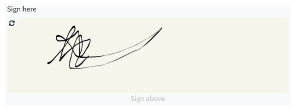
The Signature component
Users can draw a signature with this component.

In addition to the properties listed below, this component inherits properties and methods from the superclass Component. For example, any Radio component has a label and hidden property even though these are not explicitly listed here.
Properties
| Name | Description | Datatype | Default |
|---|---|---|---|
| footer | The text to display at the bottom of the component. | String | 'Sign above' |
| width | Width of the signature pad. | String | '100%' |
| height | Height of the signature pad. | String | '150px' |
| penColor | Color of the pen used to sign. | String | 'black' |
| backgroundColor | Background color of the signature pad. | String | 'rgb(245,245,235)' |
| tableView | When true and the component is part of an EditGrid, the component's value is shown (simplified) in the collapsed row of the EditGrid. | Boolean | False |