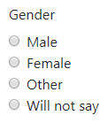
The Radio component
Defines the specifics of a set of options of which exactly one must be selected.

In addition to the properties and methods listed below, this component inherits properties and methods from the superclass Component. For example, any Radio component has a label and defaultValue property even though these are not explicitly listed here.
Properties
| Name | Description | Datatype | Default |
|---|---|---|---|
| values | Specifies the options the user can choose from. Must be an array of values where each item has the following fields:
setValues method. | Dict/Struct | |
| inline | If set to true, layout the radio buttons horizontally instead of vertically. | Boolean | False |
| optionsLabelPosition | Position of the text of every option with respect to the radio button. Can be 'right', 'left', 'top' or 'bottom'. | String | "right" |
| tableView | When true and the component is part of an EditGrid, the component's value is shown (simplified) in the collapsed row of the EditGrid. | Boolean | False |
Methods
| Name | Syntax | Description |
|---|---|---|
| setValues | obj.setValues(labels, values, default) | Set the labels and accompanying values. This sets the values property of the Radio component. Optionally, provide the label or the value of the option to select by default. |
By using the setValues method, the example Radio component above can be created using:
gender = component.Radio("gender_radio", form)
gender.label = "Gender"
gender.setValues(["Male", "Female", "Other", "Will not say"],
    ["m", "f", "o", "wns"])
gender          = component.Radio("gender_radio", form);
gender.label    = "Gender";
gender.setValues(["Male", "Female", "Other", "Will not say"], ...
    ["m", "f", "o", "wns"])
See also
- Use the triggerHappy functionality to trigger an event whenever the value of the Radio component is changed by the user.
- The Checkbox component allows for multiple selections at once.
- The Selectboxes lets you define a group of checkboxes in a similar fashion as the Radio component.
- The Survey component uses Radio buttons to ask several questions, each of them with the same set of possible answers.