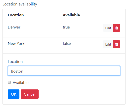
The EditGrid component
The EditGrid component is a table like component with an adjustable number of rows. Each row contains the same set of components that are children of the EditGrid component. The components can be layout components containing other components, making the EditGrid more flexible than a DataGrid.
The tableView property of components specifies whether their (simplified) values are to be shown in the 'saved'/collapsed state of the EditGrid rows. The labels of these components are used as column headers of the EditGrid.
The values of the components cannot be edited immediately. Each row contains an 'Edit' button, which brings the row in an 'edit'/expanded mode, showing all components in the row and allowing the values to be changed. Note that you can use Layout components to create more elaborate row contents. The changed values are not part of the submission data until the row is 'saved'. If there is communication with the back-end before the row was saved, the changes to the values in the EditGrid may be lost.
Rows can be added or removed by the user or from the back-end. A new row created by the user is not available in the submission data until it is 'saved'.
The submission data of an EditGrid is a list of dicts / struct array where each item in the list/array contains the values of a row in the EditGrid. The dicts / structs contain the values of the components in the rows. The getSubmissionData and setSubmissionData utilities work for an entire EditGrid and expect/return a list/array with the values of the rows. In the back-end the values per row can be processed in a for loop that runs over the list/array that was returned by getSubmissionData. When sending values back into the front-end, the complete list/array of EditGrid values must be put in the setSubmissionData utility function.

In addition to the properties and methods listed below, this component inherits properties and methods from the superclass Component. For example, any EditGrid component has a label and tooltip property even though these are not explicitly listed here.
Properties
| Name | Description | Datatype | Default |
|---|---|---|---|
| disableAddingRemovingRows | Set to true to disable adding and removing rows for the user. | Boolean | False |
| inlineEdit | Set to true to ensure unsaved changes in rows are not lost when the payload is sent to the backend. | Boolean | False |
| rowDrafts | Allow saving EditGrid rows when values in the row are not valid. | Boolean | False |
| saveRow | Text to display on the 'save' button when editing a row. | String | 'OK' |
| tableView | When true and the component is part of an EditGrid, the component's value is shown (simplified) in the collapsed row of the EditGrid. | Boolean | False |
| templates | Templates for the EditGrid header, rows and footer. Affects the alignment and layout of the component and facilitates full customization of what is shown to the user and how. Has fields/keys header, row, and footer. | Dict/Struct |
Methods
| Name | Syntax | Description |
|---|---|---|
| getColumn | column = obj.getColumn(keyOrLabel) | Returns the component of the EditGrid's column with the given key or label. Tries to match keyOrLabel with the component keys first and if no matches were found, matches the labels. |
| setContent | obj.setContent(labels, keys, types, isEditable, options) | Add components to an EditGrid component with given component labels, keys, types and editability. |
| setOutputAs | obj.setOutputAs(outputType) | Set the output type used by getSubmissionData. The default is a list of dicts (in Python) or a struct array (in MATLAB). The value can be converted to a pandas DataFrame or a MATLAB table. |
Example
The example EditGrid shown above can be recreated with the following Python and MATLAB code.
# Create the Locations list.
location_grid = component.EditGrid("location_grid", form)
location_grid.label = "Location availability"

input_location = component.Number("input_location", location_grid)
input_location.label = "Location"

input_available = component.Checkbox("input_available", location_grid)
input_available.label = "Available"
% Create the Locations list.
locationGrid = component.EditGrid("location_grid", form);
locationGrid.label = "Location availability";

inputLocation = component.Number("input_location", locationGrid);
inputLocation.label = "Location";

inputAvailable = component.Checkbox("input_available", locationGrid);
inputAvailable.label = "Available";
See also
- The DataGrid component is similar to the EditGrid, but the component values are edited directly in the row, without expanding it first. Setting the default value of an EditGrid works the same as setting it for a DataGrid.
- If your EditGrid has many rows, performance may be improved by using a DataTables component instead of an EditGrid. This also provides many additional features for displaying and editing table data.