Simian Form Builder
The Simian Form Builder can be used to build Simian web apps or components in a graphical environment, reducing the amount of code to be written.
Simian web apps created with the builder can be used without having the builder installed. They do need Simian GUI to be installed to work.
Currently the Simian Form Builder only runs in Python, although it can be used to create Matlab apps and components.
Installation
To install the builder, make sure you have simian-gui and simian-local installed. Then, in the same environment, run:
pip install --extra-index-url https://pypi.simiansuite.com/ simian-builder
Getting started
Open the Simian Form Builder window
python -m simian.builder
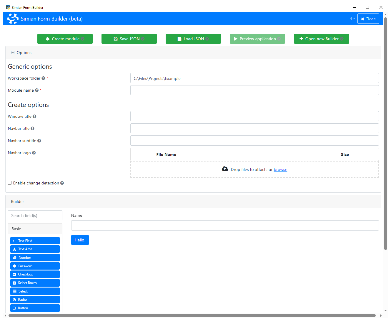
The Builder opens and shows the default layout. The menu shows two buttons: one to create a new module and one to load an existing form definition file. Below that, the Form.io builder is shown.

Click the New... button to start.

The options for creating a new module appear:
- Language: Create a Python or Matlab module.
- Mode: Create a web app or a reusable composed component.
- Workspace folder: The folder that needs to be on the path to find your module.
- Module name / Package name: The fully quailified name of the module to create.
When Mode is App:
- Window title: The title to show on the Pywebview / uihtml window.
- Navbar title: The title to show on the navigation bar.
- Navbar subtitle: The subtitle to shown on the navigation bar.
- Navbar logo: The logo to shown on the navigation bar.
- Enable change detection: When selected, shows an indicator badge whenever the user makes changes to the form.
When Mode is Composed component:
- Class name: the name of the composed component class.

In this example we will create a Python web app to illustrate the working of the Builder. The steps for the other options are similar.
Specify the Workspace folder and Module name.

Click Create code to generate the module code.

This generates:
- A form definition file (
.json). - A Python module that loads the form definition file. The module can be run as a script to open the app locally.
- A
cssfolder containing the modules style sheet.
Drag and drop components to build a form.
Edit component settings to change behavior and appearance.

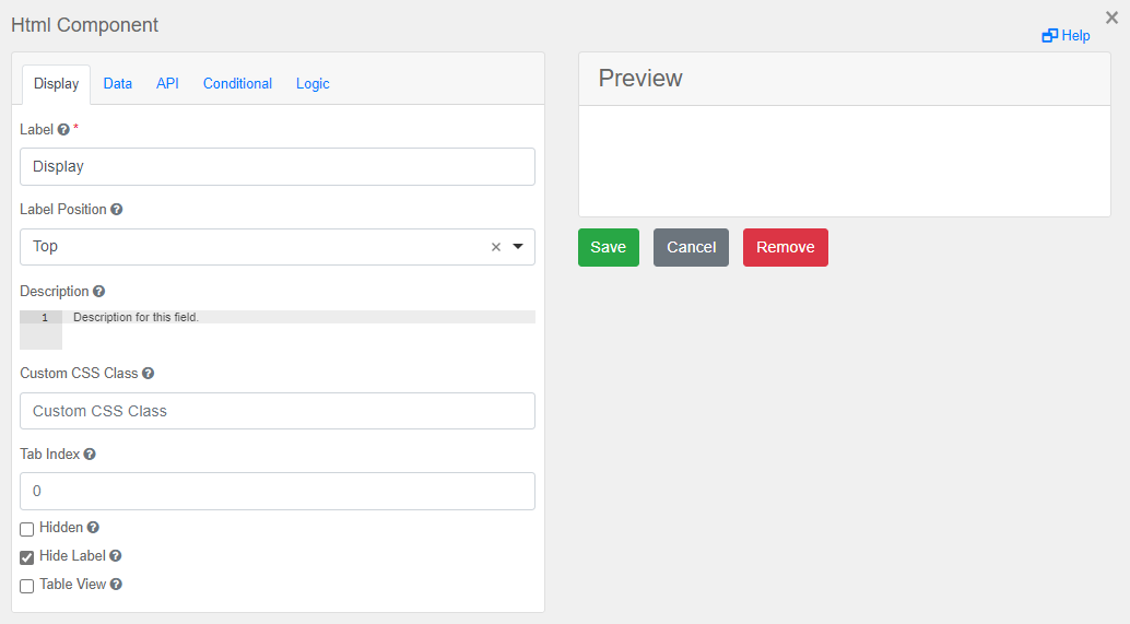
In general the edit pane for each component has several tabs with settings on the left and a preview on the right. Not each component has all tabs, and the contents of the tabs also varies depending on the properties of the component type. See the Components section and its subsections for more details on specific component types.
The tabs that may be present are:
- Display: generic options such as label, description, visibility, etc.
- Data: settings regarding the value of the component, such as default value, multiple values, input masks, etc.
- Validation: frontend input validation, such as required, min, max, etc.
- API: the field
Property Namecontains the component key. It is automatically generated based on the label, but can be changed here. - Conditional: settings to conditionally show or hide the component.
- Logic: settings to update the component properties based on triggered events.
Click the Save button to save the updated form.

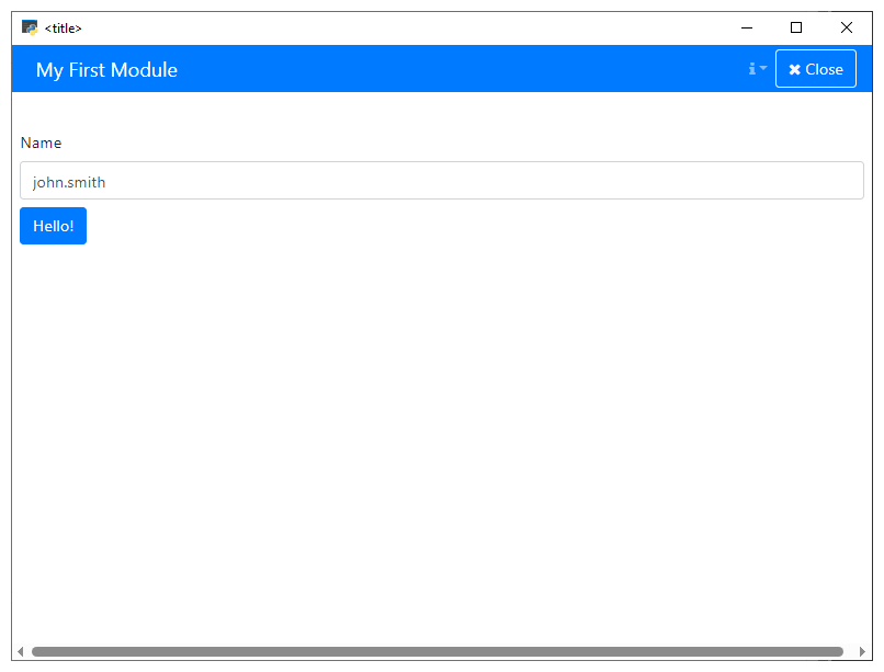
For Python web apps, a preview can be opened in a new Python process.


Next steps
Please consider reading the following documentation pages to further develop your application.