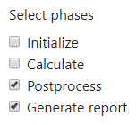
The Selectboxes component
Define a group of checkboxes in the form. This is similar to the Radio component, but allows for multiple selections at the same time.

In addition to the properties and methods listed below, this component inherits properties and methods from the superclass Component. For example, any Selectboxes component has a label and defaultValue property even though these are not explicitly listed here.
Properties
| Name | Description | Datatype | Default |
|---|---|---|---|
| values | Specifies the options the user can choose from. Must be an array of values where each item has the following fields:
setValues method. | Dict/Struct | |
| inline | If set to true, layout the checkboxes horizontally instead of vertically. | Boolean | False |
| optionsLabelPosition | Position of the text of every option with respect to the checkboxes. Can be 'right', 'left', 'top' or 'bottom'. | String | "right" |
Methods
| Name | Syntax | Description |
|---|---|---|
| setValues | obj.setValues(labels, values, defaults) | Set the labels and accompanying values (keys). All values must be valid variable names. This sets the values property of the Selectboxes component. Optionally provide default values for the checkboxes. |
The selectable options can be changed "after initialization" as well, as described in How to.
See also
- Use the triggerHappy functionality to trigger an event whenever the value of the Selectboxes component is changed by the user.
- Use the Radio to only allow for one selection.
- Change the options of a Selectboxes component after initialization as described in How to.